

Everything posted by Joel R
-
 Are you curious 🤔about ways to boost your engagement that don't require a lot of effort? Want some shortcuts to set your engagement on fire 🔥? Check out these 4x4 tips of four growth hacks that you can implement in less than four minutes ⏳ to boost engagement. 1. Add a content block at the bottom of topics. Sounds upside down 🙃, right? Most admins add content blocks at the tops of pages to attract users. But what do users do when they're finished reading or replying to a topic? Nothing. They're finished ... unless you add a block such as similar content, popular posts, recent topics, or another content block at the bottom of topics that help them discover new content. 2. Tag in your superusers 🌟 to stimulate a conversation. Your community's superusers are probably just as active as you are, and thoroughly involved in the community. They're comfortable in the community and would love to provide input. Wouldn't you agree with me @AlexJ @GTServices @Sonya* @Maxxius @media @Nebthtet@Ramsesx @tonyv?? 3. Run a poll ☑️. It makes the topic more interactive, and people love voting. 4. Write a contrarian topic or blog "Why XYZ isn't for you?" That's a surefire way to grab 😲 attention and begs the user to challenge back. And if you can't write a contrarian topic, then maybe ... being a community manager isn't right for you. Or is it?? 😜 Hope you enjoy these tips, and and share your growth hacks in the comments below!
 -
 Bad communities promise great things to its members. Good communities offer great things to its members. Great communities fulfill the greatness of its members. A primary purpose of every community is to fulfill the needs of its members. A strong community will go beyond the immediate, basic needs and ensure that fulfillment is a positive experience. By doing so, it builds in positive rewards and reinforcement for an enjoyable sense of togetherness. One of the cornerstone ideas of behavioral sciences is reinforcement: delivering a positive experience to members through multiple dimensions. Why they come, why the stay, and how to fulfill those needs is our third element of Sense of Community: Rewards & Reinforcement. Discover all the ways to fulfill member needs for your Invision Community. Fulfillment of Functional Needs Your community must have a clear and unique purpose. Your community must offer something valuable. And your community must solve a problem. This is the prime reason why a user would visit you in the first place and how you fulfill his most basic needs. He searches for a question, and your community provides the answer. Many communities build up their expertise through two ways: Crowd-source community solutions - You can highlight community-driven solutions in Invision Community to curate attention to the best answers. Two of the most underutilized features are Content Messages and Recommended Replies, which allow moderators to showcase and explain great user content. Bring experts into the community – Authoritative content should be posted and marked separately from regular user content. You can accomplish this by giving experts a dedicated Blog, authorship in Pages, or enabling Post highlights. Fulfillment of Personal Needs Beyond the fulfillment of basics needs, users want other wishes and desires. It’s impossible to identify all personal needs, but here are three of the biggest ones why users come together more: Group Status – People like to be on the “winning team,” and community success brings group members closer together. Highlight community success in your monthly newsletter or topic announcements. Competence – People are attracted to others with skills or competence. Introduce superusers and subject matter experts (SMEs) through interviews, team talk, or AMA topics ("ask me anything"). Rewards – Behavioral research shows that users gravitate toward groups that offer more rewards. Use tools like the Leaderboard, Group rank, Badges, and Reputation for extrinsic motivation that excite users and make them feel special. Fulfillment of Shared Values Society and our upbringing instruct us in a set of shared values. We bring those values into our online communities because they provide a framework of how to address our emotional and personal needs and the priority in which we address them. When users with shared values come together, they’re more receptive to helping others with the same value system: A Values Statement: Make it a point to identify the shared values in your community, in Guidelines or on a separate page. Affirm those principles in your interactions and, in difficult situations, frame your decision by referencing your community values. Private communities with high engagement usually have the strongest statements of values. Process vs. Outcome: How you answer is just as important as the answer. If you run a community that is technical, offers customer support, or involves lots of questions-and-answers, the process by which you arrive at the solution can help other users troubleshoot similar but different problems. Reinforce the solving process, and you’ll discover users will feel better about sharing their knowledge even if they don’t know the exact answer. Fulfillment by Networking Groups will naturally coalesce into smaller groups, as people find other people that they enjoy and who fulfill their own needs. Strong communities find ways to fit people together. Multiply Relationships: The sooner you can build relationships among members, the stronger those members will feel towards your community. In my community, I’ve created an “Ambassador” task force that welcomes new members to build personal relationships as soon as possible. Be a Networker: One of the virtues of being a community manager is that you’re normally introduced to the greatest number of people. Use your personal network within the community to connect two users together, bring other users into a conversion, or tap the expertise of others to help answer user questions. CONCLUSION There’s an Arabian proverb that says, “A promise is a cloud, fulfillment is rain.” Make it rain. Find ways to fulfill the greatness of your members, unleash a tidal wave of rewards and reinforcement that touch upon all the functional, personal, communal, and social needs of your members in the ultimate approach to member fulfillment. Build not just a good community, but a great one.
 -
 What do visitors see when they visit your online community? And when was the last time you logged out to browse like a visitor? Check out these 4x4 tips of four items in less than four minutes for the visitor experience: Check your Registration Process, especially any social sign-ins. You may want to increase or reduce security checks. You may need to fix social logins. And you may want to offer an easier onboarding like Quick Registration + Profile Completion. Read your Guest Sign-up Widget. This is the most important text in your entire community, since it's the first message visitors will read. Is your Guest Signup Widget giving visitors the first impression you'd like, with proper keywords and messaging? Audit your Visitor Permissions. In the ACP, go to Groups > Guests > Permissions. Do your guests have access to the right boards and categories? Test on other browsers and devices. Most of us don't have ten different computers and smartphones running different OS's and browsers, so it can be hard to check the UIX. Luckily, there are free cross-browser tools like BrowserShots.org or Device Mode on Chrome Devtools that can help. Hope you enjoy these tips, and if you have any questions feel free to ask in the comments below.
 -
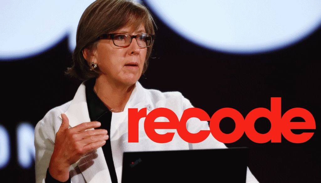 Mary Meeker delivered a rapid-fire review at the 2019 Code Conference of her latest Internet Trends Report, widely considered to be one of the most influential and comprehensive reports on Internet trends. The report covers 11 broad areas from ecommerce to education, data growth to usage, work to immigration, and China. The report's foreword includes the following statement: This is an especially appropriate message for Invision Community admins and managers, who must not only ingest the data firehose but turn it into actionable feedback. This report is presented to Invision Community clients as a way of understanding the broader trends that shape and influence the digital world around us, and to hopefully spur thoughtful conversation on how to thrive as an online community through 2019 and beyond. Here are highlights from the report, especially selected for clients of Invision Community. More International - Global internet penetration surpassed 51% in 2018, which means more than half of the world's population are Internet users. Certain regions have very different growth patterns. Asia Pacific already contains more Internet users than the rest of the world combined, yet less than half of its users are on the Internet. In contrast, North America is virtually saturated. Growth of new users is getting harder, except for China, India, and Indonesia which show the most promise of new users. More Ecommerce - Ecommerce is a rapidly rising a major portion of retail sales. Ecommerce growth is a strong 12% year over year. Physical retail growth is 2% year over year. More Online Advertising on Mobile - Internet advertising is continuing to increase overall at 22% year over year, with all of the new growth dedicated to mobile advertising spending. Spending on desktop advertising is flatlining. More Hours Online - Online media usage increased by 7% year over year in the USA, with all of the growth on mobile. Desktop usage flatlined in 2013 and even decreased in the past three years. Out of online time, Facebook, Youtube, WhatsApp, and WeChat dominate the global time spent online. Mobile use also surpassed time spent on TV for the first time in 2018. More Short-form Video - Short videos like Instagram Stories, Facebook Stories, and WhatsApp Status are one of the newest trends to explosively grow in the past 3 years. More Opportunity for the Underserved - Square is a popular credit card processor and merchant services provider. The fastest area of growth comes from new users in the lowest-income metropolitans in the USA versus the highest-income metropolitan areas in the USA, with 58% of its businesses from females and 35% from minority-owned businesses. More Images - For two decades, users on the Internet have been dramatically ramping up image creation and image sharing. Image sharing has also evolved, with leading platforms like Instagram adding new features like video stories and collaborative story-telling. More Interactive Gaming - Interactive gaming continues to be a dominant Internet trend with 2.4 Billion users, an increase of 6% year over year. Interactive gaming is social in nearly all ways, with real-time play + talk, shared environments, collective goals, and in-game social networks. One of the leading gaming-related platforms is Discord. More Digital Payments - Digital payments continue to be more efficient, now driving 59% of all global payments. More Data Personalization - The amount of data being collected has exploded in the past decade. Successful companies now deploy data as a core part of their workflow to improve customer satisfaction. Retail customers like sharing data if it gives them a better experience. More Negativity and Polarization - With more people than ever coming online, there continues to be usage concern over problematic content and activity. We will continue to see a world that gets more polarized and divisive due to less filtering, more amplification of extreme content, more vivid live images and videos. More Internet Censorship - The early days of a free Internet are over. We are living in a 'splinternet,' where your online experiences are increasingly determined by local regulation. Truly free Internet decreased with governments increasing surveillance and censorship. More Trust in an Open Internet - On the other hand, an open Internet and online consumer reviews boost multi-sided accountability that ensure safety of products and services, make companies accountable to consumers, and make consumers feel confident on their purchases. On AirBNB, a popular online booking platform for short-term rentals, 70% of guests leave a review. The reviews are fundamental to building trust on AirBNB. More China Internet - China continues to be the world's success story, with global growth that underscore its superpower status. It is a rapidly rising country with room to grow for most macroeconomic and technical trends including urbanization, disposable income per capita, share of world exports, mobile internet users, and cellular internet growth. Some of the notable Chinese apps include WeChat, Meituan, and Alipay. CONCLUSION Online communities have been a part of the online experience from the beginning through email listservs, chat rooms, bulletin boards, Usenet groups, multiplayer dungeons, and more. We will always be a part of humanity's need to connect, to share, and to relate with similar people but our methods and technology will evolve. The world is more mobile, more pictures and videos, more international, more polarized and open to abuse, and also more connected than ever before. As more people come online, as more methods to communicate flourish, as the technology and infrastructure around the Internet continue to mature, I hope you find inspiration in the 2019 Internet Trends Report to grasp upon these macro trends and find new opportunities to connect and serve your communities better. Download the full deck here: https://www.vox.com/recode/2019/6/11/18651010/mary-meeker-internet-trends-report-slides-2019
 -
 Communities are bound by a code of conduct that govern user behavior. Sometimes these rules are explicitly written, such as terms, guidelines, or my personal favorite: “Must Read Before Posting Or Banned!!!” topics. (That’s a joke. Please don’t ever write a topic like that!) Sometimes the rules are unwritten, based on evolving behaviors and user-to-user interaction. No matter the method of conduct or scale of communication, all communities contain these community guideposts that govern user behavior. Being able to influence, and being influenced by, these rules of conduct is our second element of Sense of Community. Community Managers. The original influencers. The privilege to persuade is a powerful feeling. It fills users with a sense of control, knowing that they can impact others. It gives purpose to users, who will tap into their inner helpfulness by assisting others. And it imparts a sense of satisfaction, which is one of the highest transcendent values a user can feel. It also leads to a better community. Over time, the mutual interaction between members builds trust, forming a community of authenticity where users can expect repeatable and expected behaviors. It also leads to good governance, where members embrace the codes of conduct by the group, inculcate the code into their own behaviors, and repeat the code to newer members – reinforcing the very codes they learned themselves. Members conform to community rules and standards, sacrificing a little bit of their own individuality but gaining acceptance by the community. Clearly, influence and persuasion is a powerful element. Let’s take a look at some ways in which you can build a better community by unlocking the power of influence. 1. Show New Members How to Influence If your community is anything like mine, you have a welcome topic or message: Do this, read, that, follow this. It’s usually filled with stuff to influence the member. But have you thought about giving the new member an opportunity to influence? And not just in a superficial manner like posting an Introduction topic, but one that’s filled with meaning and purpose. In addition to linking to the best guides and expert content in your community, ask your users to help other members, answer challenging topics, or identify any skills that can help others. 2. Influence through explanations Have you seen communities where the moderators take heavy-handed actions and do things without prior notice? Or they assume you know everything? It feels rude, unwelcoming, and very cliquish. On the other hand, I’ve also seen communities where the moderators and community managers take the time to explain every response. When you take the time to explain the response, you share your reasoning with others. That’s influence. Over time, users will turn around to repeat the reasoning to others, which builds good governance. (It also means less work for you!). Communities are built on transparency and trust, and the more you can openly establish your community norms, the more clearly other users can repeat and reinforce your governance. 3. Be influenced by asking for help One of the most powerful and uplifting things you can do is to ask your members for genuine help. Be candid. Be vulnerable. Explain the challenge. And ask for help. You will find members who will rise to the occasion. Humans are naturally compassionate. We will always help others if we can and communities are one of the best platforms to ask and receive help. If you ever make a mistake, take on a big project, or if you’re ever in over your head, don’t be afraid to ask for help and allow others to influence you. 4. Influence as a privilege One of the stellar reasons for choosing Invision Community are the multiple ways to publish content. You can offer user albums, polls, blogs, articles, discussions, files, clubs, the list goes on. This allows you to offer increasing channels of influence for your superusers. Unfortunately, most communities throw all the choices at a new user, hoping one will stick. That’s like asking a new member who steps into a room of strangers if he wants a microphone, a loudspeaker, and a spotlight! That can be scary. Influence is something to be gained over time, in small bits of comfort and trust. 5. Appreciate the influence. One of the most inspiring actions you can do as a community manager is to acknowledge and appreciate the influence of others. When you do, you affirm the influence of others. It's one of the simplest things you can do too. Pick three random post by members on your site and reply: “I appreciate this contribution because …”. You’ll be surprised by how well members respond to your note of appreciation. CONCLUSION The best influencers are the members who care about the needs and wants of other members. The power to influence is one of the greatest gifts you can give to your members. By allowing them to influence other members, the codes of conduct, and even the direction of your community, they feel a deeper sense of community because they can make an impact on others. The most influential members in a community are surprisingly not the ones who post the most or who act the most dominant. The best influencers are the members who care about the needs and wants of other members. Share in the comments below one of your success stories on how you influenced – or were influenced by – another member. As always, I appreciate your contribution to join me in helping Invision Communities of all sizes build more rewarding and successful communities.
 -
 Cultivating a strong Sense of Community is a clear goal for community builders. Develop a strong sense of community, and you’ve built a community experience that sparks a more meaningful and connected community that your members will love. A strong sense of community means: An integrated community where members feel personally related An impactful community where a member can influence and be influenced by the group. A fulfilling community where members meet the needs of others and can feel rewarded. A shared community, where users undergo common history, time together, and social experiences. Do you believe you’ve developed a strong sense of community? Follow long as we critically examine the first element in the Sense of Community: Membership. Membership Boundaries of communities have always existed, whether it be neighborhoods, social groups, or online communities. By definition, there are people who belong and people who do not. It’s okay to decline membership to users, thereby providing a more comfortable space for members who are accepted. Here are some time-tested tips from my years of community management that touch upon various attributes of membership: Don’t try to be everything to everyone. It’s far better to be an exclusive community to a smaller, impassioned group of users than to dilute your community for a wide audience. Not everybody deserves to belong, and by intentionally removing irrelevant members, it makes it a more purposeful community for those who can join. Define who should belong, and outline the requirements on your Registration screen and Guest Sign-up widget. Boundaries are walls, but safe walls. Although there’s the pain of rejection and isolation of private communities, it’s offset with the positive benefits of joining. It creates a space where members can feel safe to open up, to feel related to one another, and to feel protected. Reinforce the benefits of joining the community to new members in a welcome message. A new sense of identification. Not only do members join the group, they should develop an extended sense of belonging and identity with the group. The more strongly you can define the sense of belongingness, the more deeply the member will feel connected. There should be a feeling of acceptance, an expectation that one fits in, and a willingness to sacrifice for the group. Create a welcome team that immediately reaches out both publicly and privately, ask how the new member can contribute, and constantly highlight how the community has gone above-and-beyond in members helping members. The higher the boundary, the greater the reward. Personal investment is an important contributor to a member’s feeling of group membership. By working for a membership, a member will feel like he’s earned a place – and that the membership will be more meaningful and valuable. You can ask guests for their accreditations, background, or how they can contribute to the community. The power of symbols. Social groups throughout history have long used symbols, icons, ceremonies, and group language to cultivate a unique sense of identity. These conventions are powerful representations of a group. You can cultivate and write a common language in your Invision Community in large ways and small by uploading unique reactions, changing the language string, and celebrating community-specific holidays and events. As you re-evaluate your community framework with me, take the time to outline what it means to be a member of your community. Defining your membership goes hand-in-hand with defining your purpose. It should touch upon these five attributes of membership: boundaries, emotional safety, sense of belonging, personal investment, and common symbolism. Establish clear distinctions for your community’s membership qualifications, and you’ll be able to develop a deep Sense of Community from the very start of a member’s registration. Share with me and others how you've defined your community's membership in the comments below. I love to hear about other Invision Communities. Joel, Invision Community Advocate and Certified Community Manager
 -
 “Every success story is a tale of constant adaption, revision and change.” – Richard Branson, billionaire and founder of Virgin Group. We all seek success with our Invision Communities. For too many of our communities, however, we yearn for success but we don’t plot the correct navigation to get there. We haphazardly pursue our strategies, trying new ideas and hoping one will stick. It’s time to take a step back and assess your goals in context to your growth. It’s important to understand the stages of the community lifecycle, and to strategically match your goals with your growth sequence. Alicia Iriberri and Gondy Leroy of Claremont Graduate University surveyed over 1000 publications across multiple disciplines including computer science, information systems, sociology, and management in their seminal 2009 research paper “A Life-Cycle Perspective on Online Community Success.” Their research forms the foundation for most modern community management, and in their paper they write, “The impact each design component has on the success of the online community shifts depending on which life-cycle stage the online community is experiencing.” The right strategy at the right time will maximize the impact. Every community goes through a community lifecycle of four stages: Inception, Growth, Maturity, and Mitosis. Setting the wrong objective can not only fail, it can even backfire and destroy goodwill. Here are classic examples of good strategies that go wrong because of poor sequencing: A new community with no activity that builds dozens of new boards A growth community not fostering a unique sense of community A mature community not establishing strong codes of conduct Architecting a community is very different for the first ten users versus the next thousand users. New priorities come into play, community concerns will shift and strategies need tochange. As a community manager, ensure the strategy is appropriate and reflects your community lifecycle to ensure maximum impact. Let’s take a look at proper goal settings for each stage of the community lifecycle. Inception Inception is the start of your community. You’re bursting with energy, enthusiasm, and big ideas. While your Invision Community is full of potential, your goal is to turn your vision into reality: Members: Focus on nurturing a core team of members. Your goal is to get 10 – 12 superusers to consistently engage and support the community vision. Promotion: Your community won’t contain enough content to attract visitors through search engines, so you’ll have to rely on personal referrals, word-of-mouth, and direct acquaintances. Content: Focus on building expertise on core content areas that will make you stand out. You want to be the best in one subject. You’ll need to generate much of the content programming yourself, which should focus on functional value. Organization: Establish organizational parameters for the community, define the vision with stakeholders, write your Terms of Use, and validate the community concept. Community: The community is heavily centered around the community founder at this stage, so set the right tone and lead through example. Growth Growth is where the magic of community happens, balanced against the development of more explicit and formal conduct. Members: Shift your focus from nurturing individual users to creating a workflow that can systematically welcome new members. Promotion: You should be proactive with your self-promotional activities to build community awareness such as email marketing, social media, or mailing lists. Content: Content will now be a mix between self-generated and co-created. You want to highlight community content by others to encourage community expertise. When you create content yourself, you want to start including emotionally-driven questions that connect users. Organization: Measure specific metrics for organization goals, highlight community health and successes, secure funding for ongoing budget and team. Community: A unique sense of community is cultivated at this time with shared experiences and language between members. Members feel excited to be a part of your community’s growth. Maturity Maturity is when your Invision Community becomes critically acclaimed and well-known in the field. Even though your community looks to be run smoothly, there are still areas to address so your community doesn’t stagnate: Members: There should be a clearly defined process and welcome guide for onboarding new members, an established pipeline that constantly brings on new superusers, and a rewards program that recognizes members for different types of member journeys. Promotion: Your site is well-known, so the search engine traffic and content within your community is enough to bring in new users. You can optimize your SEO at this point. Content: Almost all content is user-created at this point, which means your focus needs to shift to content recognition, organization, and moderation. Highlight the best community content; categorize and properly tag new content so the community stays organized; and scale your moderation to handle the size of your community. Organization: The community is a key part of your organization’s larger success and supports multiple areas of the business. Be a strong internal advocate for the community and align your community with your organization’s new profit areas. Community: Superusers not only have the privilege of creating their own content for the community, but they’ve stepped up as mentors and moderators. Your community has a strong culture that’s reinforced by members. Mitosis Mitosis is the stage when your Invision Community grows beyond its original mission, potentially splitting off into new subgroups. Many communities stagnate at this point with falling engagement and plateauing registration, but you’re catching onto the next big trend in your industry to grow into. Members: New member registrations flatlines because you’re tracking with the industry. Your goal is to continue to delight members with new forms of omnichannel engagement like regional meetups, video conferencing, and headline conferences. Promotion: Your community self-generates organic traffic. Your promotion should shift from trying to advertise for yourself to exerting influence with industry partners as a trusted leader in the field. Content: Members can find the most comprehensive set of resource documents and discussion on your community. Your goal is to distill the knowledge into the best tips and guides for newcomers to obtain the most accurate information as quickly as possible. You should also archive areas that no longer receive activity while finding growth topics in your field. Organization: The community is a critical part of all business operations and integrates into all relevant workflows. You should build custom metrics to measure results, help determine new investment decisions, and streamline business efficiencies at the organizational level that benefit the community. Community: Your community becomes an incubator of new sections in a controlled manner for potential spin-off. Superusers control and moderate their own areas of the site like Clubs or Blogs. Online communities evolve through distinct stages of the community lifecycle. At each stage, the needs and activities of members require different tools, features, and community management. Certain strategies are more impactful when they coincide with the right sequence. Invision Community makes it easy to get started with a technology platform packed with features that every community manager can start using right away. But how you get to the first ten users, to the first thousand posts, or even to one billion likes will be a journey that’s truly your own. Share your success story of Invision Community in the comments below. Did you make any rookie mistakes that you wish you knew beforehand? What are some strategies that you’re pursuing right now, and why do you think it’s an impactful decision for this stage of your community’s lifecycle? We’d love to hear your journey along the community lifecycle.
 -
 Online communities shine with the brilliance of humanity. Every day, our communities inspire, evoke, inform, motivate and engage in a hundred different ways. Every member feels a uniquely individual sense of value from your community. For too many communities, the strategy revolves around two simple pillars: content and engagement. You inform. You engage. And you think your job is done. However, you’ve barely scratched the surface of offering value. You need to expand the ways in which you strategically match your community to member value. New studies are coming out that show humans feel up to 27 emotions from admiration to triumph, and the best communities unleash a rainbow spectrum of value – functional and emotional, business to social - for their organizations and for their members. This results in not just deeper and more extensive engagement, but greater financial payoff. Indeed, research from global management consulting firm Bain & Company shows brands like Apple, Samsung, and Amazon that demonstrate multiple elements of value have x3 greater customer loyalty and x4 faster revenue growth than others. The elements of value can be divided into two broad categories. Specialize in Functional Value Don’t deliver content. Deliver time savings, cost savings, risk savings, organization, connection, education, and variety. What is the utility benefit to your users? Functional values are the core reasons why members would visit your community. It forms the baseline rationale for your community’s existence, and you want to not just be good – you want to be the best in delivering functional value in your field. Improve your Q&A boards for feedback, inquiry, or ideation. Provide a template in a pinned topic where users fill out a consistent set of questions, so you can answer with the most appropriate and accurate options. Use moderator tools like Recommended Replies to summarize and spotlight key points in a topic. This saves time and focuses attention on expert information. Super-charge the training for your response team. Empower them to be subject experts by giving them private training, templates, and extra resources in a staff wiki so they can investigate the unique needs of user inquiries and provide the best responses. Build a set of content resources in the Pages application, which is the most powerful application in the suite. It can be used to create a set of content resources with unlimited custom fields, filters, and templates enabling you to offer variety, organization, and education that no other competitor can match. Spark Emotional Value Don’t deliver engagement. Deliver admiration, amusement, awe, empathy, joy, nostalgia, satisfaction, and triumph. How does your community make your members feel better? Here’s a little secret. Even though functional value is the foundation of your community’s value proposition, emotional elements are 50% more valuable. Fortunately, Invision Community comes loaded with ways to recognize, reward, and promote members. Take the time to explain the purpose of a new group promotion, rank, or title. Don’t let the reward be the goal in and of itself. You should connect the feature with its underlying emotion by explaining what steps are required to earn the rank, how many others earned it, and what it’ll take to earn the next one. Start with the Leaderboard. Invision Community ships with the Leaderboard, which provides an overview of the most popular users and content. Scan for up-and-coming members to investigate what triggers their emotional satisfaction; scan for popular content to discover what excites your membership. Create multiple member journeys. Most communities follow a pattern of new member to trusted member to moderator. But members can become superusers in many ways. Members who enjoy nostalgia can organize a Year-in-Review topic. Members who enjoy affiliation should serve as Ambassadors to greet and mentor new members. Members who seek reputation will appreciate new outlets for publishing. Define multiple pathways that strategically tap into the diverse desires of your members. As you implement your initiatives to build a Community of Excellence, take the time to relate the initiative to the Elements of Value (Attachment: IPS Elements of Value Attachment.pdf). You’ll find new and creative ways of offering value to strengthen the relationship between your community and your members. Look deep within your community to unearth the rainbow spectrum of value. You’ll discover a wellspring of extraordinary value waiting to help your members shine brightest.
 -
 Are you a vBulletin admin looking to stay on the leading edge of online communities? As an IPS client who frequents the Invision Community support forums on a daily basis, I often run across existing or former vBulletin admins looking to migrate to IPS. In fact, based on my not-so-scientific survey, vBulletin is one of the most popular platforms from where admins migrate. Many of the vBulletin users are professional administrators looking for a stable company, rapid development, and a trusted platform to power their communities into the future. I interviewed 6 former vBulletin admins who are now Invision Community clients. Most of these vBulletin admins have 10+ years of experience running successful forums, so their input was especially insightful. “I love the design of the admin and moderation back-end, a real treat after living with the antiquated and confusing vBulletin back-end.” -- @cfish “I like the well-thought concept, the details, and abundance of features and functions.” --@Ramsesx I’ve compiled the top 10 questions and answers from their interviews and the forums specifically for vBulletin admins for an insider’s perspective on how to convert from vBulletin to Invision Community. You can also read their full interviews in my Community Guide attached at the bottom. 10. What is the typical lifecycle of Invision Community and what new features come out? Invision Community is currently on 4.4. It’s a great time to be migrating as both the software and converter are very mature. You’ll be able to take advantage of all the new features from Invision Community 4.x such as Social Clubs, Subscriptions, SEO updates, and GDPR updates. In general, IPS publishes one major update like 4.4 once a year, with several bug fixes, security updates, and enhancements throughout the year. The best place to read about Product Updates is the official IPS Blog in Product Updates. 9. What are the pricing options and how do they compare to vBulletin? IPS is comparable in pricing when compared to vBulletin depending on your choice of apps. The self-hosted option is cheaper when considering support and upgrades. The pricing for an active license is simple, easy, and comprehensive. A new license includes professional ticket support, forum support, access to new upgrades, and managed spam service for 6 months. Renew again in six months to continue those benefits. If you choose not to renew, your software will continue to work. 8. Is the software mobile ready like vBulletin? Yes, the software is responsive by design. This means the community naturally fits and beautifully displays in any device size, giving you a consistent look-and-feel across all devices. Try it now by resizing your window! It also means you don’t need to pay for any extra “mobile bundles.” This approach to mobile design was one of the reasons why @cfish chose IPS: “I didn’t like vBulletin’s approach to mobile. The IPS approach to responsive web design was inline with my own thinking.” 7. What are the official Invision Community apps and how do they compare to vBulletin? @Steve Bullman converted to IPS because “IPS seemed to offer a better all-round package for what I needed.” One of the biggest reasons for considering IPS is a broader approach to community. Whereas vBulletin focuses only on Forums and Blogs, IPS empowers you to build a suite of applications customized to your needs. Mix and match apps like Gallery, Blogs, Downloads, Pages, and Commerce to build a modern community with resource directories, databases, paid subscriptions, albums and more that go beyond forums. You can read more about the apps in Features. Calendar and Clubs are included for free! 6. What will be migrated from vBulletin? The free converter app will migrate all of your member and content items from vBulletin 3.8.x, 4.x, and 5.x. This includes members, private messages, member groups, ranks, forums, topics, posts, and attachments. You can view the full list on Migrate and choose your vBulletin version from the list of choices. Obviously, you will not be able to migrate any custom themes or custom modifications. @ChristForums adds, “I wish I had known that the converter was so easy to use and migrate from Vbulletin 5.” 5. What are the channels for support? Every active license comes with professional ticket support, which should always be your first source of contact. @Markus Jung highlights “fast support” as the item he appreciates the most about his license. You can also obtain help from the community forums, help guides, release notes, and other public resources. If you’re not an IPS client yet, you can post in Pre-Sales forum or email [email protected]. 4. How do I prepare my community? The six admins that I interviewed offered several tips for new Invision Community owners. Prior to the conversion, you should read through the converter package to see what will convert and redirect. You should purchase other Invision Community apps in advance to fully convert vBulletin items as needed; not delete any old content since Invision Community includes an archive function; and not make drastic changes to allow members a chance to become accustomed to the new forum. 3. What will happen to my traffic and URL redirects? The free converter app will redirect your existing URLs. This includes forums, topics, posts, member profiles, print view pages, archived content, attachments, and tags. You need to leave your converter installed after migration to ensure the redirects will work. AlexWebsites wrote, “the converter came with built-in redirects and I was able to redirect most of my traffic. Traffic recovered within a few months.” 2. What are the server configuration and database requirements? If you choose cloud, then Invision Community will manage the hosting. If you choose on-premise, you can use the free ‘Get Ready’ compatibility file to check your server. The latest version of Invision Community 4.4 requires: PHP 7.1.0 or higher (7.3.x is supported) MySQL 5.5.3 or higher (5.6.2 recommended). 1. How stable is the company? Other companies lost their development talent. Other companies were bought and sold by multi-media conglomerates. Other companies have a history of lawsuits. Through it all, Charles, Lindy and Matt have been here since the beginning providing steady leadership to Invision Communities everywhere. If you’re looking for stability, it’s nice to know you can rely on the same people who started the company. For serious and professional vBulletin admins looking to transition, you know you’re not just buying into the software, but investing in the development team, staff, and platform for years to come. Ramsesx shared his personal story: “I always prefer the best for my community from where I earn my income. An important aspect was the longtime outlook. Invision Community gave me the feeling of being trustworthy, they are more than 17 years in the forum software market.” It’s no wonder that so many successful vBulletin admins feel the same after moving to Invision Community. You get stability, years of experience, a deep understanding of online communities, and a dedication to development that continues to innovate. It’s time to bring your vBulletin community over to Invision Community! Bookmark this page for future reference and download the Community Guide for experiences from real clients who converted from vBulletin. Much appreciation to @AlexWebsites @cfish @Christforums @Markus Jung @Ramsesx @Steve Bullman for participating in the interviews. - Joel R Community Guide vBulletin Migration to Invision Community.pdf
 -
 The Internet is a fierce battleground for users, clicks, attention, and audience. Competition surrounds your community from all angles and new threats constantly emerge. The Internet has leveled the playing field for local businesses, solopreneurs, and small organizations which means more people than ever are competing for users. Online communities are no different, and as companies realize the growing power of communities, you too may face more challenges. Online communities are growing faster than ever: IDC predicts worldwide online communities market to grow to $1.2 billion in 2019 According to research by Leader Networks, twenty-three percent of marketers who have online communities indicate that the size of their communities doubled in the past year. How is your community competing against your competitors? Is your community growing or stagnating relative to your competitors? In this blog post, we identify core concepts of competitive strategy that stretch from traditional theory to unique methods of winning for communities. Theory of Competition The broadly-accepted understanding of competition in the business world rests on the seminal work by Professor Michael Porter, when he mapped out the origins of competitive forces in his 1979 book “How Competitive Forces Shape Strategy.” Fundamentally, all strategies for Porter distill into two basic options: Build on what you already do, or do something no one else can do. You can compete by doing what everyone else is doing but be more efficient, such as offering higher quality content, a better user experience, or having a lower price of member acquisition. Or, you can expand the pie by forging a new position in the marketplace, such as staking out an untapped niche or developing a unique service. What’s your current competitive strategy: be better at what you’re already doing and your competitors, or to do something completely new? Emerging Theories A new strategy on competition is emerging that is just as potent as Porter’s competitive forces. It’s especially relevant for online communities in the digital age: reacting opportunistically to emerging possibilities. Discovery-driven planning is the field’s most recent thinking. It was introduced 20 years ago in works like Tim Luehrman’s “Strategy as a Portfolio of Real Options” that talked about flexibility as a strategy. The idea was also introduced in the more recent “Stop Making Plans: Start Making Decisions” by Michael Mankins and Richard Steel, which argued for continuous strategic planning cycles. Online communities are impacted by – and can seize advantage of – fluctuating factors: Technical advances and digital disruptions Disruptions in your industry The faster you react to market or technological change, the greater your advantage will become over time. What disruption recently impacted your industry or niche? How can you capitalize on the opportunity? Application to Online Communities Online communities are at an especially powerful intersection of customers, superusers, industry experts, and brand representatives. By assembling a broad mix of users, you gain a source of competitive knowledge and crowd wisdom unmatched by traditional businesses. Market intelligence – Harness the power of crowds by letting your members feed you real-time market intelligence on the industry, market trends, and competitors. Use technology to your advantage – Become an expert on utilizing your Invision platform as a technological advantage, whether you’re increasing visitor registrations with Post Before Registering, adding in store filters in Commerce, or enabling the application manifest settings for faster access on smartphones. Collaborative ideation – Collaborate with users early in the design process to create services or products that are highly-differentiated. Co-Creation – Channel your user’s expertise, enthusiasm, and product knowledge into co-created content such as tutorials, support answers, industry news, contests, and more. Brand Ambassadors – Turn your membership’s most passionate users into brand ambassadors to provide outreach and personalized connections. Conclusion Communities are challenged and tested every day by a multitude of competitors that compete for users. Competition is fierce, and as the web continues to proliferate and level the playing field, competition will only get stronger. It’s no longer enough to host a general discussion forum. Successful communities envision a clear competitive strategy. Although competition is fierce, there are winners on the Internet who consistently gain market share. The winners are those who understand the fundamental drivers of competition: to create sustainable advantages over their competitors, to offer unique services and experiences, and to react opportunistically. They also leverage all facets of their community for maximum value. Join me in 2019 in defining your competitive strategy and becoming a Community of Excellence. - Joel R Joel R is a mystery wrapped inside an enigma. When he's not running his own successful community, he's peppering Invision Community's private Slack channel with his feedback, community management experience and increasingly outrageous demands (everything is true except the last part).
 -
 It's a new year, and a new beginning. And the possibilities are endless for you and your community. It’s an exciting time to be leading an online community with Invision Community - whether you’re starting out or switching over - and the new year is the perfect opportunity to start anew. How are you celebrating the new year with your community? What are your community goals for 2019? To kick off the new year, I’ve outlined guidance for several types of communities, whether you’re just starting out or you’re looking to take your community to the next level. New Community Are you a new community or looking to start one? You’re in the best position because you have a blank slate and everything is possible. Invest in a formative experience during your first year of defining your community’s purpose. What are your community’s mission, goals, and objectives? What is your competitive advantage against other similar communities or are you developing a new niche? How are you going to develop content programming, site features, or digital services in support of that advantage? What is your marketing plan to attract new users? Who is your core base of users, and what’s your plan to cultivate your first set of superusers? What is your budget to create a sustainable plan for hosting? Interest Community Are you a hobbyist with an established community of passion? Your community is a labor of love for you, and while it can feel like you’re pouring your heart and soul into it on a daily basis, it can be refreshing to take a step back and take stock of your community’s purpose, engagement goals, and how you want to lead in 2019 through fresh eyes. What’s your plan to create more emotionally-driven storytelling in your community? How are you going to deepen your tribal connection to users and between users? How can you incorporate member feedback into your New Year’s resolutions through polls, surveys, and member insights? How are you building a scalable community that leverages automation, staff, and user generated content to achieve your objectives? What are your engagement metrics year over year for 2018, and what is your projection for 2019 metrics like active members, online activity, best answers, and other user targets? How are you going to achieve those engagement metrics through initiatives like new pathways for engagement or enhanced training for staff? Enterprise Are you a brand community that’s part of a parent organization? Your organization probably already understands the value of investing in an online community, but rest assured that you’re in good company. In the 50th Anniversary report by the research firm IDC, it’s estimated that 80% of all Fortune 5000 companies will host an online community by 2020. As a community manager, you’ve probably covered all the basics such as approving your community’s budget for the new year, provided performance reviews of your staff, and mapped out your community strategy to align with organizational goals. Nevertheless, there are always more opportunities to increase your community’s prominence: What new early-stage relationships do you want to cultivate with employees, suppliers, vendors or partners? How can you create more networking touch points between your community and key constituencies to deliver community-driven solutions? How can you present your community’s data to stakeholders in new ways for better insight? How can you vest key stakeholders into community decisions and let them be a rewarding part of the conversation? What growth areas are happening within the organization, and how can you make the community be an integral part of its delivery? My personal New Year’s resolution is to develop my website into a Community of Excellence. This involves incorporating thought leadership from professional community management resources, making data-driven decisions, and formalizing a growth plan based on best practices. I hope you’ll join me in a year-long journey of community management as we conceptualize, learn, and discuss how to co-build Communities of Excellence. It’s a new year of endless opportunities to drive new growth and excellence for our members and communities. What are your community goals for 2019? Share in the comments below or in the exclusive Client Lounge in the Invision Community forums, so we can cheer each other on, check-in periodically, and provide peer mentorship for each other. Join me in a Year of Community. - Joel R Joel R is a mystery wrapped inside an enigma. When he's not running his own successful community, he's peppering Invision Community's private Slack channel with his feedback, community management experience and increasingly outrageous demands (everything is true except the last part).
 -
 A successful community manager is a combination of so many things. Being a successful community manager demands that you be a multi-faceted person and to apply a dynamic personality to a position that’s always in flux. You’re the authorized ambassador of your organization; you’re the chief moderator who sets and enforces community guidelines; and you’re the counselor and friend to all of your peers in the community. You may also be the one who updates your community suite, approves members, and manages the moderator team. Oh, and you find time to be the social media coordinator, digital designer-in-training, and all-around fantastic human being. You wear many hats and it can be challenging to juggle all of those hats. So what do you do? Take a breather. The good news is that you don’t have to wear all the hats, all the time. My head used to spin at the sheer amount of work that I faced as a solo community manager - especially when my community first started out – and I didn’t have a disciplined approach to community management. I didn’t even know what hats to wear! Over time, I’ve learned that there are specific ‘hats’ to community management. The best way to figure out which hats to juggle? Determine which hats are most important to you, which hats to wear for a specific goal, and which ones to swap out as your needs change. Create the change you believe in by wearing the right hat. Evangelist No matter the niche or industry, you should be a self-professed evangelist who is passionate and always learning about the topic. This personal interest will shine over time with your expertise in helping other users, bringing in new members with your helpful knowledge, and focusing discussion to evolving trends. You’re trusted as a leading voice of the community and your organization, and you can use your expertise to spread the positive impact of your organization’s mission. User Advocate You’re passionate about your users because you understand that the beating heart of your community is the valuable feedback, peer support, and testimonials that your users provide. You’re a champion of nurturing a positive and supportive community that’s aligned with your organizations’ goals. Customer service is a vital component to your team’s community outreach. Digital Marketer An effective community manager will engage people, even outside of the community. This means being a leading voice on external sites like blogs, partner communities, social media, industry events, and professional organizations. It extends the reach of your organization through non-traditional marketing and gives you and your community an online impact in relevant areas. Relationship Builder Part of your job is to be a networker for all the people around you and to be a bridge for authentic relationships. You want to listen to the ensuing conversations happening around your product, company, or industry, then add value and build relationships with key stakeholders both online and in-person. It’s especially important to build meaningful relationships within your organization to advocate for your organization’s mission through your community. Suite Administrator Finally, you should be an expert in Invision Community to leverage the built-in tools. Invision Community makes it easy for community managers of all technical backgrounds to get started and run successful communities. The more you learn of the Administrator and Moderator functionality, the more effective you become in supervising your community staff and driving your organization’s success. Community Management is one of the most exciting and rewarding roles in the modern web. It’s a position that’s filled with dynamism and people, and you grow yourself in ways that you never imagined. An effective community manager needs to extend herself by trying on new hats. And while some of these hats may be new to you at first, I encourage you to try all the hats and slowly develop your expertise in these new roles over time. Putting on more hats is the first step to becoming a more valuable and effective community manager. What hat do you wear today, and what hat do you want to wear tomorrow? No matter which new role you decide to embark upon, hats off to you for stepping up and growing yourself as a community manager. Joel R is a mystery wrapped inside an enigma. When he's not running his own successful community, he's peppering Invision Community's private Slack channel with his feedback, community management experience and increasingly outrageous demands (everything is true except the last part).
 -
 Did you know that the most magical community in the world runs on Invision Community? For close to 12 years, Invision client @Michael R has been spreading joy through the Santa Claus Network (ClausNet.com), the world’s largest community for Santa and his followers. He started building the site in November 2006 and went live in the beginning of 2007, using Invision Community as his platform of choice since the beginning. Michael also founded the James D. Rielly Foundation in honor of his grandfather – a non-profit organization that provides charitable and emotional support to military and first responder families. As a tribute to the holidays, Mike was gracious enough to be interviewed by Joel on behalf of Invision Community on how he uses Invision Community and engages with his unique community. J: This is such a wonderful community of passion. How did you get started? Back in October 2005, I attended the world-famous Charles W. Howard Santa Claus School. It was a Christmas present I received from my wife. At that time, I had already been portraying Santa for 34 years but was a bit skeptical of what I would get out of attending a “Santa School.” He’s already nailed the Santa look. At the school I got to meet Santas from all over the World! It was a wonderful experience and I am still friends with many of the folks, but what I enjoyed most of all was the camaraderie I felt with my fellow brothers and sisters in red. This was the catalyst in creating ClausNet – to recreate the same feeling of fellowship I felt at the school. J: Your membership must be very unique. ClausNet is the world's largest online community dedicated to the faithful portrayal of Santa Claus. Our membership also includes Mrs. Claus, Elves, Reindeer Handlers, and all others who devote their time to bringing the magic of Christmas to children and adults throughout the world! In comparison to other sites, 2,900 isn’t a lot of members. But based on some estimates it’s about two thirds of all the Santas and Mrs. Clauses on the planet! We are very selective who of we approve for membership. In addition to Invision’s validation process, I personally email each person who registers for an account. I do this to help eliminate trolls and other Grinchy people, but mostly to keep out the prying eyes of children to preserve the Secret of Santa and keep the magic alive for children of all ages! J: What Invision apps do you use, and how do you use them? We have all the Invision Community apps and rely upon them for many purposes. We don’t sell products on the site but we do use Commerce for donations. Members can purchase Supporter Level Memberships at varying prices. We use Pages and Blogs for posting short stories, opinion pieces, and even business advice. We use Downloads for sharing files such as example contracts and business card templates. The Calendar app is a great resource in notifying and scheduling regional get-togethers, workshops, schools, and training sessions. Articles and short stories written in Pages. J: What are some of the most innovative features of Invision Community that your members have embraced? I believe Invision Community is the most robust platform for building online communities. Our members really like the new Clubs feature. We use Clubs for regional and local groups as well as specific topics such as prop making and costuming. From the Long Leaf Pines to the Northern Pacific, ClausNet uses regional clubs all over the world to foster closer relationship. J: There must be seasonality with your niche. How do you keep your members engaged throughout the year and what are some special events that you host? Throughout the year we run several activities designed to keep up engagement. Member of the Month - Each month, I select a different member of our community to featured. We interview the candidate and post the interview on the site. ClausNet Gazette Monthly Newsletter - We send out a monthly newsletter of content from the website. Surprisingly, it’s the first time many of the members see the content. It is a great way to keep members coming back to the site. Christmas Card and Ornament Exchange – These are two of the most anticipated events we hold. Members sign up and are randomly paired with another, so they can exchange cards or ornaments. It’s very exciting to receive Christmas ornaments from another part of the world! We also run several other programs such as an Annual Raffle, Countdown to Christmas, Picture Contests, and Latest News. J: As a longtime Invision client whose passion is the holidays, what are your holiday wishes to other Invision clients and clients-to-be? As many of you know, Christmas is my favorite holiday – a holiday that lives in my heart year-round! May this holiday season be one of health and happiness for you and your loved ones. Happy Holidays, Happy Hanukkah, Joyous Kwanzaa, Festive Festivas, Fröhliche Weihnachten, Nollaig Shona, Boas Festas, Buon Natale, Feliz Navidad, Merry Christmas! J: Thank you Mike for graciously spending your time with me and other Invision clients to learn how you engage with members using Invision Community. Hopefully this interview has helped inspire and motivate other clients with some extra cheer during the holiday season!
 -
 Outside your window, the leaves have burst into fiery reds and oranges. A crisp breeze floats in the air. The birds have long chirped their good-byes. And you’re sipping a hot cup of apple cider, contemplating the change in season. The holidays are almost here. The end of the year is one of the best chances to take stock your community and provide an emotive experience for your members. It’s a chance to reflect upon what you learned, what new initiatives you started, and what you still have ahead of you. It’s a chance to provide a sense of closure to the year and to ignite one more burst of community-wide goodwill. In short, the holiday season is an amazing opportunity to bring your community together one last time in 2018. Here are 16 ideas for the holidays in four categories. Try to select at least one idea from each category for a holiday plan that runs the gamut of the community experience. Choose the ones that you especially like; gather your staff members to brainstorm; and put together a plan that’ll navigate you better than Santa’s reindeer through the holidays! Design One of the easiest and simplest things you can do is to update your community’s design for the holiday to provide an immediate visual impact. Users love to see fun twists on your theme. 1. Tweak your logo with falling snow or twinkling lights. 2. Replace your forum icons with holiday ones. 3. Go bold and install a whole new holiday theme from the Marketplace. 4. Coordinate the holiday design across all of your social media and web properties. Remembrance Your 2018 was filled with emotional triumphs and tribulations. Did your community accomplish something great? How many new members did you welcome? Did you lose any members? Create a shared experience that binds and connects your community closer together. 1. Craft a year-end mailer that chronicles your community’s victories and struggles. 2. Post a “Did You Remember This?” topic that reconnects with all the funniest, informative, and most poignant topics. 3. Edit a “Top Moments of 2018” montage that highlights the biggest events that transformed your community in the past year. 4. Memorialize members who have moved on or departed your community. Appreciation Holidays are all about demonstrating appreciation for your loved ones, and your community is no different. Take the time to demonstrate an authentic and warm appreciation for all members who have shared the past year with you. 1. Promote new users who have done a superb job of supporting the community over the year. 2. Send out physical or digital gifts as a token of your appreciation to key members. 3. Write individualized messages for every staff member that highlights their wonderful contributions. 4. Send a thank-you note to Invision Community in the comments below on how using Invision Community has helped propel your community’s growth in 2018. Celebration Finally, the holidays are a season of celebration. Spread tidings of joy and merriment to all members in your community, social media, and offline for all-around cheer. 1. Count down to the holidays with different daily announcement using the Announcements feature. 2. Write a year-end “2018 Celebration Message” mailer to applaud all the great events from 2018 3. Host a winter giveaway with special holiday packages or gifts. 4. Throw a holiday party as a meet-up, using Calendar and Venues, to mingle with your members in person. Reconnect your members one more time in 2018 with a rich and shared story of the past year. The holidays are an intensely emotional time that can provide an occasion for remembrance, an occasion for appreciation, and most of all, an occasion of celebration of all great things that have happened and are yet to come. Let your community be the gift that keeps on giving. Happy holidays to all Invision Community clients, and may your winter holidays be filled with joyous cheer and community friendship! Joel R is a mystery wrapped inside an enigma. When he's not running his own successful community, he's peppering Invision Community's private Slack channel with his feedback, community management experience and increasingly outrageous demands (everything is true except the last part).
 -
 Yet again, Joel hijacks our company blog for another generous slice of knowledge from the front-lines of administrating a successful community. Inspired by Invision Community client @Joey_M who discovered the emoji of serendipity and chief architect @Matt who literally knows everything about Invision Community in ACP Tips and Tricks, they both made me realize there’s always something to learn no matter your level of experience. You know how to post. You know how to react. You sometimes spice it up and make a poll. And for the most part, you and your users go about your forum lives with a secure sense of certainty and satisfaction that you know how to interact with your community. But what if I told you there’s a whole world of wonder at your fingertips, young grasshopper? Your Invision Community includes stars to navigate by; magical pictures that appear and disappear; and little yellow men who giggle, laugh, and sometimes roll over in delight. Here are 5 hidden tips to help you discover a little more of the IPS magic for you and your users. How do you know what you don’t know? 1. Click-and-hold Be sure to dazzle your users with this secret way of changing your content title. Change titles of your content items such as topic titles, album titles, and download files by using the click-and-hold strategy. Go to your forums and click-and-hold down the mouse over any topic title until you see that you’re able to edit the title. Surprise! Use this secret strategy as the perfect way to quickly mass edit titles. Click-and-impress your users with the click-and-hold strategy 2. Stars and Dots Active forum users jump around dozens of boards every day to stay involved. And within a loooong topic with many pages, you need a fast way to jump to the most recent unread topic. Before each topic is an icon: either a dot or a star. Clicking these icons will always jump you to the latest unread post, so you can quickly dive back into the conversation. Dot means unread; Star means you participated in the topic. My forum icon constellation tells me that I’m most compatible with a Capricorn. 3. Emoji Short-codes One of the newest features to be included in Invision Community is emojis. While there are ways to insert emojis from both mobile keyboards and the editor, you can also start typing “:thumbs up:” to reveal the secret emoji menu. Try it now in the comments of this article. Last person to give me an emoji thumbs up wins! Be a 💯 with 🙂 4. Image Attachments Forum posts come alive with image attachments that add color and vibrancy. But adding thumbnails to the bottom of your posts is a missed opportunity to enrich your post at the appropriate spots within the post. After you upload an image attachment to a forum post, double-click on the image attachment. You’ll be presented with a secret menu with options to align and resize, so you can create stunning forum posts with images. Much color. Much alignment. So much wow. 5. Profile Banners Banners play a prominent part in multiple parts of the community, such as the Calendar, Profile, Clubs, and Blogs. But usually the page only displays a portion of the banner, and most of the banner is hidden. If you ever want to see the full banner in all of its glory, click near the top of the banner to auto-magically reveal everything! Now you see, now you don’t. The iceberg is a metaphor How many of these five secret tips did you know? If you knew all five, give yourself a round of applause! It’s rare for even the most seasoned Invision Community administrator to know all five, and you’ve mastered them all. Did you know four? Congrats, you’ve done a great job of exploring your community suite and you should keep it up. Did you know three or less? You should do some serious soul searching. Kidding. But it’s a definite sign that your soul would benefit from reading Invision Community News for more useful tips. Becoming a great community manager is a combination of community strategy and product knowledge. By empowering yourself with more functional knowledge and tools, you’re giving yourself the ability to leverage a bigger toolkit. Whether you’re typing emoji short-codes to laugh with your members or inserting attachments into a tutorial on hidden tips for your community, I hope you learned something new, something surprising, and something perhaps even a little wonderful. Let us know in the comments below what hidden tip surprised you the most.


