

Ehren
Invision Community Team
-
Joined
-
Last visited
Everything posted by Ehren
-
Actually, there is a way to create grids using the "v4 span method", but it's only in the framework for legacy reasons and isn't widely used anymore. My earlier grid examples are the best for responsiveness since they'll work in every context, but you can use the following in situations that demand it: <div class="ipsSpanGrid"> <div class="ipsSpanGrid__4">Column</div> <div class="ipsSpanGrid__4">Column</div> <div class="ipsSpanGrid__4">Column</div> </div> Those grids will collapse into a single column on tablets, just like v4. But they aren't nearly as adaptive as the ipsGrid and ipsFluid versions.
-
You can use custom CSS to do that. Grids are now dynamic so instead of instantly wrapping to a single column on tablets, their column count will get less and less based on the width of the entire element (4 columns, then 3, then 2, then 1). To wrap from 4 to 2 to 1, you’d need to configure that in a container query. I can write up instructions for that in the docs when I get around to it.
-
You have 2 solutions. The first uses grid, but a variation which uses auto-fit instead of auto-fill <div class="ipsGrid ipsGrid--auto-fit i-text-align_center" style="line-height:1.3em;"> <div></div> <div></div> <div></div> <div></div> </div> The second is to use ipsFluid which behaves very similar, but wrapped elements behave differently. Using ipsFluid, wrapped elements will span to occupy the full width of the grid. In comparison, ipsGrid will keep wrapped children aligned in columns. You should also specify a basis when using ipsFluid, which assigns an "ideal" width to children before they wrap to a new line. <div class="ipsFluid i-basis_200 i-text-align_center" style="line-height:1.3em;"> <div></div> <div></div> <div></div> <div></div> </div> ipsFluid is probably a better candidate for your example.
-
Documentation will arrive at some point. The framework is pretty much locked in now, I just haven't had a chance to type it all up yet. 🤝 Grids in v5 are fluid now, so you no longer need to specify a width for every single cell. If you can let me know what sort of layout you're trying to make @David N., I'll be happy to guide you 🙂
-
Unfortunately no, not with CSS anyway. Every other i-data element can mix and match styles by changing the ipsData-- class (eg. ipsData--table, ipsData--grid, ipsData--wallpaper, etc), but the Forums use different HTML for the different layouts, so that concept doesn't apply there.
-
Yes. You can do this in v4 already, and the same feature exists in v5.
-
Your presumption is correct! 🤝 Topic feeds will display the "share/embed" image if one exists. For the moment, a placeholder is shown for topics which don't have an image in the first post, but we can revisit that in the future if needed 🙂 Two example screenshots below using Grid and Wallpaper:


-
Widget Designs are still being rolled out and will be available for many widgets once I’m done. They are not finished in Alpha 2.
-
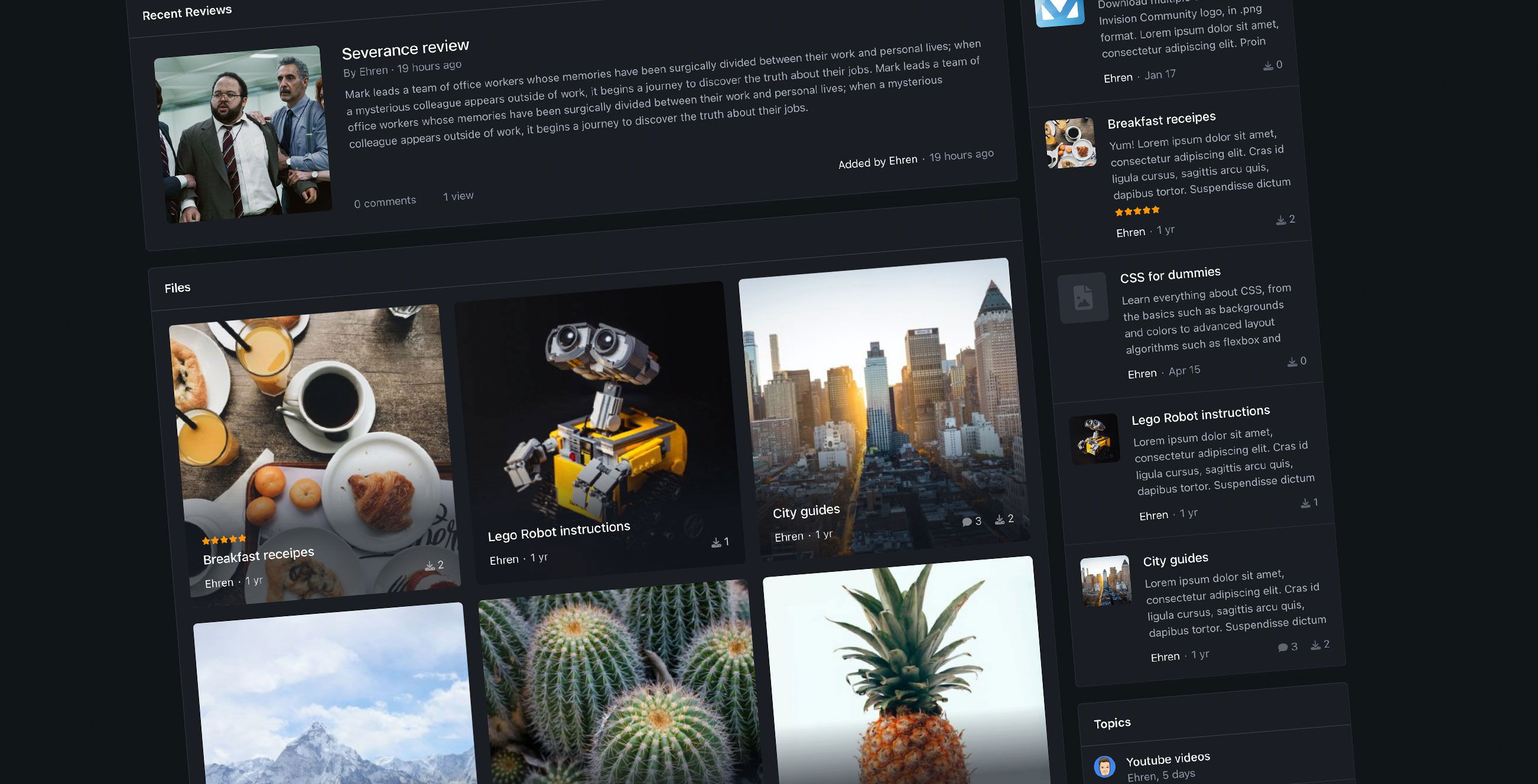 Introducing new Page Builder tools in Invision Community 5 Widgets are an incredibly powerful tool for displaying curated content of your choice on any page of your community - and despite the extensive array of settings for customizing their data, they've often been limited in terms of their design options. But this changes thanks to the new Page Builder tools in Invision Community 5! Widget Designs Previously in version 4, widgets would often have 2 designs: one for the main content area and a more minimal version for the sidebar. This worked well, but it meant your page was very limited in terms of design as you'd typically need to use the same table-like layout for most widgets. Anything beyond that would typically require a custom block to be coded, often with additional HTML or CSS. Version 5 offers much more customization by allowing you to change the design of each widget with the click of your mouse - no coding necessary! When dragging a widget onto your page, a new toolbar at the bottom of the page appears, holding all of the widget design options. Lets take a look at some below! Grid A familiar a very layout used elsewhere in the suite, the Grid design neatly aligns entries in a grid with a large cover photo sitting up top. A great combination of visual imagery alongside meta data such as entry descriptions. Featured A spacious list and a great way to feature content, pardon the pun. Wallpaper Perfect for content which includes uploaded cover photos or thumbnails! The Wallpaper design stretches each image to make it occupy the entire background, overlaid by a minimal amount of content. A subtle gradient sits behind the text to ensure it's easy to read, even on detailed images. Rows (table) The Rows design is a very familiar one, used very often throughout other areas of the suite. Content is displayed in a neat table, that collapses into a more compact design on small screens. Minimal Great for displaying a lot of content in a compact area! Minimal only shows primary information and hides meta data such as entry descriptions and stats. Great for sidebars, or areas with limited width. Minimal Grid The Minimal Grid design removes large meta information and displays content in a nice, compact grid. A nice option for displaying a lot of content while being cautious of vertical space. Carousel The Carousel option is quite unique because it can be applied in tandem with other widget designs, and is a perfect way to make the existing layouts even more compact. For example, by default, the Wallpaper design is aligned as a grid, but with the Carousel option enabled, the layout is converted into a carousel instead: Carousel-widget.mp4 Here's another example, using the Featured and Carousel options: Blog - featured carousel.mp4 Fun fact for developers: All of these designs use the exact same HTML structure; the only thing that differs is the class name on the parent element. This makes it incredibly easy to adjust the design of your own widgets without needing to manually code multiple layouts. Widget Areas Version 4 was often quite limiting when it came to aligning widgets in pages. Widgets could be dragged into a stacked, vertical list but that was typically as far as you could go in terms of design. Version 5 introduces a new concept called Widget Areas, which allow you to align multiple widgets in a variety of ways. Lets take a look! To create an area, you simply need to drag one widget on top of another. Blog - areas.mp4 By default, they'll align themselves into a grid, but can be realigned with ease by using the toolbar at the bottom of the page. The toolbar also holds controls for adjusting the width of widgets, and the gap between them: Blog - alignments.mp4 Widget Designs and Widget Areas in Version 5 make it incredibly easy to create a completely custom page in a matter of seconds. We're really excited for you to get your hands on these new tools in Invision Community 5, and are looking forward to seeing all of these new page designs in the wild, in the very near future!
 -
Introducing new Page Builder tools in Invision Community 5 Widgets are an incredibly powerful tool for displaying curated content of your choice on any page of your community - and despite the extensive array of settings for customizing their data, they've often been limited in terms of their design options. But this changes thanks to the new Page Builder tools in Invision Community 5! Widget Designs Previously in version 4, widgets would often have 2 designs: one for the main content area and a more minimal version for the sidebar. This worked well, but it meant your page was very limited in terms of design as you'd typically need to use the same table-like layout for most widgets. Anything beyond that would typically require a custom block to be coded, often with additional HTML or CSS. Version 5 offers much more customization by allowing you to change the design of each widget with the click of your mouse - no coding necessary! When dragging a widget onto your page, a new toolbar at the bottom of the page appears, holding all of the widget design options. Lets take a look at some below! Grid A familiar a very layout used elsewhere in the suite, the Grid design neatly aligns entries in a grid with a large cover photo sitting up top. A great combination of visual imagery alongside meta data such as entry descriptions. Featured A spacious list and a great way to feature content, pardon the pun. Wallpaper Perfect for content which includes uploaded cover photos or thumbnails! The Wallpaper design stretches each image to make it occupy the entire background, overlaid by a minimal amount of content. A subtle gradient sits behind the text to ensure it's easy to read, even on detailed images. Rows (table) The Rows design is a very familiar one, used very often throughout other areas of the suite. Content is displayed in a neat table, that collapses into a more compact design on small screens. Minimal Great for displaying a lot of content in a compact area! Minimal only shows primary information and hides meta data such as entry descriptions and stats. Great for sidebars, or areas with limited width. Minimal Grid The Minimal Grid design removes large meta information and displays content in a nice, compact grid. A nice option for displaying a lot of content while being cautious of vertical space. Carousel The Carousel option is quite unique because it can be applied in tandem with other widget designs, and is a perfect way to make the existing layouts even more compact. For example, by default, the Wallpaper design is aligned as a grid, but with the Carousel option enabled, the layout is converted into a carousel instead: Carousel-widget.mp4 Here's another example, using the Featured and Carousel options: Blog - featured carousel.mp4 Fun fact for developers: All of these designs use the exact same HTML structure; the only thing that differs is the class name on the parent element. This makes it incredibly easy to adjust the design of your own widgets without needing to manually code multiple layouts. Widget Areas Version 4 was often quite limiting when it came to aligning widgets in pages. Widgets could be dragged into a stacked, vertical list but that was typically as far as you could go in terms of design. Version 5 introduces a new concept called Widget Areas, which allow you to align multiple widgets in a variety of ways. Lets take a look! To create an area, you simply need to drag one widget on top of another. Blog - areas.mp4 By default, they'll align themselves into a grid, but can be realigned with ease by using the toolbar at the bottom of the page. The toolbar also holds controls for adjusting the width of widgets, and the gap between them: Blog - alignments.mp4 Widget Designs and Widget Areas in Version 5 make it incredibly easy to create a completely custom page in a matter of seconds. We're really excited for you to get your hands on these new tools in Invision Community 5, and are looking forward to seeing all of these new page designs in the wild, in the very near future! View full blog entry