

Ehren
Invision Community Team
-
Joined
-
Last visited
Everything posted by Ehren
-
You may want to isolate it to the member autocomplete using this code instead. I've also added code which improves the vertical alignment. #elInput_author_results .ipsAutocompleteMenu_item .i-color_soft{ display: none; } #elInput_author_results .ipsAutocompleteMenu_item .ipsPhotoPanel{ align-items: center; }
-
Yep, that's correct. You can also comma separate the selectors if they share the same properties: #ipsTabs_search_searchMembers, #ipsTabs_search .ipsTabs__scrollers { display: none; }
-
This Custom CSS will do the trick. You can either add it to your theme, or to a CSS file in Pages which is assigned to your database: /* Remove cover photo from database record */ .ipsPageHeader--database-record .ipsCoverPhoto{ display: none; }
-
Hi @Chris027 This CSS should do the trick: /* Remove views from Profile > Activity */ .cProfileContent .ipsData__stats > li:nth-child(2){ display: none; }
-
Yeah, there simply isn't enough room for your breadcrumbs, navigation and search bar all in that single row. Relocating is the best solution 🤝
-
Those classes should only be used for the logo. Use this instead: <a href="LINK_HERE"> <!-- Light mode image (hidden in dark mode) --> <img class="i-display_light" src="PATH_TO_YOUR_LIGHT_IMAGE" alt="light-image" loading="lazy"> <!-- Dark mode image (hidden in light mode) --> <img class="i-display_dark" src="PATH_TO_YOUR_DARK_IMAGE" alt="dark-image" loading="lazy"> </a>
-
Great! I've applied these changes to the next update, so you won't need the Custom CSS code in the future.
-
Actually, add this too. This will ensure small images (like your Lorem Ipsum one in the last row) stretch to the full width: .ipsCmsEntries__thumb .ipsThumb{ width: 100%; }
-
Thanks, that's helpful! If you add this to your Custom CSS area, does it help? .ipsCmsEntries__primary{ grid-column: 1 / -1; }
-
You're welcome to send me a PM with the URL if you like. I should be able to help from there 🤝
-
That’s correct, there are multiple ratios and sizes. You could enforce a strict 16:9 ratio on every instance using CSS, however the image would be quite small on mobiles. Uploading a large image and then selecting the focal point (by repositioning the image) is the recommended approach as it should cover most use cases 🙂
-
Hi there, The Event cover photos will be displayed at different sizes (and ratios) depending on the size of the device which is being used. There isn't a "one size fits all" approach unfortunately. The "Reposition Cover Photo" setting will only work if the image is taller than the cover photo space. It allows me to choose a "focus point" within the image, which is preserved for all instances of the image, including the small/thumbnail version. Do you notice any errors in the browser console when trying to reposition it?
-
Hello, This is an intentional design change in 5.0.15. Navigation dropdown menus are now centered below their toggle button, matching all other dropdown menus (which have been centered for a while) If you'd like to change this, adding this to your Custom CSS area will left-align it in browsers which support anchor-positioning (except for Safari which uses its own alignment code): @supports ((position-area: bottom) and (not (-webkit-hyphens:auto))){ .ipsNavBar > li > .ipsNav__dropdown{ position-area: bottom span-right; margin-inline: 0; } }Other browsers will continue to use the centered alignment.
-
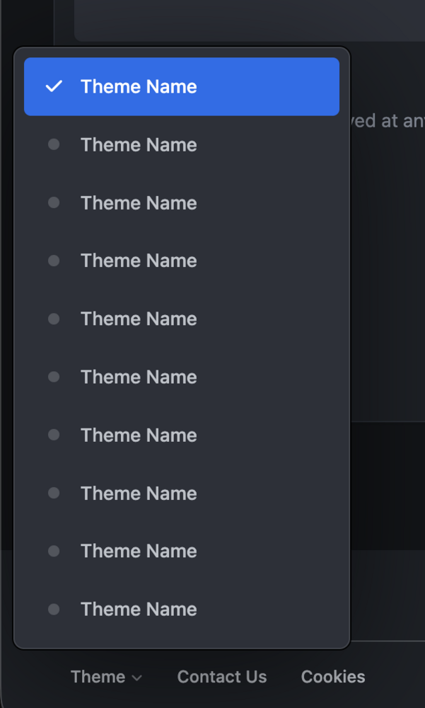
Don't forget to reset the opacity too: .ipsFallbackImage::before{ background-image: url('https://site.com/image.jpg'); mix-blend-mode: normal; opacity: 1; }Sure. This will replace the default_photo.png image with your own. Add to your Custom CSS area: /* Replace default_photo.png avatar */ .ipsUserPhoto:has([src$="default_photo.png"]){ background-image: url("https://site.com/avatar.png"); background-size: cover; } .ipsUserPhoto:has([src$="default_photo.png"]) img{ display: none; }We hope to expand the Page Editor functionalities sometime in the future so I’ll keep this suggestion in mind for that as I can see the benefits of this 🙂 For the moment, you’d need to create the tabs using a Manual HTML page since it can’t be done with the existing widgets.I don't believe resolution would have any impact, no. I've been testing this further and still can't reproduce it but I'll send you a PM to discuss it further so we don't clutter this topic too much 🤝 Edit: Solved via PM 👍What browser are you using? I tested these menus quite often during development in Chrome, Safari, Edge and Firefox - and they all continue to work correctly for me (they pop-up above the button and stay within the viewport). I wasn't able to see the Theme selector on Cedric's site, but I've attached a screenshot of mine, with the theme names changed for privacy reasons. Strange.. There's no code within the dropdown component which would only cause them to fail on new posts - so I imagine there's a different issue at play here. Feel free to send through URL examples via PM and I can take a closer look.
 Swiping works in both Safari and web apps in all versions of iOS from 2013 onwards, so your visitors will most definitely be able to do it 🙂Most things like that can be achieved with CSS. There are lots of helpful classes within the code which you can target like so: /* Add a border to table/grid categories */ .ipsData--forum-category:is(.ipsData--grid, .ipsData--table){ border-top: 10px solid red; }Thanks @Dreadknux , I'll take a look at that shortly! 🙂Thanks, I've fixed this locally and will have it patched for the next update 🤝The dropdowns use this: font-family: var(--i-font-family);You can either update the variable like so: --i-font-family: "Custom font name", var(--set__i-font-family, system-ui), system-ui, Helvetica, Arial, sans-serif, "Apple Color Emoji", "Segoe UI Emoji", "Segoe UI Symbol";Or you can change the dropdown font-family to: i-dropdown{ font-family: inherit; }I originally added the font-family property to i-dropdown to ensure it used the global font (just in case the menu was located in an element which had a different font), but I don't believe there are any instances of that, so the second solution should be fine 🙂It’s a known iOS 26 bug. Fixed/sticky elements become misaligned once the keyboard has been opened and dismissed. Unfortunately this is a bug within the operating system and isn’t something web developers can fix, so it’s up to Apple to solve that one. Fingers crossed it’s fixed for the next update!