

Ehren
Invision Community Team
-
Joined
-
Last visited
Everything posted by Ehren
-
Thanks for the tip @David N.. All sorted! 🙂
-
Lots of credit goes to @Matt Finger for this weeks update. He did a great job 👏
-
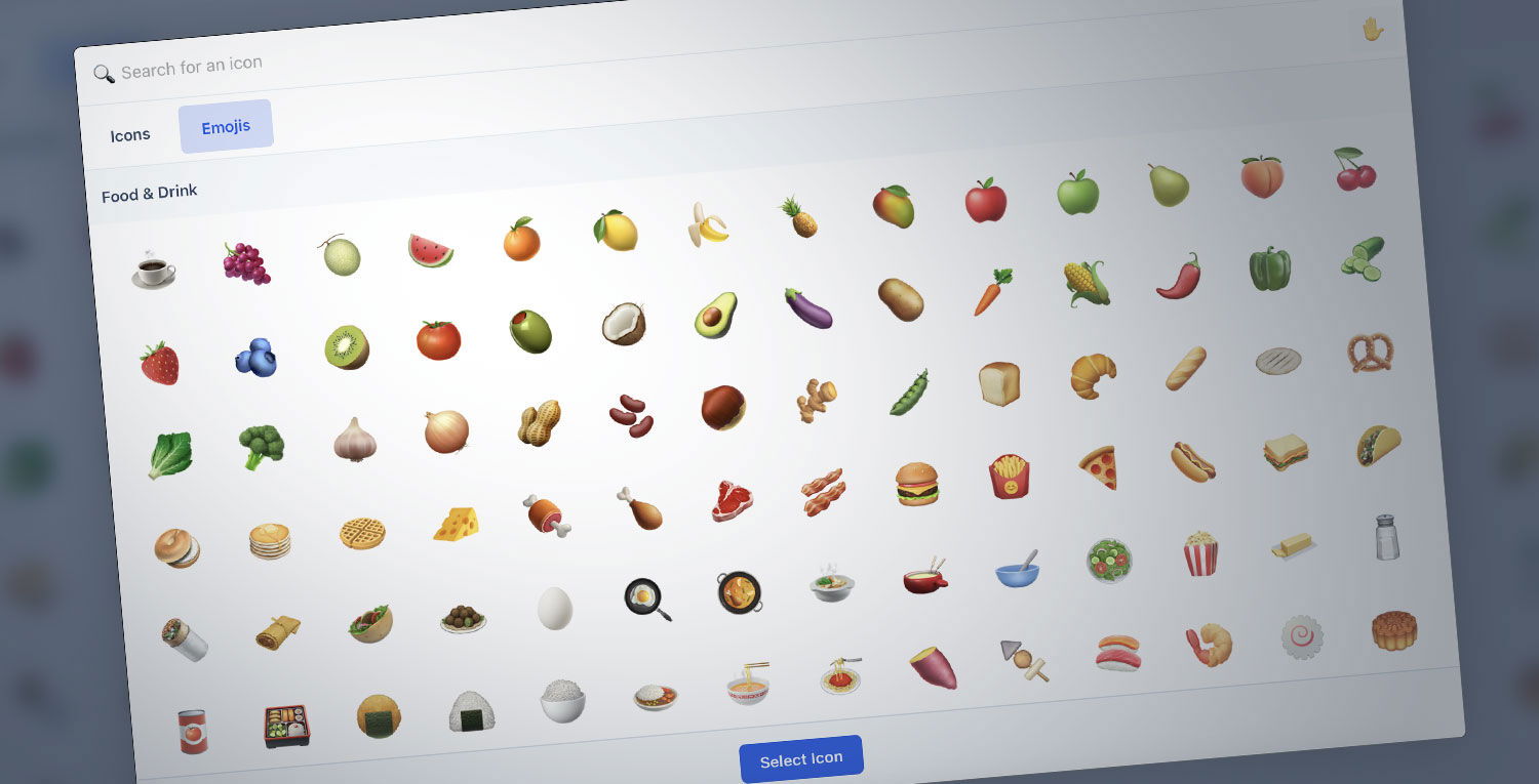 Invision Community offers fantastic ways of customizing the user experience for your members, and today, we’re excited to introduce some new and really simple ways of customizing Invision Community 5 even further using our new icon tools. Icon Picker Lets begin with our brand new icon picker. Containing both Font Awesome icons and emojis, the new picker allows you to easily search and assign icons to specific areas throughout your site. Lets take a look at some examples! icon-picker.mp4 Navigation icons Adding icons to the navigation list has been a highly requested feature, so we're happy to announce that you can now use this new picker to do exactly that, for both the horizontal and vertical navigation panels, without needing to modify your theme. Forum icons Uploading forum icons is a great way to personalize individual areas of your community. In the past, these icons have typically been images, uploaded via the admin panel. In addition to the upload form, the icon picker now makes it a breeze to assign icons to forums - and if a Font Awesome icon is chosen, it'll even inherit the featured forum color. Forum Feature Color We have brought the existing forum feature color to feed view allowing for a flash of color and personalization that helps associate a color with a specific forum. The feature color pairs really well with the card image to lift the forum display. Icon creator for badges, ranks and reactions Creating unique badges, ranks and reactions is a great way to boost activity within your community by encouraging members to share more engaging and frequent content - but designing these icons from scratch using a graphics program often comes with hurdles of its own. With our new icon creator, you can now design your own custom icons for badges, ranks and reactions straight from your Admin panel, using a combination of colors, icons and shapes. icon-creator.mp4 We think this new icon creator will make the rank, badges and reactions features even more accessible for everyone, allowing you to create a user experience that is uniquely yours. With Invision Community 5, bringing in customization and personalization moves beyond adding new themes. We're excited to see how you can take advantage of these new tools, and we look forward hearing your feedback in the comments below!
 -
Invision Community offers fantastic ways of customizing the user experience for your members, and today, we’re excited to introduce some new and really simple ways of customizing Invision Community 5 even further using our new icon tools. Icon Picker Lets begin with our brand new icon picker. Containing both Font Awesome icons and emojis, the new picker allows you to easily search and assign icons to specific areas throughout your site. Lets take a look at some examples! icon-picker.mp4 Navigation icons Adding icons to the navigation list has been a highly requested feature, so we're happy to announce that you can now use this new picker to do exactly that, for both the horizontal and vertical navigation panels, without needing to modify your theme. Forum icons Uploading forum icons is a great way to personalize individual areas of your community. In the past, these icons have typically been images, uploaded via the admin panel. In addition to the upload form, the icon picker now makes it a breeze to assign icons to forums - and if a Font Awesome icon is chosen, it'll even inherit the featured forum color. Forum Feature Color We have brought the existing forum feature color to feed view allowing for a flash of color and personalization that helps associate a color with a specific forum. The feature color pairs really well with the card image to lift the forum display. Icon creator for badges, ranks and reactions Creating unique badges, ranks and reactions is a great way to boost activity within your community by encouraging members to share more engaging and frequent content - but designing these icons from scratch using a graphics program often comes with hurdles of its own. With our new icon creator, you can now design your own custom icons for badges, ranks and reactions straight from your Admin panel, using a combination of colors, icons and shapes. icon-creator.mp4 We think this new icon creator will make the rank, badges and reactions features even more accessible for everyone, allowing you to create a user experience that is uniquely yours. With Invision Community 5, bringing in customization and personalization moves beyond adding new themes. We're excited to see how you can take advantage of these new tools, and we look forward hearing your feedback in the comments below! View full blog entry
-
You’ll be able to add any of your custom profile fields, so if a bio is already a part of those then you’re good to go 🙂 We don’t have plans to show the signature here though.
-
You sure can: body{ background: linear-gradient(to bottom, var(--i-base_3), var(--i-base-contrast_3)); } Designers Mode has been revamped for version 5. Matt gives a brief overview here, but with the addition of "template hooks" in favour of the template editor, you won't have that issue anymore 🙂
-
Thanks for the feedback everyone! Thanks mate! Third party designers will be able to release themes which take advantage of all of these features, which almost makes "premade themes" much closer to "custom themes". If you find a theme for sale, but the header positions aren't quite right for example, you'll be able to customize it without asking the designer for custom changes. Win win for both the designer and the customer! The web developer tools built into your browser are likely the best solution here. I'll write up documentation for all of the new components (grid, buttons, etc), but as for the custom CSS editor, there are no plans at this stage to expand it beyond a regular code editor. Yeah, the swatches will come in really handy. It's a much easier system instead of manually trying to allocate light/dark shades manually. The header background in the intro was added via Custom CSS. I've been thinking of the best way to add an image feature for the header, but making a simple UI for something like that is ironically a very complex task since you also need to cater for the multiple header/nav bars as you mentioned. It's very simple to add using CSS, so at least there's a simple fallback if nothing else comes to mind before the release date 🙂 There are no plans for gradients, but since you seem pretty confident with CSS, you'll have no problems adding them using the code editor 🙂 Thanks David! There certainly is. Snippets are truncated to a maximum of 680 characters for memory - but you can trim that down using CSS line-clamp. One line of CSS can do that for you. 👍
-
Welcome to the third video of our sneak peak series! Today, we're really excited to introduce you to the new Theme Editor! Built entirely from scratch, the new editor provides an instant, live preview of your theme, as soon as you modify a setting. It's a zero-code approach to creating themes, and has been designed to ensure your theme adheres to your color scheme and looks great on every device, with very little effort. Let's take a closer look! Paragraph 1.mp4 To the left of the editor, you’ll see a live preview of your community. You can navigate to any page, as if you were browsing your site normally. At the top left of the editor, you’ll find icons which change the theme between the light and dark color schemes. Below that are buttons which change the viewport size, from desktop, to tablet, to mobile. This is a really convenient way to ensure your theme looks great on every device, without needing to manually resize your browser window. Lets take a closer look at the Color Palette. Editing colors in version 4 was a fairly time consuming process. For example, modifying the color scheme from the default blue to another color meant that 26 theme settings needed to be changed. In contrast, the Version 5 theme is powered by just 3 colors: Primary colors are responsible for styling the main elements on your page, such as the Start new topic button. Secondary colors control minor elements, such as pagination links, while the Base color is responsible for controlling the overall tint on your site. Clicking on these colors opens a color picker. Let’s change this blue color to yellow. Video 2.mp4 You’ll notice two things have happened here. First, the preview window updated as soon as we modified the color. All elements which were previously blue, now use yellow, such as the Start new topic button. Secondly, the text color in our button has changed from white to black. This is our automatic contrast feature and it ensures our text is easy to read on our new yellow background, since white text may be more difficult to read for some viewers. Below the color picker is a text box, with our color displayed in HSL. You can paste your own colors in this box, in any color format and that color will be applied to your elements. Video 3.mp4 The Base color controls the tint of your backgrounds and text colors. Let's try a few examples to demonstrate how easy it is to recolor your theme. Video 4.mp4 Next up are Logos! Invision Community 5 has three logo types: a text logo, an image logo for desktops and an image logo for mobiles. Let’s edit our text logo. Video 5.mp4 After changing the text to “Theme Editor Demo”, we can see that the logo in our preview window updates instantly with our new text. Below that, we have multiple options to help us style the text logo, such as font-family These fonts are a combination of system fonts and web fonts. The web fonts are hosted locally on your site for optimal performance. Additionally, we can also change the font-weight and font-size. We might want a different font-size for mobile logos, so that can be edited too. We can see a live preview by changing our viewport to the mobile option. If you’d prefer to use an image logo, you can assign it using the Image Logo options. Image logos are made up of 2 upload fields, one for the light theme and one for the dark theme. Below these upload fields, a slider lets you resize your logo so it fits neatly. Video 6.mp4 Layout options let you assign the default layouts in your community. In our first sneak peak video, we showcased the new side panel layout, feed view for forum categories, and compact view for topics. These can all be enabled via the theme editor using a simple select menu. Video 7.mp4 Lets explore some Color options! In the Header panel, we can see a list of elements we can customize. Clicking on an element opens the Swatch List, which is a list of 22 colors that are powered by the Base, Primary and Secondary colors from earlier. We have 6 "light" base colors, 6 "dark" base colors as well as various shades of our primary and secondary colors. Clicking on any of these swatches will apply that color to your element. But what if none of these colors suit your requirement? That’s where the Color Picker comes in handy. Here, we can easily choose any color, or even paste in our own color like before. Video 8.mp4 A major hurdle with themes in version 4 was customising the header. Depending on the complexity, this would typically involve modifications to both the CSS and HTML. That is a thing of the past with version 5! If we flick over to our Settings tab, you’ll see a brand new interface for customising the header. A new drag and drop feature allows you to easily reposition header elements without touching a single line of code. Video 9.mp4 It’s an incredibly fun tool to play with, and we’re really excited to hear what you think! Below the drag and drop area, we can customise the header further by using sliders to adjust its height, or we can enable navigation icons with a single click. Body settings let you can customise global elements such as the body background color, text colors, the max-width of your site, the font-family, font-size and more. Editing Content boxes has always required code modifications in the past. Using this new editor, we can adjust not only the colors of the boxes, but also the borders and shadows. Theme editing has honestly never been this easy! Video 10.mp4 And there you have it! Our brand new theme editor. With a few simple clicks and drags, we've been able to create a customised theme that looks great on desktops and mobiles, with a new color scheme, new logos, a customised header, new page layouts and restyled content boxes - all without touching a single line of code. Speaking of code, for those of you who want to apply more advanced customisations, we’ve added a really convenient way to access your custom CSS file, via a new dialog box. Video 11.mp4 And last but not least - the new theme editor is fully responsive, so even if you’re away from the desk, so you’ll be able to change colours and settings, upload new logos, redesign your header and even add your own code! Video 12.mp4 Developing this new editor has been a lot of fun, and it’s even more fun to use. Themes have never been easier to edit and we're really excited for you all to get your hands on it so you can have a play for yourself - but for now, let us know what you think the comments, and we’ll see you next time! View full blog entry
-
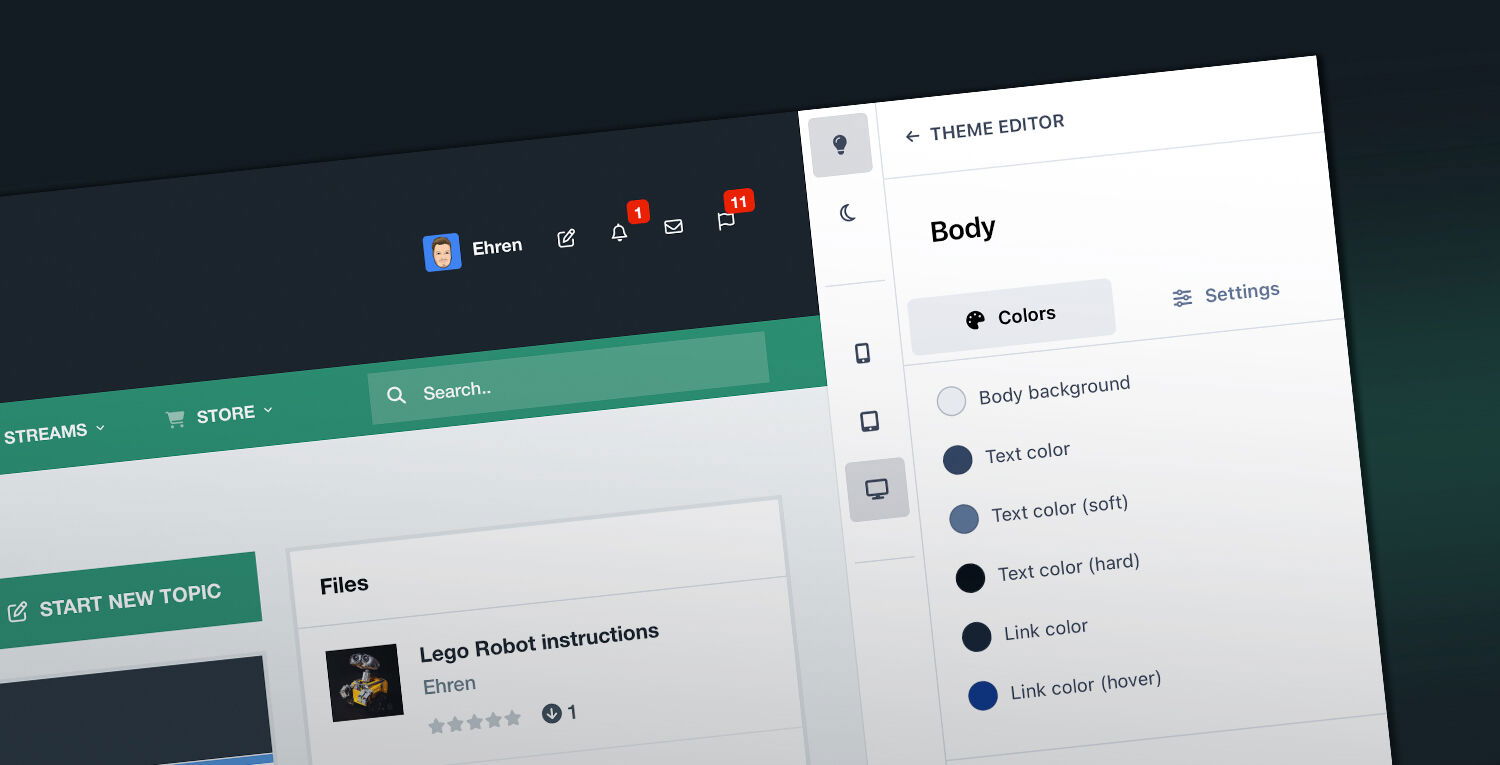 Welcome to the third video of our sneak peak series! Today, we're really excited to introduce you to the new Theme Editor! Built entirely from scratch, the new editor provides an instant, live preview of your theme, as soon as you modify a setting. It's a zero-code approach to creating themes, and has been designed to ensure your theme adheres to your color scheme and looks great on every device, with very little effort. Let's take a closer look! Paragraph 1.mp4 To the left of the editor, you’ll see a live preview of your community. You can navigate to any page, as if you were browsing your site normally. At the top left of the editor, you’ll find icons which change the theme between the light and dark color schemes. Below that are buttons which change the viewport size, from desktop, to tablet, to mobile. This is a really convenient way to ensure your theme looks great on every device, without needing to manually resize your browser window. Lets take a closer look at the Color Palette. Editing colors in version 4 was a fairly time consuming process. For example, modifying the color scheme from the default blue to another color meant that 26 theme settings needed to be changed. In contrast, the Version 5 theme is powered by just 3 colors: Primary colors are responsible for styling the main elements on your page, such as the Start new topic button. Secondary colors control minor elements, such as pagination links, while the Base color is responsible for controlling the overall tint on your site. Clicking on these colors opens a color picker. Let’s change this blue color to yellow. Video 2.mp4 You’ll notice two things have happened here. First, the preview window updated as soon as we modified the color. All elements which were previously blue, now use yellow, such as the Start new topic button. Secondly, the text color in our button has changed from white to black. This is our automatic contrast feature and it ensures our text is easy to read on our new yellow background, since white text may be more difficult to read for some viewers. Below the color picker is a text box, with our color displayed in HSL. You can paste your own colors in this box, in any color format and that color will be applied to your elements. Video 3.mp4 The Base color controls the tint of your backgrounds and text colors. Let's try a few examples to demonstrate how easy it is to recolor your theme. Video 4.mp4 Next up are Logos! Invision Community 5 has three logo types: a text logo, an image logo for desktops and an image logo for mobiles. Let’s edit our text logo. Video 5.mp4 After changing the text to “Theme Editor Demo”, we can see that the logo in our preview window updates instantly with our new text. Below that, we have multiple options to help us style the text logo, such as font-family These fonts are a combination of system fonts and web fonts. The web fonts are hosted locally on your site for optimal performance. Additionally, we can also change the font-weight and font-size. We might want a different font-size for mobile logos, so that can be edited too. We can see a live preview by changing our viewport to the mobile option. If you’d prefer to use an image logo, you can assign it using the Image Logo options. Image logos are made up of 2 upload fields, one for the light theme and one for the dark theme. Below these upload fields, a slider lets you resize your logo so it fits neatly. Video 6.mp4 Layout options let you assign the default layouts in your community. In our first sneak peak video, we showcased the new side panel layout, feed view for forum categories, and compact view for topics. These can all be enabled via the theme editor using a simple select menu. Video 7.mp4 Lets explore some Color options! In the Header panel, we can see a list of elements we can customize. Clicking on an element opens the Swatch List, which is a list of 22 colors that are powered by the Base, Primary and Secondary colors from earlier. We have 6 "light" base colors, 6 "dark" base colors as well as various shades of our primary and secondary colors. Clicking on any of these swatches will apply that color to your element. But what if none of these colors suit your requirement? That’s where the Color Picker comes in handy. Here, we can easily choose any color, or even paste in our own color like before. Video 8.mp4 A major hurdle with themes in version 4 was customising the header. Depending on the complexity, this would typically involve modifications to both the CSS and HTML. That is a thing of the past with version 5! If we flick over to our Settings tab, you’ll see a brand new interface for customising the header. A new drag and drop feature allows you to easily reposition header elements without touching a single line of code. Video 9.mp4 It’s an incredibly fun tool to play with, and we’re really excited to hear what you think! Below the drag and drop area, we can customise the header further by using sliders to adjust its height, or we can enable navigation icons with a single click. Body settings let you can customise global elements such as the body background color, text colors, the max-width of your site, the font-family, font-size and more. Editing Content boxes has always required code modifications in the past. Using this new editor, we can adjust not only the colors of the boxes, but also the borders and shadows. Theme editing has honestly never been this easy! Video 10.mp4 And there you have it! Our brand new theme editor. With a few simple clicks and drags, we've been able to create a customised theme that looks great on desktops and mobiles, with a new color scheme, new logos, a customised header, new page layouts and restyled content boxes - all without touching a single line of code. Speaking of code, for those of you who want to apply more advanced customisations, we’ve added a really convenient way to access your custom CSS file, via a new dialog box. Video 11.mp4 And last but not least - the new theme editor is fully responsive, so even if you’re away from the desk, so you’ll be able to change colours and settings, upload new logos, redesign your header and even add your own code! Video 12.mp4 Developing this new editor has been a lot of fun, and it’s even more fun to use. Themes have never been easier to edit and we're really excited for you all to get your hands on it so you can have a play for yourself - but for now, let us know what you think the comments, and we’ll see you next time!
 -
When you add links using the Menu Manager, you can choose what menu(s) the link is shown in. Either the side panel, the horizontal bar, or the mobile panel. You basically answered this yourself haha 🙂 Simplicity. The "2 row" navigation bar was always a burden to restyle in version 4, and took up a fair amount of vertical space. Simplifying the navigation into a single row allows us to display the navigation bar in multiple ways, which you'll see more of next week. As always, the cover photos are optional. 👍
-
Thanks @Makoto - I'm glad you like it! Version 5 has received a huge code refresh and we wanted to provide a bunch of optional customization/design choices, so we're keen to see how sites start taking advantage of the new sidebar and UI layouts. 🙂 Looking forward to sharing more soon!
-
Thanks @Clover13! Relocating your ad would likely be the best solution here. You could technically use CSS to reposition the mobile menu, but a top menu doesn't really meet the goals of an "app-like" interface which we've been aiming for. It's not a setting which will come baked in with version 5, but it's certainly achievable with a couple of lines of CSS 🙂 I appreciate that, thanks Cedric! The amount of time that goes into a quick 4 minute video is more than I'd like to admit haha! 😅
-
Hey Joel, 1. The advanced search page is still available. The search modal is just an "enhanced version" of the drop-down filter menu which we currently use in version 4. 2. We'll have a lot more information on this in a future update 🤫 But to answer your question, they're FA 6 icons. 3. Correct, this is static. You could use your own javascript code to target the element and change the text every x seconds, but it's not a feature which is coming with version 5. 4. "Focus rings" for focused elements are very important for keyboard users. It's definitely not for power users or developers, but rather users who find it difficult to browse your site with a mouse. Imagine a condition which affects motor control such as Parkinson's disease, or someone who has a broken arm - both of those users would likely find it more convenient to browse using the TAB key instead of using a mouse. Focus rings only appear when pressing the TAB key on your keyboard (they won't appear when clicking with a mouse), so they've been added purely to improve accessibility for those who need them. Accessibility took a back seat in version 4, however we've placed a higher priority on it with version 5 and will be improving it further in future updates. This is a desktop only feature, but will also work on iPads if a bluetooth keyboard is connected. 5. Currently hard-coded, but customization is currently on my "would be nice to have list". Certainly something to consider.
-
Not at all, image logos are most definitely a thing. Next weeks video will showcase that in detail 🙂
-
Welcome to the second video of our sneak peak series! Today we'll be taking a closer look at the new Invision Community interface, including dark mode, accessibility improvements, performance improvements and the mobile layout! Before we begin, I should mention that this is a pre-alpha version of Invision Community 5, so some areas of the design may change before the official release. New traditional header design In our previous video, we showcased our new, optional side panel which formats your navigation into a vertical list. For those who prefer a traditional, horizontal header, here it is! A much more compact header compared to version 4, the new design condenses the navigation bar into a single row, moving all sub-navigation items into dropdown menus. A new, optional area below the text logo allows you to add your website slogan or announce events such as anniversaries or holidays, and our new search modal provides convenient access to the advanced search filters from any page on your community. Accessible interface The main content area has been designed with accessibility as a priority. High contrast text colours and larger font-sizes help to make reading more comfortable and clickable table rows (which can be enabled or disabled via the Theme Editor) allow you to navigate between pages more easily. A visible focus ring significantly improves navigation for visitors who find it more comfortable to browse with their keyboard TAB key, instead of using their mouse (ie. visitors with conditions such as Parkinson's disease, or those who have temporarily lost function due to a broken arm). Focus.mp4 Elements are highlighted while navigating with the keyboard Dark mode Dark mode has become increasingly popular over the past few years - so it's no surprise that Version 5 has been designed from scratch with both light and dark mode in mind. With version 4, it was necessary to manage two themes in order to provide a light and dark colour scheme. In version 5 though, all of that is handled by a single theme. By default, your members will be able to choose their own color scheme preference: either light, dark, or system. System assigns a color scheme based on your system preferences - so if your device automatically switches to dark mode at night, your community will too! With that said, as an administrator, you also have the option to restrict your site to a single color scheme - so if you ONLY want to offer a dark theme, that's easily achieved. Performance Despite all of these new inclusions, the version 5 UI has been coded with significant reductions in both CSS and Javascript. We'll dive deeper into code reductions in a future blog entry, however two great examples are: - Grids: which have had a 100% removal of Javascript and are powered by only a few lines of CSS, resulting in a faster rendering time, especially for users on slow connections. - And carousels: which have had a 95% reduction in Javascript and now rely on native browser scrolling, for a much smoother experience on both desktop and mobile! Additionally we've removed a number of helper libraries that are no longer needed with modern browsers saving even more. Mobile UI With an incredible amount of mobile visitors accessing the web, we’ve placed a huge priority on redesigning the interface to ensure it lives up to todays standards. A new navigation bar at the bottom of the page provides convenient access to your activity feed, notifications, messages, a search panel, and navigation links. A conscious effort was made to ensure that this information was available within a single tap, and we found that a bottom bar like this was easier to interact with compared to icons in the header. The mobile navigation bar from Invision Community 5 A goal of the mobile UI was to display elements that were previously only available on larger devices, while still maintaining a clean interface. For example, to improve navigation, we've added a scrollable breadcrumb list to the top and bottom of the page. To improve guest participation, we added Sign In and Sign Up links to the bottom navigation bar. These links were previously hidden within the hamburger menu, so we feel like this will really benefit those looking to improve registrations. And as demonstrated in last weeks video, profile information is now available within posts, comments and reviews on small devices. We’re really excited for you to literally have a hands on experience with the new mobile interface of Invision Community 5, and we're interested to hear your feedback in the comments! View full blog entry
-
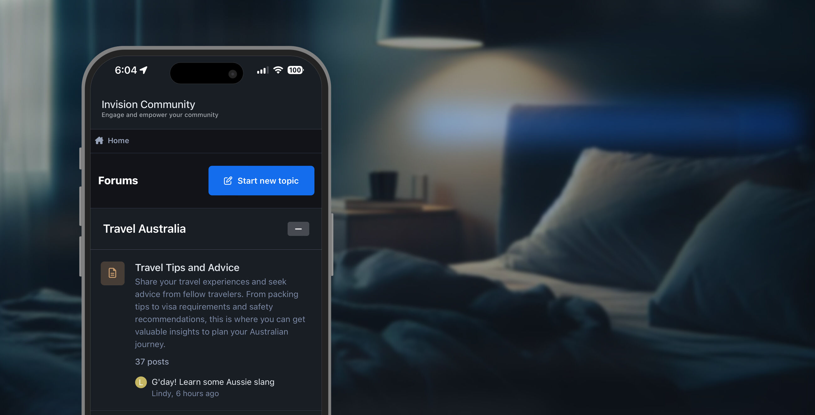 Welcome to the second video of our sneak peak series! Today we'll be taking a closer look at the new Invision Community interface, including dark mode, accessibility improvements, performance improvements and the mobile layout! Before we begin, I should mention that this is a pre-alpha version of Invision Community 5, so some areas of the design may change before the official release. New traditional header design In our previous video, we showcased our new, optional side panel which formats your navigation into a vertical list. For those who prefer a traditional, horizontal header, here it is! A much more compact header compared to version 4, the new design condenses the navigation bar into a single row, moving all sub-navigation items into dropdown menus. A new, optional area below the text logo allows you to add your website slogan or announce events such as anniversaries or holidays, and our new search modal provides convenient access to the advanced search filters from any page on your community. Accessible interface The main content area has been designed with accessibility as a priority. High contrast text colours and larger font-sizes help to make reading more comfortable and clickable table rows (which can be enabled or disabled via the Theme Editor) allow you to navigate between pages more easily. A visible focus ring significantly improves navigation for visitors who find it more comfortable to browse with their keyboard TAB key, instead of using their mouse (ie. visitors with conditions such as Parkinson's disease, or those who have temporarily lost function due to a broken arm). Focus.mp4 Elements are highlighted while navigating with the keyboard Dark mode Dark mode has become increasingly popular over the past few years - so it's no surprise that Version 5 has been designed from scratch with both light and dark mode in mind. With version 4, it was necessary to manage two themes in order to provide a light and dark colour scheme. In version 5 though, all of that is handled by a single theme. By default, your members will be able to choose their own color scheme preference: either light, dark, or system. System assigns a color scheme based on your system preferences - so if your device automatically switches to dark mode at night, your community will too! With that said, as an administrator, you also have the option to restrict your site to a single color scheme - so if you ONLY want to offer a dark theme, that's easily achieved. Performance Despite all of these new inclusions, the version 5 UI has been coded with significant reductions in both CSS and Javascript. We'll dive deeper into code reductions in a future blog entry, however two great examples are: - Grids: which have had a 100% removal of Javascript and are powered by only a few lines of CSS, resulting in a faster rendering time, especially for users on slow connections. - And carousels: which have had a 95% reduction in Javascript and now rely on native browser scrolling, for a much smoother experience on both desktop and mobile! Additionally we've removed a number of helper libraries that are no longer needed with modern browsers saving even more. Mobile UI With an incredible amount of mobile visitors accessing the web, we’ve placed a huge priority on redesigning the interface to ensure it lives up to todays standards. A new navigation bar at the bottom of the page provides convenient access to your activity feed, notifications, messages, a search panel, and navigation links. A conscious effort was made to ensure that this information was available within a single tap, and we found that a bottom bar like this was easier to interact with compared to icons in the header. The mobile navigation bar from Invision Community 5 A goal of the mobile UI was to display elements that were previously only available on larger devices, while still maintaining a clean interface. For example, to improve navigation, we've added a scrollable breadcrumb list to the top and bottom of the page. To improve guest participation, we added Sign In and Sign Up links to the bottom navigation bar. These links were previously hidden within the hamburger menu, so we feel like this will really benefit those looking to improve registrations. And as demonstrated in last weeks video, profile information is now available within posts, comments and reviews on small devices. We’re really excited for you to literally have a hands on experience with the new mobile interface of Invision Community 5, and we're interested to hear your feedback in the comments!
 -
To clear any confusion, the "Popular travel forums" header is just a manually created header using the Menu Manager - it's the same as the "Browse" header for example. With version 5 though, instead of manually inserting URL's to certain forums, categories, albums, etc, you select them from a list and they'll display based on user permissions. They'll also highlight when active, like so:

-
The side navigation panel is completely separate from the widget sidebar, so it's reserved for navigation items only. When enabled via theme settings, the navigation panel replaces the horizontal header/navigation menu - so you can only use a single one at a time. The navigation links are managed via the Menu Manager, as you'd expect. The sidebar has independent scrolling which means you won't have a long empty space in either the sidebar or the content area: sidebar-scroll.mp4 Just like the other views (table and grid), the avatar is of the person who posted the most recent reply. User participation isn't displayed in our existing views (apart from fluid of course), but is something we can keep in mind for a future iteration. To prevent the index page from becoming overwhelmed with icons and badges, there are no badges for answered, staff, etc. Quotes, codes and gifs are removed, so only plain text is shown in the snippet. Thanks! The hovercard has received a UI polish in version 5, but still behaves as normal in the compact topic UI. Here's an example with more data for you. The stats behave like bricks in a wall - they'll occupy the full width of the mini profile, as neatly as possible. Desktop: Mobile: Thanks Joel!


-
In addition to Matt’s post, each of your members (where a new group permission allows) can also choose their own preference out of the views. So if you’d prefer to use the traditional table view for the forum index and the traditional column view for topics (even if the admin has assigned other layouts), that’s of course possible. We’re absolutely not forcing change, just offering more options than before 🙂
-
Welcome to Invision Community 5! Over the coming weeks, we'll be exploring a bunch of new features and improvements coming to our user interface including our brand new theme editor, a new mobile UI, dark mode and performance improvements thanks to a reduction in both JavaScript and CSS. To kick off this series, let’s take a closer look at the new sidebar layout and new view modes for the forum index and topic pages. Sidebar Layout Traditionally, Invision Community has shipped with a horizontal header and navigation bar at the top of the page, which is still available in version 5. We're introducing a brand new (and optional) sidebar layout, which can be enabled or disabled easily from within your theme settings. The sidebar not only provides convenient access to your applications, activity streams and search bar, but you can now add links to nodes for even easier access to popular or commonly used areas of your community. For example - a category from your forum, an album from the Gallery, or a product group from Commerce. Sidebar-zoom.mp4 Forum Index: Feed view One of our goals for version 5 was to re-imagine new ways for your visitors to consume content, and the sidebar layout is just one of our solutions. Table view has been the typical way of displaying forums, providing visitors with a simple summary of the most recently active topic. Grid mode introduced cover photos to forums and is a great way to make your page more visually engaging, while fluid view allows visitors to filter through a list of topics to easily focus on multiple areas of the community. Joining these view modes in version 5 is our new Feed view. Optional cover photos and featured forum colours allow you to personalise each forum, and a list of recently active topics with snippets of the most recent reply allow you to easily see what each forum is focusing on at a glance. The topic list drops below the cover photo and converts to a scrollable list on small devices. It's our fresh take on content display, and we can’t wait to hear your feedback! Topic pages: Compact view In addition, Invision Community 5 also introduces a new, compact layout option for topics. We wanted to create a layout which placed focus on your content while still keeping all of the authors profile information easily accessible within a mini profile. Stats, rank, badges, reputation points and more can be found by tapping the icon at the top of every post. The mini profile strip has also been added to other areas of the software too, such as comments and reviews in applications like Gallery and Blogs, and will appear on the mobile layout when the traditional "table view" is used in topics. Switching between the new compact view and the author sidebar view takes just seconds giving you complete control over your community. Mini profile.mp4 As part of this view, you also have the choice to feature/pin the original post to the top of every page, making it a breeze for your visitors to easily understand the context of replies without navigating back to page 1. Pinned posts have a slightly larger font-size to distinguish them from replies, and we've thoughtfully truncated them on pages beyond the first to keep scrolling to a minimum. The new sidebar layout and view modes offer a fresh and innovative approach to navigating and interacting with your community. We’re really keen to hear your thoughts on these new views and whether you’ll be unleashing them on your own sites! We appreciate that no two sites are the same, and those who are a fan of the classic header look will benefit from quick styling tools and a visual way to re-arrange the header elements which we’ll cover in a later blog. We’re looking forward to showcasing a whole bunch of new features over the coming weeks - so stay tuned, and we’ll see you then! View full blog entry
-
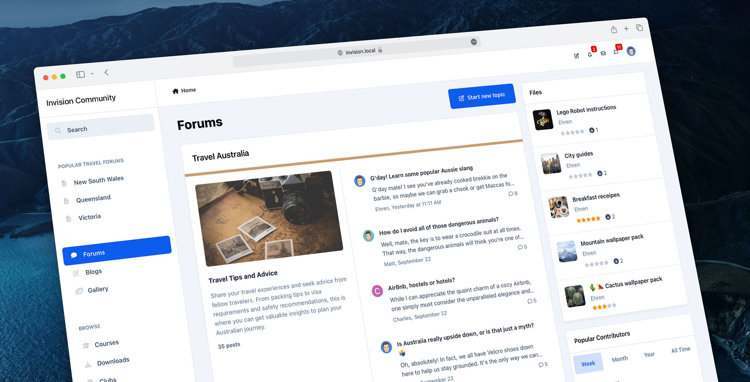 Welcome to Invision Community 5! Over the coming weeks, we'll be exploring a bunch of new features and improvements coming to our user interface including our brand new theme editor, a new mobile UI, dark mode and performance improvements thanks to a reduction in both JavaScript and CSS. To kick off this series, let’s take a closer look at the new sidebar layout and new view modes for the forum index and topic pages. Sidebar Layout Traditionally, Invision Community has shipped with a horizontal header and navigation bar at the top of the page, which is still available in version 5. We're introducing a brand new (and optional) sidebar layout, which can be enabled or disabled easily from within your theme settings. The sidebar not only provides convenient access to your applications, activity streams and search bar, but you can now add links to nodes for even easier access to popular or commonly used areas of your community. For example - a category from your forum, an album from the Gallery, or a product group from Commerce. Sidebar-zoom.mp4 Forum Index: Feed view One of our goals for version 5 was to re-imagine new ways for your visitors to consume content, and the sidebar layout is just one of our solutions. Table view has been the typical way of displaying forums, providing visitors with a simple summary of the most recently active topic. Grid mode introduced cover photos to forums and is a great way to make your page more visually engaging, while fluid view allows visitors to filter through a list of topics to easily focus on multiple areas of the community. Joining these view modes in version 5 is our new Feed view. Optional cover photos and featured forum colours allow you to personalise each forum, and a list of recently active topics with snippets of the most recent reply allow you to easily see what each forum is focusing on at a glance. The topic list drops below the cover photo and converts to a scrollable list on small devices. It's our fresh take on content display, and we can’t wait to hear your feedback! Topic pages: Compact view In addition, Invision Community 5 also introduces a new, compact layout option for topics. We wanted to create a layout which placed focus on your content while still keeping all of the authors profile information easily accessible within a mini profile. Stats, rank, badges, reputation points and more can be found by tapping the icon at the top of every post. The mini profile strip has also been added to other areas of the software too, such as comments and reviews in applications like Gallery and Blogs, and will appear on the mobile layout when the traditional "table view" is used in topics. Switching between the new compact view and the author sidebar view takes just seconds giving you complete control over your community. Mini profile.mp4 As part of this view, you also have the choice to feature/pin the original post to the top of every page, making it a breeze for your visitors to easily understand the context of replies without navigating back to page 1. Pinned posts have a slightly larger font-size to distinguish them from replies, and we've thoughtfully truncated them on pages beyond the first to keep scrolling to a minimum. The new sidebar layout and view modes offer a fresh and innovative approach to navigating and interacting with your community. We’re really keen to hear your thoughts on these new views and whether you’ll be unleashing them on your own sites! We appreciate that no two sites are the same, and those who are a fan of the classic header look will benefit from quick styling tools and a visual way to re-arrange the header elements which we’ll cover in a later blog. We’re looking forward to showcasing a whole bunch of new features over the coming weeks - so stay tuned, and we’ll see you then!
 -
 This week, we're excited to preview some of the UI changes which will be included with Invision Community 4.7.8. These changes result in improved performance for Google Fonts and better contrast for accessibility, while also fixing a few bugs along the way. When combined, these small improvements result in a much more polished UI, so lets dive in and take a look at some examples below! Google Fonts Google Fonts are now imported using the latest version of their API, which includes support for font-display:swap. This CSS property prevents FOUT, or the Flash Of Unstyled Text, where fonts would temporarily be invisible if the Google Font hadn't finished downloading. With this update, a fallback font will be displayed until the Google Font has been downloaded, so your text will be immediately visible even on your initial page load. With this update, we have also imported font-weight:600 for improved rendering of semi-bold fonts. Cleaner UI for Forum Grid This update includes a cleaner UI for forum grids, resulting in improved contrast particularly for the forum icon and forum name. Cleaner UI for "Expanded view" topic lists In addition to new forum grids, the expanded view UI has also seen improvements in this update, where items are now separated by a simple border instead of being separated into their own boxes. Improved button alignment on mobiles When possible, buttons will now only occupy a single line on mobiles which results in a cleaner layout and less scrolling. Win win! Before: After: Breadcrumbs Breadcrumbs now use a darker color and thicker font-weight for improved contrast, and no longer truncate when long titles are included. Before: After: Social Icons The background color of certain social icons has been updated to match their current brand colours. Before: After: Widget designs All widgets have received a slight UI overhaul, resulting in improved readability due to heavier font-weights on titles. Alignment issues have also been addressed in certain widgets for mobiles: Before: After: Improved alignment in posts Post controls (the bar containing the quote link and reactions) are now vertically aligned to the bottom of posts, regardless of the post length. Small change, but a big difference! Before: After: And much more! In addition to these changes, we've included a bunch of fixes including broken stats on record lists, wide tooltips, sticky announcements not staying stuck to the screen, incorrect image ratios for Recent Achievement badges and stretched thumbnails in widgets. We think these improvements have really helped to clean up certain areas of our UI and we look forward to them going live on all sites with 4.7.8!
 -
You guys did a great job, much better than I ever would have done! 😂
-
It's been a bunch of fun working with you on all of our projects together. You've been a huge part of my time with Invision, always full of positivity, and I'm sure you'll impact just as many people at Amazon. With that said, I'd happily swallow Matts key too. If you ship the key to Australia, it'll be physically impossible for Jordan to use it because it'll only exist in the future.

-
It's always great seeing my themes in the wild, including the customizations you've all made. 👏 @Ehren has made all of my themes too! 10/10, would recommend 😂


