

KiteLife
-
Posts
469 -
Joined
-
Last visited
Content Type
Downloads
Release Notes
IPS4 Guides
IPS4 Developer Documentation
Invision Community Blog
Development Blog
Deprecation Tracker
Providers Directory
Forums
Events
Store
Gallery
Posts posted by KiteLife
-
-
Hot horse is dead, let’s not beat it - situation explained, complaints acknowledged, onward. ✌️
-
I got one am looking forward to having this app back in the marketplace, it’s the best if it’s kind and much needed by me - will buy as soon as it’s available again.
-
Hi, just installed bookmarks on IPB 4.3 but not appearing on posts...

Any suggestions? Looking forward to making this available to our members. :)
==
Oddly enough, "My Bookmarks" is visible in the member menu.
==
Of course I just found it - edited the member groups that I want to access the bookmarks, RESOLVED.
Thanks for a great app. :)
-
Thank you.
-
-
Looks like it went just fine, downloaded from your site, thanks. :)
-
I haven't been able to find the upgrade instructions for going from 2.3.1 to the latest version, or exactly what the latest version is and where I can download it.
When I click on "download this file" here at IPB, there's no second download link to actually do so.
Please advise, we're on the latest version of IPB and need to upgrade SiteMap asap. -
What was updated on 4/1, anything crucial?
-
We installed the update and we've been steadily growing on the number of indexed pages, satisfied customer. :)
-
I installed this app about 33 days ago and all links have been submitted, but none indexed... Waiting on further news from Mr Ramburn.
-
Any recent reviews from folks using this app?
Possibly interested in buying.. How effective is it, and user friendly? -
Agreed, just ran into a problem with this... IPB support advised me to edit the database, a pain in the butt.
+1 -
Install guide is bringing up just this...
anapcQ <a href="[url="http://kfxhbkodqfrg.com/"]http://kfxhbkodqfrg.com/[/url]">kfxhbkodqfrg</a>, [url=[url="http://aluftgoezids.com/"]http://aluftgoezids.com/[/url]]aluftgoezids[/url], [link=[url="http://aphrrhltqbun.com/"]http://aphrrhltqbun.com/[/url]]aphrrhltqbun[/link], [url="http://qrspykpywvcm.com/"]http://qrspykpywvcm.com/[/url]
Is there another install guide in the download? -
Put "View Today's Active Topics" back in a place where people can find it, got TONS of members who use the 24 hour, weekly, etc to browse through stuff, but have a helluva time finding that wimpy little link at the bottom of the forum index page.
- AlexJ and ~sullengirl~
-
 2
2
-
Cool, looking forward to the new release, and eventually, to multiple subscriptions. :)
We have a few people who electively sign up for more than one subscription to support our site. -
Quick question, does anyone know if the current system allows users to have multiple subscriptions?
-
Thanks a bunch, 2 cents delivered in that discussion. :)
-
Fair enough.
Is there a public discussion in progress elsewhere? -
Examples of how the old skin is cleaner, in my eyes...
Old:
New:
The new skin looks kind of "bloated" with regard to padding, images and font style/size. -
Superb news! ;)
Lastly, is there a thread where can I join in on discussion? -
Thanks!
Anyone know if they're available for download? -
An addendum from the same user, I'm still in agreement. ;)
Upon further investigation, it appears that the topic name itself in the View New Content results has the functionality of going to the first unread post. But then, the Rev forum allows you to go either to post #1 by clicking the topic name, or the first unread by clicking the orange icon. I like having the option. Sometimes, if the thread isn't fresh in my mind, I like to go to the first post, other times, just to the first unread...
-
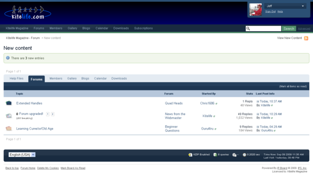
A great summary post from one of my forum users...
When it comes to a discussion forum, I like functional and organized over aesthetic. Now, it's just my personal preference, but I have time for one example here...
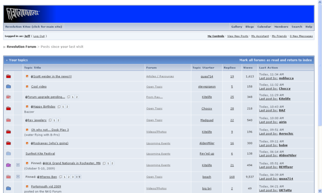
Here's a view of pages at both forums after clicking for New Posts:
I know it makes me an old fogey, but I like the tighter and more organized look of the Rev forum.
I like the tabular look of the topics and the fields for each. I like the background that sets it apart from the page, and clearly separates each topic with a contrasting line. I like the clear orange marker that shows which ones have posts I haven't read yet. I like the compactness that allows more content to be viewed on the page. I like that the hyperlinks are clearly indicated with the traditional underline.
I feel like the new format is trying to look more like a paper document instead of a web page, which can have benefits, but...
I don't like the wasted space where it tells me how many new entries there are. I don't like the amount of white space because it fails to contrast the content with the page background. The stats are combined in one column, but that only increases the vast white space by saving one column. The page is unbalanced with that larger gap. I don't like that the hyperlinks are not instantly visible. I don't have that visual that tells me what I can click on for more information. It's harder to see what has posts I've already read. In the screen cap above, I've already followed the third topic, and the folder icon is very slightly faded, but that's all the indication I have. Also, unless I just haven't found it, there is no "go to first unread post" icon in the new forum when you use the "View New Content" search. There is a "go to last post."
Also, in the old format, there is a dropdown at the bottom of the page of new content that allows you to change the time span on active topics right from there, and that's not available on the new one.
Anyway, that's a few observations of mine on one particular page.
Myself, I love the tabbed extras under new content, and the more robust aesthetics, but I too would like to see a tighter skin made available from Invision (to sustain/evolve real-time through future upgrades)... Something similar to the old style (Revolution forum above), less unused space, etc, but with the sidebar and other new features found in the latest IPB release.
Here's hoping, thanks. :) -
I can confirm that the media button does no longer work while it did on v3.0.2
This is a created bug in 3.0.3.
Also the update reverted all my edited media tags (the embed codes) but did not update my mp3 media embed code while that was one I did not touch at all.
I had an identical issue, support is looking into it for me now.
==
I just had a chance to see the CleanCut template, no great improvement imho, looks pretty tacky...
Right now, I'm contending with a lot of my users who don't like the v3 layout, common comment is "can't find my way around".
Sure, this falls under the "change hurts - wah" category, but I'm wondering if a skin will be released that is suitably LIGHT and CLEAN like v2's layout, while utilizing the new features (admin, hooks, sidebar, etc)... All the new v3 skins I've seen are a little bloated, heavy on graphics and less compressed (less visible on each page).
Here's hoping. ;)


Classifieds System
in Marketplace
Posted
Hi, we just updated both IPB and Classifieds and one of our users reported "Error code: EX1048" when trying to mark their adverts as complete.
Seems the adverts completed, but the error code causes some concern. Any ideas?