
CP_User
Clients
-
Joined
-
Last visited
Everything posted by CP_User
-
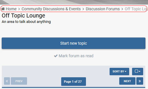
That works, but it breaks, it removes the home icon and the >
-
Doesn't seem to be showing on a mobile/cell device. I adjusted the screen size on the browser and it disappeared?
-
Pictures are so much easier lol. In red, the breadcrumb is hidden from view when viewing on mobile/tablet. Can it be altered to show it? (I've photoshop this image to show it on a mobile view)
-
I think it's due to the slider not being full width, and it cuts the top of the slider image off. (However I have made the site fluid @ 96% and it does look better) I get what you mean about the full width, specially on larger widescreens. But I do like that look. Something like this where the navigation sits on top of the slider would be a cleaner look (but again this is personal preference) Sorry, I should of made it clear. Can you include one in the mobile view of the site? Just so it sits under the header as it would do on the desktop view. (Or is possible, supply code and we can choose to add it?) Mine looks like it's trying to do both at the same time lol. I wanted it square so I left it blank, and this happened. Added the 0px and the same thing happened. It hurt my eyes so bad haha That would be the best solution.


-
4.2 Bugs Search box (0px 0px 0px 0px) or leaving blank makes the box appear as a rectangle and rounded edges Style Forums - the boarder is inherited from the global section titles, there for having a green section title and then having a blue boarder looks odd (in my case) News Ticker - Bottom boarder (the gap) I think looks a little odd, better if there was no gap (personal preference though) When editing the theme, please can you choose a deeper colour of yellow as it's currently unreadable 4.2 Suggestions Header Menu - Able to be above the slider? As above, but with a FULL PAGE SLIDER. What's happened to the boxed full width options? Has this changed due to the new nav bar? (Reason I like the theme is due to the full width) Different nav bar headers (not sure if this is viable to you) - I'm not a fan of this currently, I love how it works on 4.1. **I could show different examples of better looking nav bars if this is something you wish to look at. Being able to choose from 2/3 would be a nice feature.** Reduce the size of the nav header (which would reduce the size of the search box too) Global colour schemes - Now I've been thinking of this late, more so since looking at your other themes. Is it possible that you can select from colours and the theme would change to the colour and different shades of it. Lets say I'd like to use BLUE as a base colour, and the system would auto set buttons, pagination, section title and menus to match? MOBILE Breadcrumb - I find it really annoying to skip between pages/categories on a mobile, is it possible to add one, or even supply code to which we could use? Boarder/Line colour to separate post and authorpane - I personally like it all white but then you've lost the separator Quote | Edit | Options (ipsItemControls)? - Are you able to make these sit at the BOTTOM of the post so it's inline with the size of the authorpane box? Adjust size of section and sidebar section titles, they are massive haha, I know I could adjust these via custom.css Positives Thank you for including the slider to deactivated on forum topics, been waiting for this and it works well! Saves so much screen space! Slider rearrangements - You wont believe how much time this will save and being able to put the most important slider first!!! Many improvements across the theme, along with 4.2 it's really looking clean, modern. Really impressed with it overall. I think this is it for now, thank you for the continued development of the theme!
-
All I ask is that you please continue to update it so it's functional on each update of the IPS software. I don't want this add-on dead within 6 months to a year and it becomes obsolete, which I think Ohio was getting at, just not in a constructive way. If done right, and feedback/features are listened to (within reason) as you know, you could make a healthy income. Thanks for taking over the app, I look forward to what you can bring to the app.
-
Good man, just going to test this now!
-
That's worked. Thanks!
-
Cheers I'll add that for a backup. I still cannot get the avatars round, not sure what's going on, I've turned every setting off to see if it effects it.
-
OK, breath, don't loose faith! I have found the issue. If you don't have a cover image, and it's enabled to show the avatar moves up to fill the gap covering the username. Switched it off and all is well. However, my avatars are still not round, setting enabled.
-
I have indeed.
-
Hope it's not getting shorter! OK, so that didn't work. So I thought it would be best to uninstall it, clear cache and re-install. But, this has caused another issue. The avatar is now covering up the username.
-
My Avatar is now square regardless of setting. Cleared cache on browser and site.
-
This has worked, it's more to do with the font I'm using. I've tried another and it's OK. I have adjusted the font to 26px which works better. No ill effects around the site as of yet.
-
I can confirm this, same issue on the hover card. Exactly the same size I'm using.
-
Another fantastic update. With the uploaded fonts, the username has come out quite small (which I think is due to the font), is there an easy way to adjust the size of the font? This might be to be another option? (Without it effecting other areas of the site)
-
Surprises! Wonder what it could be...
-
Splendid , will I be able to upload my own font to my directory and link it?
-
Ah, you're a good man! Thank You.
-
Morning, Just wondering, is it possible to change the font on the members name only? I could either use a Google font or use one I've uploaded myself (without changing any other font on the board).
-
Thank You
-
Hi Taman. Is there a way I can remove the slant and the shadow on the sidebar widgets and return them to normal so I can match them with the forum title section?
-
Absolute diamond! Exactly what I was after. I attempted it but I missed some code. Many, many thanks.
-
Could I ask for the full class to hide on mobile, is it: ipsResponsive_hidePhone, and where I'd add it? - As I would like to hide certain custom profile fields also. Cheers!
-
Fantastic, love the options! Top Work! I have found 1 bug - if you have a tablet (I'm using iPad mini) the avatar is sitting to the side (left) of the author pane. And not underneath the name, if turned to landscape there is no issue. Desktop/Mobile view is fine.


