
Everything posted by Cedric V
-
That really doesn't make much sense or makes the process easier. The best method is to flag them as spammer, not move them to a separate group.
-
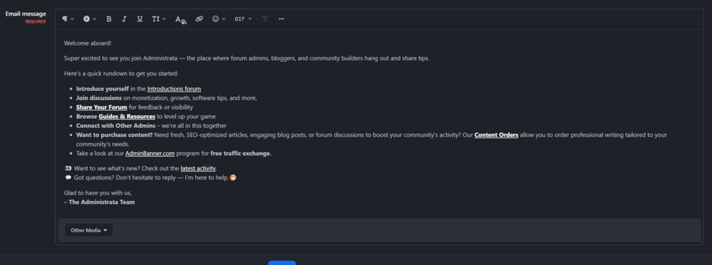
Great stuff! I especially like the welcome email. This is a perfect new addition in combination with Daniel's Welcome PM application. Thank you for your work, Invision. 👌
-
While I was peacefully asleep, around 400 spammers decided it was a good time to attack one of my communities. Admittedly, I didn’t have much spam prevention in place, so it was an easy target. However, cleaning it up was painful - banning or flagging each member one by one took ages. It really highlighted how useful a multiple select option on the Members page in the Admin Panel would be, allowing us to flag or ban several accounts at once. That would turn a 30-minute job into a 3-minute one.
-
Great stuff! Upgraded like a charm.
-
Do you have any further info, which devices, pages, etc? I haven’t encountered any issues so far, but I’d be happy to investigate further and think of a solution.
-
Ermm no. It doesn't. I totally forgot about that. 😅 I'll report back. This will display the notification count on the bell and remove it from the avatar: document.addEventListener('DOMContentLoaded', function () { let attempts = 0; function injectBell() { attempts++; const mobileNav = document.querySelector('.ipsMobileHeader .ipsMobileNavIcons'); const userIcon = mobileNav?.querySelector('[data-el="user"]'); const existingBell = mobileNav?.querySelector('[data-el="notifications"]'); const offCanvas = document.querySelector('[aria-controls="ipsOffCanvas--notifications"]'); if (!mobileNav || !userIcon || existingBell || !offCanvas) { if (attempts < 30) requestAnimationFrame(injectBell); return; } const li = document.createElement('li'); li.dataset.el = 'notifications'; li.innerHTML = ` <button type="button" class="ipsMobileNavIcons__button" aria-controls="ipsOffCanvas--notifications" aria-expanded="false"> <svg xmlns="http://www.w3.org/2000/svg" height="16" width="14" viewBox="0 0 448 512"> <path d="M224 0c-17.7 0-32 14.3-32 32V51.2C119 66 64 130.6 64 208v25.4c0 45.4-15.5 89.5-43.8 124.9L5.3 377c-5.8 7.2-6.9 17.1-2.9 25.4S14.8 416 24 416H424c9.2 0 17.6-5.3 21.6-13.6s2.9-18.2-2.9-25.4l-14.9-18.6C399.5 322.9 384 278.8 384 233.4V208c0-77.4-55-142-128-156.8V32c0-17.7-14.3-32-32-32zm0 96c61.9 0 112 50.1 112 112v25.4c0 47.9 13.9 94.6 39.7 134.6H72.3C98.1 328 112 281.3 112 233.4V208c0-61.9 50.1-112 112-112zm64 352H224 160c0 17 6.7 33.3 18.7 45.3s28.3 18.7 45.3 18.7s33.3-6.7 45.3-18.7s18.7-28.3 18.7-45.3z"></path> </svg> <span class="ipsNotification" hidden data-notificationtype="notify" data-currentcount="0">0</span> </button> `; const btn = li.querySelector('button'); btn.addEventListener('click', e => { e.preventDefault(); offCanvas.click(); }); mobileNav.insertBefore(li, userIcon); const avatarNotif = userIcon.querySelector('.ipsNotification'); const bellNotif = li.querySelector('.ipsNotification'); if (avatarNotif) { bellNotif.hidden = false; bellNotif.textContent = avatarNotif.textContent; avatarNotif.remove(); } } requestAnimationFrame(injectBell); });
-
Add this to your theme -> Theme Designer Core CSS & JS -> Javascript document.addEventListener('DOMContentLoaded', function () { let attempts = 0; function injectBell() { attempts++; const mobileNav = document.querySelector('.ipsMobileHeader .ipsMobileNavIcons'); const userIcon = mobileNav?.querySelector('[data-el="user"]'); const existingBell = mobileNav?.querySelector('[data-el="notifications"]'); const offCanvas = document.querySelector('[aria-controls="ipsOffCanvas--notifications"]'); if (!mobileNav || !userIcon || existingBell || !offCanvas) { if (attempts < 30) requestAnimationFrame(injectBell); return; } const li = document.createElement('li'); li.dataset.el = 'notifications'; li.innerHTML = ` <button type="button" class="ipsMobileNavIcons__button" aria-controls="ipsOffCanvas--notifications" aria-expanded="false"> <svg xmlns="http://www.w3.org/2000/svg" height="16" width="14" viewBox="0 0 448 512"> <path d="M224 0c-17.7 0-32 14.3-32 32V51.2C119 66 64 130.6 64 208v25.4c0 45.4-15.5 89.5-43.8 124.9L5.3 377c-5.8 7.2-6.9 17.1-2.9 25.4S14.8 416 24 416H424c9.2 0 17.6-5.3 21.6-13.6s2.9-18.2-2.9-25.4l-14.9-18.6C399.5 322.9 384 278.8 384 233.4V208c0-77.4-55-142-128-156.8V32c0-17.7-14.3-32-32-32zm0 96c61.9 0 112 50.1 112 112v25.4c0 47.9 13.9 94.6 39.7 134.6H72.3C98.1 328 112 281.3 112 233.4V208c0-61.9 50.1-112 112-112zm64 352H224 160c0 17 6.7 33.3 18.7 45.3s28.3 18.7 45.3 18.7s33.3-6.7 45.3-18.7s18.7-28.3 18.7-45.3z"></path> </svg> <span class="ipsNotification" hidden data-notificationtype="notify" data-currentcount="0">0</span> </button> `; const btn = li.querySelector('button'); btn.addEventListener('click', e => { e.preventDefault(); offCanvas.click(); }); mobileNav.insertBefore(li, userIcon); } requestAnimationFrame(injectBell); });
-
I’ll have a look asap, but don’t make any promise.
-
Most welcome.
-
Okay, this should now fully work as far as I have tested it. @media screen and (max-width: 979px) { html, body { height: 100%; overflow-x: hidden; overscroll-behavior-y: auto; -webkit-overflow-scrolling: touch; } .ipsApp, .ipsLayout_container { transform: none !important; perspective: none !important; } .ipsMobileFooter { bottom: 0; left: 0; right: 0; z-index: 9999; justify-content: space-around; padding-bottom: env(safe-area-inset-bottom, 0); transition: transform 0.3s ease; -webkit-transform: translateZ(0); will-change: transform; } body.atTop .ipsMobileFooter { position: static !important; } body:not(.atTop) .ipsMobileFooter { position: fixed !important; } body { padding-bottom: calc(56px + env(safe-area-inset-bottom, 0)); } @supports (-webkit-touch-callout: none) { .ios-scroll-fix .ipsMobileFooter { position: sticky !important; bottom: 0 !important; transform: translateY(0); } } } body.atTop .ipsMobileFooter { position: static !important; display: none !important; }This will keep the mobile sticky again on iOS26 and the refresh functionality working.
-
Actually no, that breaks the refresh. I’ll try again.
-
Add it to your custom CSS: @media screen and (max-width: 979px) { html, body { height: 100%; overflow-x: hidden; overscroll-behavior-y: none; } .ipsApp, .ipsLayout_container { transform: none !important; perspective: none !important; } .ipsMobileFooter { position: fixed !important; z-index: 9999; justify-content: space-around; padding-bottom: env(safe-area-inset-bottom, 0); transition: transform 0.3s ease; } body { padding-bottom: calc(56px + env(safe-area-inset-bottom, 0)); } @supports (-webkit-touch-callout: none) { .ios-scroll-fix .ipsMobileFooter { position: sticky !important; bottom: 0 !important; transform: translateY(0); } } }
-
Okay, this should now fully work as far as I have tested it. @media screen and (max-width: 979px) { html, body { height: 100%; overflow-x: hidden; overscroll-behavior-y: auto; -webkit-overflow-scrolling: touch; } .ipsApp, .ipsLayout_container { transform: none !important; perspective: none !important; } .ipsMobileFooter { bottom: 0; left: 0; right: 0; z-index: 9999; justify-content: space-around; padding-bottom: env(safe-area-inset-bottom, 0); transition: transform 0.3s ease; -webkit-transform: translateZ(0); will-change: transform; } body.atTop .ipsMobileFooter { position: static !important; } body:not(.atTop) .ipsMobileFooter { position: fixed !important; } body { padding-bottom: calc(56px + env(safe-area-inset-bottom, 0)); } @supports (-webkit-touch-callout: none) { .ios-scroll-fix .ipsMobileFooter { position: sticky !important; bottom: 0 !important; transform: translateY(0); } } } body.atTop .ipsMobileFooter { position: static !important; display: none !important; }This will keep the mobile sticky again on iOS26 and the refresh functionality working.
-
This is a known iOS 26 issue. We will need to wait for a fix from Apple.
-
Apologies, I'm not aware of any tickets I made. Not that I can remember at least. Nor did I get any email. I can however access the board again, so whatever you did, thanks! 😁
-
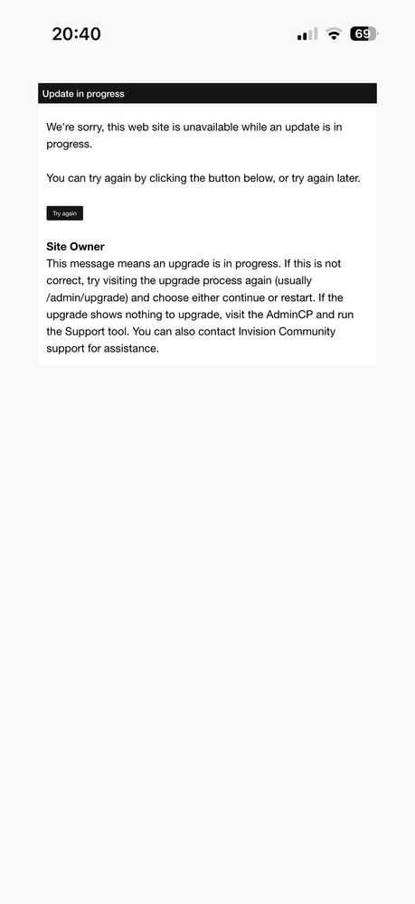
@Stuart Silvester , is there an automation ongoing for our website? I am positive I didn’t upgrade to beta 3, nor did my admin. Yet I’m running in an upgrade screen when visiting:
-
There is a slight hiccup when upgrading: I've lost my images on Administrata such as logo, and uploaded images in theme resources. Edit: reimported the theme fixed it, but it's a workaround, just so you know.
-
I've had that happen prior iOS 26. It only happens to my own website. On Invision or any other forum, I don't have that behavior.
-
Doesn't happen always. If you close the app and reopen it, chances are it's not happening again.
-
I actually love iOS26. Ha.. but can also confirm these issues.
-
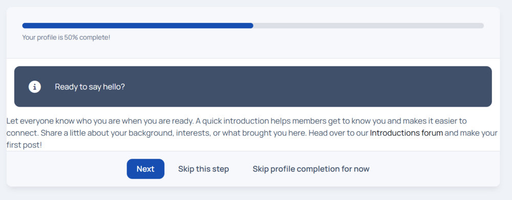
I've added a Post registration profile completion as a custom message and noticed it could use some spacing on the left.
-
That is not an excuse. You can easily give a color to your links. But I guess, if it works, it works.
-
Bold is a statement. Ha.. Guess it depends how your community uses it.
-
To emphasize something. 😄
-
You would need to do this in your domain management. Using a DNS CNAME / A Record. Additionally you can also use an Invision menu item for linking.