.thumb.jpeg.beabd3e950acc9626a39df2efa937da3.jpeg)
If you've been around Invision Community for a while, you'll know our frontend default theme hasn't significantly evolved since the early days of 4.0. Indeed, the last significant refresh came with 4.2.
With the upcoming release of 4.5, we wanted to revisit the default theme and give it a facelift for 2020, as well as make incremental improvements to the underlying codebase as a stepping stone to a bigger re-engineering in a future version.
In this entry, I want to talk a little about some of the design decisions that went into building the new theme.
Goals
Redesigning for the sake of it is never a good idea, so we first laid out what we wanted to achieve:
- A brighter UI with more saturation & contrast and simpler overall color scheme
- Improved typography
- Better, more consistent, spacing around and between elements, especially on mobile
- Better logical grouping of sections of each page
- Reducing underutilized links/buttons on the page and finding alternative ways of making them available
- Improving how post states are displayed
- Modernizing and enhancing the underlying code that powers the default theme
Let's talk a little about each of these.
Brighter UI
The most obvious change will be that our default colors are brighter and more saturated than before. Before making any changes, we first created a color scale for both neutrals and the brand color (blue, of course). This gave us a flexible but consistent palette of colors to choose from, with appropriate contrast built in. Neutrals have a touch of blue too to avoid seeming washed out.
We've simplified the style, in particular reducing reliance on background colors to differentiate sections within cards (a card essentially being an ipsBox, for those who are familiar with our framework). Instead, we use spacing, borders and appropriate typography to achieve visual separation.

Brighter default colors

Simplifying the UI by removing block backgrounds
Improving typography
We've felt our typography has been somewhat muddled for some time - with a mixture of sizes, weights and colors used depending on the particular context.
The first step to improving it was to create a typography scale that we could refer to and implement, to ensure we remained consistent throughout the product.

Our typography scale
(The keen-eyed amongst you may also notice we've switched our default font to Inter. Inter is a fantastic open source font that is ideal for text on the web, and was recently added to the Google Web Fonts project making it super simple for us to incorporate it into our default theme.)
We've been much more deliberate about applying type styles, especially for titles, ensuring that they are always visually distinct from surrounding text. We've done this through both color and weight. As a result, pages should instinctively feel more organized and logical than before.

An example of improved typography, from the Downloads app
Improved spacing (especially on mobile)
We identified that spacing (padding and margins) needed some improvement. A lot of spacing values were arbitrary and inconsistent, leading to poor visual harmony across any given page.
Most troubling of all, on mobile sizes we simply halved desktop padding values. While this was a reasonable approach in the days of phones with small screens, it has felt decidedly dated for some time. Phone screens are now typically larger and able to accommodate roomier UIs without appearing comical.
In 4.5, we have done away with that approach, and the impact was immediate. Mobile sizes now get a much more pleasant interface, with elements having room to breathe. In addition, we've also made most cards full-width to provide additional breathing space for content.

Posts can finally breathe on mobile
There are numerous other tweaks across the product too: default spacing has been increased a little, data tables (e.g. topic listing) get extra vertical spacing, and spacing between elements has become more consistent.
Improved grouping of related elements
Prior to 4.5, most content areas existed inside cards. However, one notable exception to this was page headers and as a result, they could feel particularly disorganized, especially for users who had many controls in this part of the page (such as staff).
To solve this problem, we've developed a new, standardized design for content item page headers, giving them their own cards and consistent button placement.

Topic view header
Some areas don't necessarily fit into the same design pattern above. In those areas, we've tweaked styling to suit the context, while still adhering to our overall aesthetic.

Calendar header

Messenger conversation header
Reducing underutilized links/buttons
Finally, another area we identified as needing improvement is the abundance of tools, made up of links and buttons, across pages. Many of these are only used occasionally and so would be better moved out of the main view to simplify the page.
Two particular areas we focused on were share links and postbits (both forum posts and comments in other apps).
Research shows social share links are used by a vanishingly small percentage of users, so even though they were at the bottom of the page, it was unnecessary to make them so prominent (given their eye-catching colors). To solve this, we've added a share link to the page header, with the social network links themselves in a popup menu. The result is ideal: sharing functionality is unobtrusive but obvious.

Share links in content items
Comment areas have also suffered from 'button creep' over the years. A typical comment will contain a report link, a share link, a quote link and multiquote button, reactions, plus IP address, checkbox, edit and options links for certain users. That is a lot of visual noise around the important part: the content.
We've therefore simplified comment boxes as much as is reasonable. Reporting and sharing comments/posts is now available in the post options menu, as are any tools for the author/staff. Quoting and reacting are two primary interactions for users, so they of course retain their position in the control bar.

Simpler postbits, even for staff
Improving post states
Posts/comments in Invision Community can have many states - sometimes more than one. Posts can be hidden/unapproved, popular, recommended, solved (new in 4.5!) or highlighted because of the author's group. It's always been a challenge to indicate these statuses well.
In previous versions, we added a border but the most prominent indicator was a flag in the top-right corner of the post. This had three problems:
- Due to the lack of space (thanks to report/share links), showing more than one flag was difficult.
- Showing any flags on mobile was messy because of the space constraints.
- The meaning of the flags was not obvious, especially to new users. Group-highlighted posts had no flag, just a border, which made them even more difficult to understand.
With the top-right corner of posts now tidied up and free from fluff, we were able to much more effectively use this space to indicate post statuses.
In 4.5, posts and comments will show badges when they have a particular status, as well as a more attractive semi-transparent border. For group-highlighted posts, we show the group name instead (the colors of this highlight are still controllable via theme settings).

A post with two states: group highlighted and popular
This works much better on mobile too, where the status badges get the prominence they deserve:

Mobile post statuses
Modernizing the underlying code
I wrote about the technical improvements behind the theme in a previous entry. If you're a theme designer or edit the theme for your own community, go and check it out now!
Wrapping up
As well as these large-scale concepts, you'll notice many other smaller enhancements as you start using the new theme.
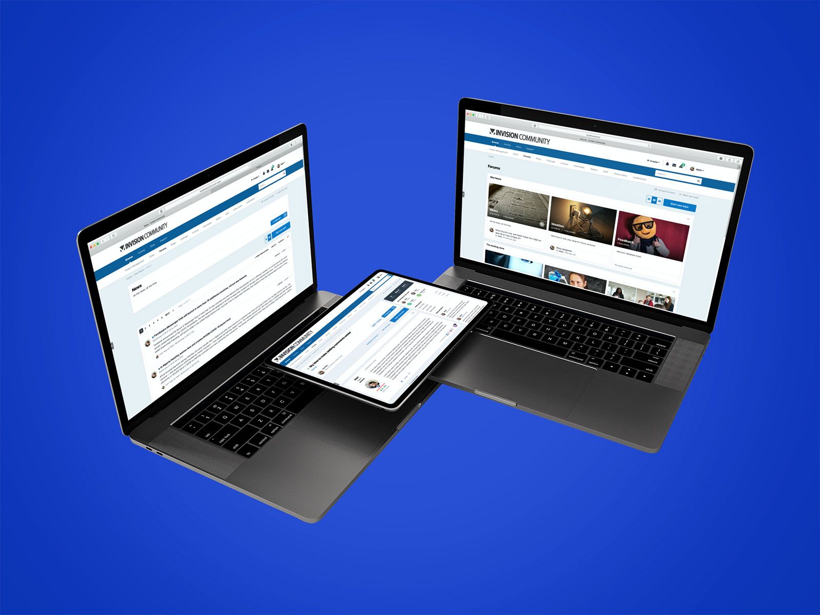
I've shown some snippets of pages in the screenshots above, but I've included some full-page views below so you can see the overall aesthetic and how these pieces fit together.
Modernizing and refreshing our default theme has been needed for some time, but we view this as just a stepping stone to future work that will be reserved for a major version bump, and we're excited to figure out where we go next.
Screenshots
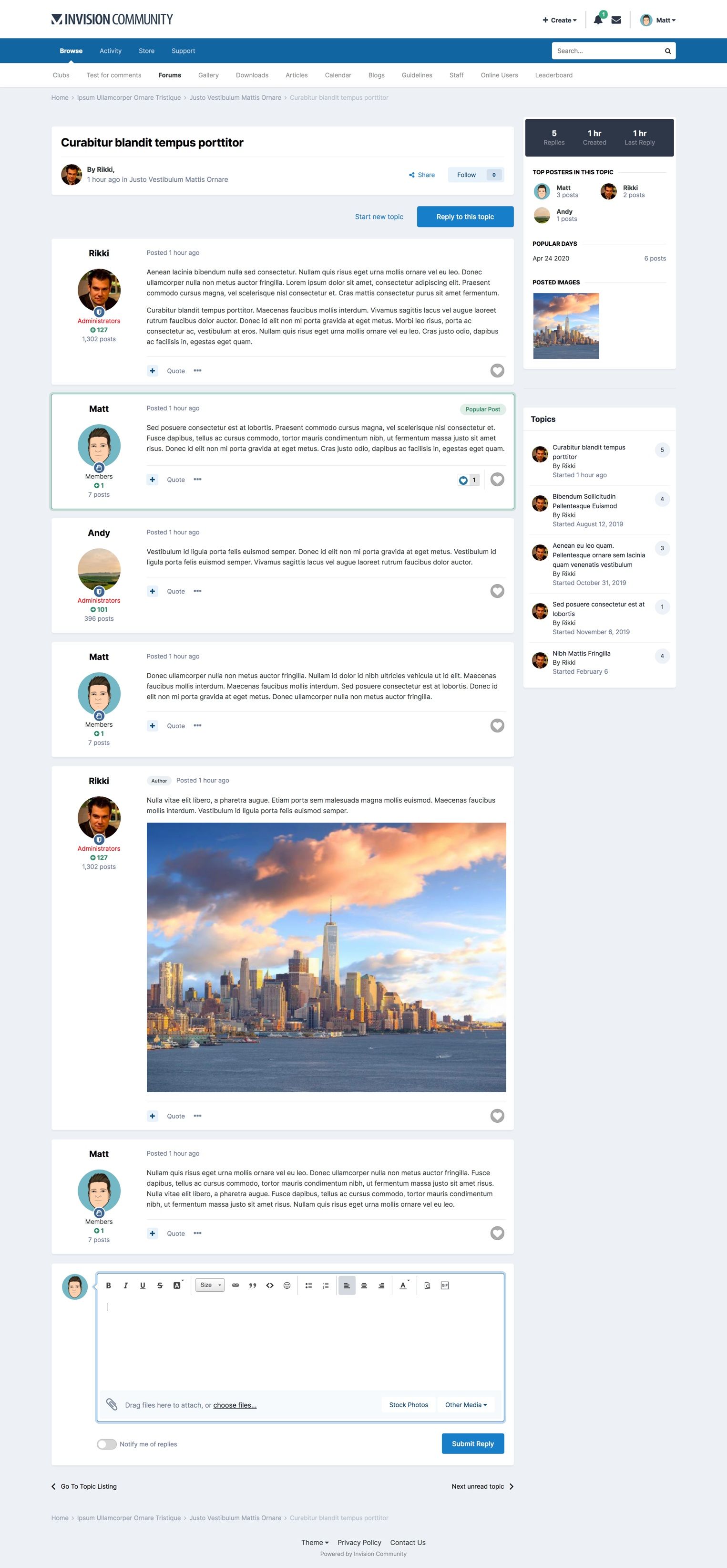
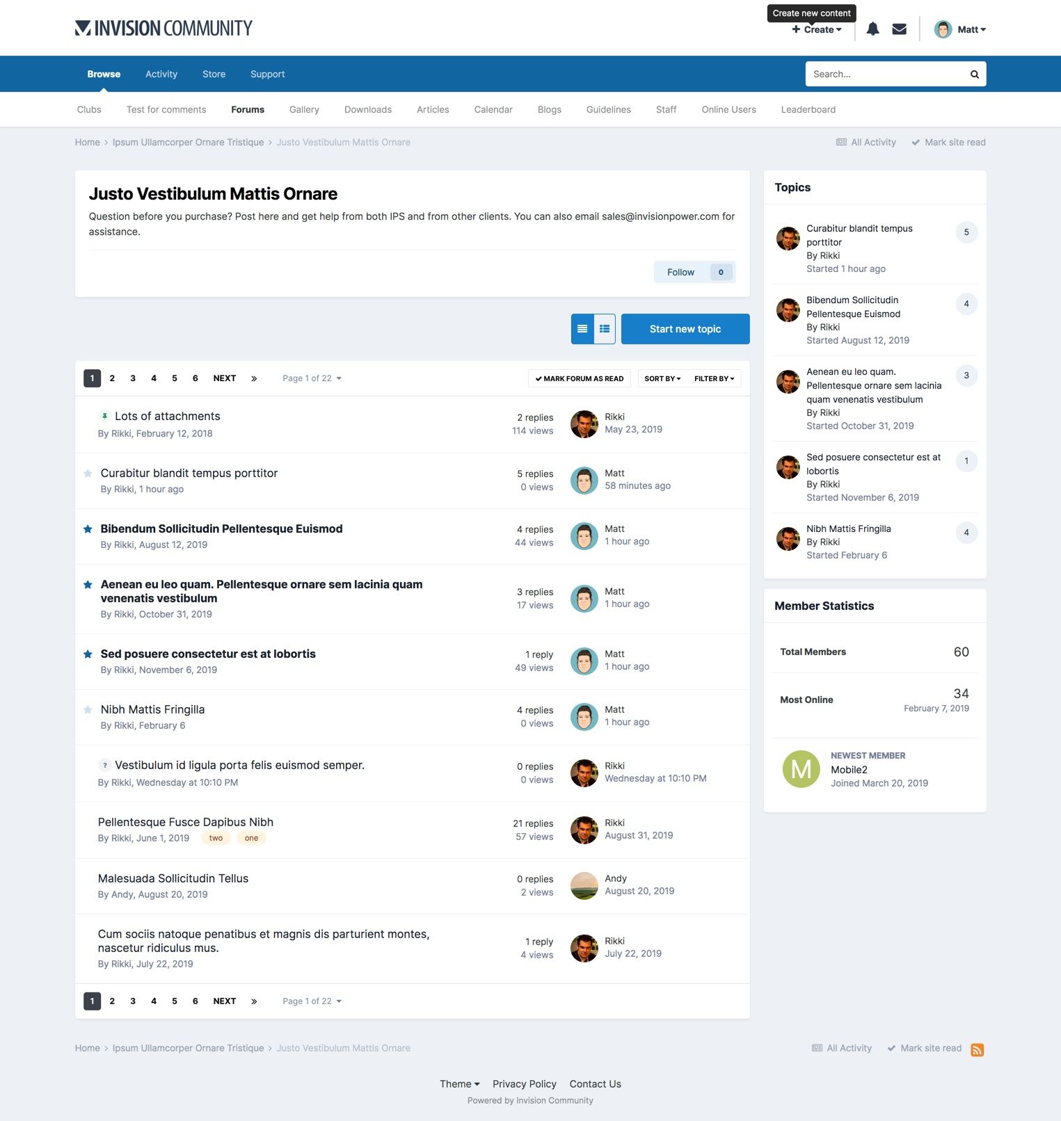

Desktop forum views (click to expand)
.jpg.cbc7d0646b75c792171b75726ea3217b.jpg)
.jpg.4f8f0f186be53465283f26ffa5797c72.jpg)
Mobile forum views (click to expand)

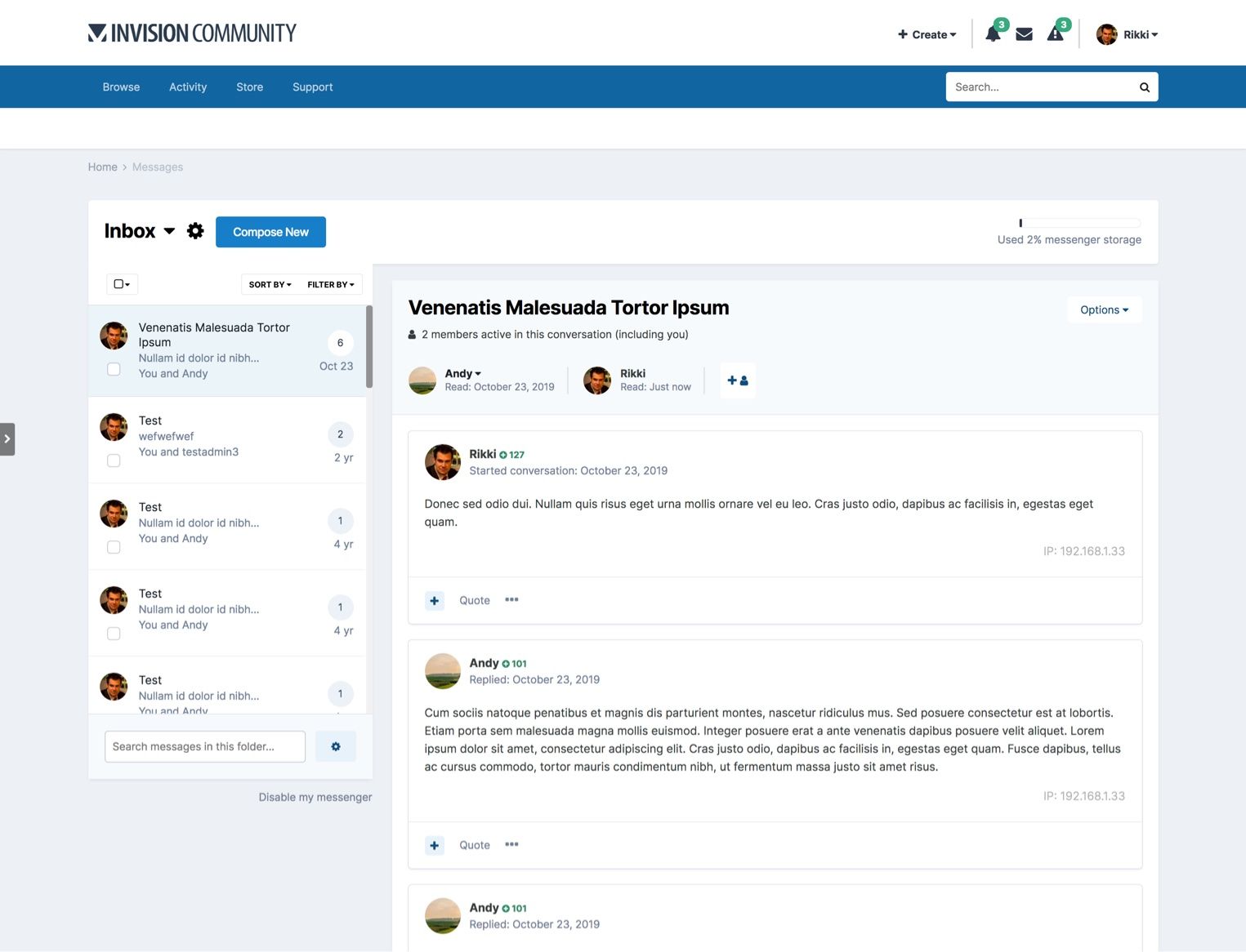
Activity streams & messenger (click to expand)