

This week, we're excited to preview some of the UI changes which will be included with Invision Community 4.7.8.
These changes result in improved performance for Google Fonts and better contrast for accessibility, while also fixing a few bugs along the way. When combined, these small improvements result in a much more polished UI, so lets dive in and take a look at some examples below!
Google Fonts
Google Fonts are now imported using the latest version of their API, which includes support for font-display:swap. This CSS property prevents FOUT, or the Flash Of Unstyled Text, where fonts would temporarily be invisible if the Google Font hadn't finished downloading. With this update, a fallback font will be displayed until the Google Font has been downloaded, so your text will be immediately visible even on your initial page load.
With this update, we have also imported font-weight:600 for improved rendering of semi-bold fonts.
Cleaner UI for Forum Grid
This update includes a cleaner UI for forum grids, resulting in improved contrast particularly for the forum icon and forum name.

Cleaner UI for "Expanded view" topic lists
In addition to new forum grids, the expanded view UI has also seen improvements in this update, where items are now separated by a simple border instead of being separated into their own boxes.

Improved button alignment on mobiles
When possible, buttons will now only occupy a single line on mobiles which results in a cleaner layout and less scrolling. Win win!
Before:

After:

Breadcrumbs
Breadcrumbs now use a darker color and thicker font-weight for improved contrast, and no longer truncate when long titles are included.
Before:
![]()
After:
![]()
Social Icons
The background color of certain social icons has been updated to match their current brand colours.
Before:

After:

Widget designs
All widgets have received a slight UI overhaul, resulting in improved readability due to heavier font-weights on titles. Alignment issues have also been addressed in certain widgets for mobiles:
Before:

After:

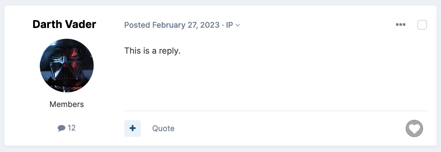
Improved alignment in posts
Post controls (the bar containing the quote link and reactions) are now vertically aligned to the bottom of posts, regardless of the post length. Small change, but a big difference!
Before:

After:
And much more!
In addition to these changes, we've included a bunch of fixes including broken stats on record lists, wide tooltips, sticky announcements not staying stuck to the screen, incorrect image ratios for Recent Achievement badges and stretched thumbnails in widgets.
We think these improvements have really helped to clean up certain areas of our UI and we look forward to them going live on all sites with 4.7.8!

