
Welcome to the second video of our sneak peak series! Today we'll be taking a closer look at the new Invision Community interface, including dark mode, accessibility improvements, performance improvements and the mobile layout! Before we begin, I should mention that this is a pre-alpha version of Invision Community 5, so some areas of the design may change before the official release.
New traditional header design
In our previous video, we showcased our new, optional side panel which formats your navigation into a vertical list. For those who prefer a traditional, horizontal header, here it is!

A much more compact header compared to version 4, the new design condenses the navigation bar into a single row, moving all sub-navigation items into dropdown menus. A new, optional area below the text logo allows you to add your website slogan or announce events such as anniversaries or holidays, and our new search modal provides convenient access to the advanced search filters from any page on your community.

Accessible interface
The main content area has been designed with accessibility as a priority. High contrast text colours and larger font-sizes help to make reading more comfortable and clickable table rows (which can be enabled or disabled via the Theme Editor) allow you to navigate between pages more easily. A visible focus ring significantly improves navigation for visitors who find it more comfortable to browse with their keyboard TAB key, instead of using their mouse (ie. visitors with conditions such as Parkinson's disease, or those who have temporarily lost function due to a broken arm).
Elements are highlighted while navigating with the keyboard
Dark mode
Dark mode has become increasingly popular over the past few years - so it's no surprise that Version 5 has been designed from scratch with both light and dark mode in mind. With version 4, it was necessary to manage two themes in order to provide a light and dark colour scheme. In version 5 though, all of that is handled by a single theme.
By default, your members will be able to choose their own color scheme preference: either light, dark, or system. System assigns a color scheme based on your system preferences - so if your device automatically switches to dark mode at night, your community will too! With that said, as an administrator, you also have the option to restrict your site to a single color scheme - so if you ONLY want to offer a dark theme, that's easily achieved.

Performance
Despite all of these new inclusions, the version 5 UI has been coded with significant reductions in both CSS and Javascript. We'll dive deeper into code reductions in a future blog entry, however two great examples are:
- Grids: which have had a 100% removal of Javascript and are powered by only a few lines of CSS, resulting in a faster rendering time, especially for users on slow connections.
- And carousels: which have had a 95% reduction in Javascript and now rely on native browser scrolling, for a much smoother experience on both desktop and mobile!
Additionally we've removed a number of helper libraries that are no longer needed with modern browsers saving even more.
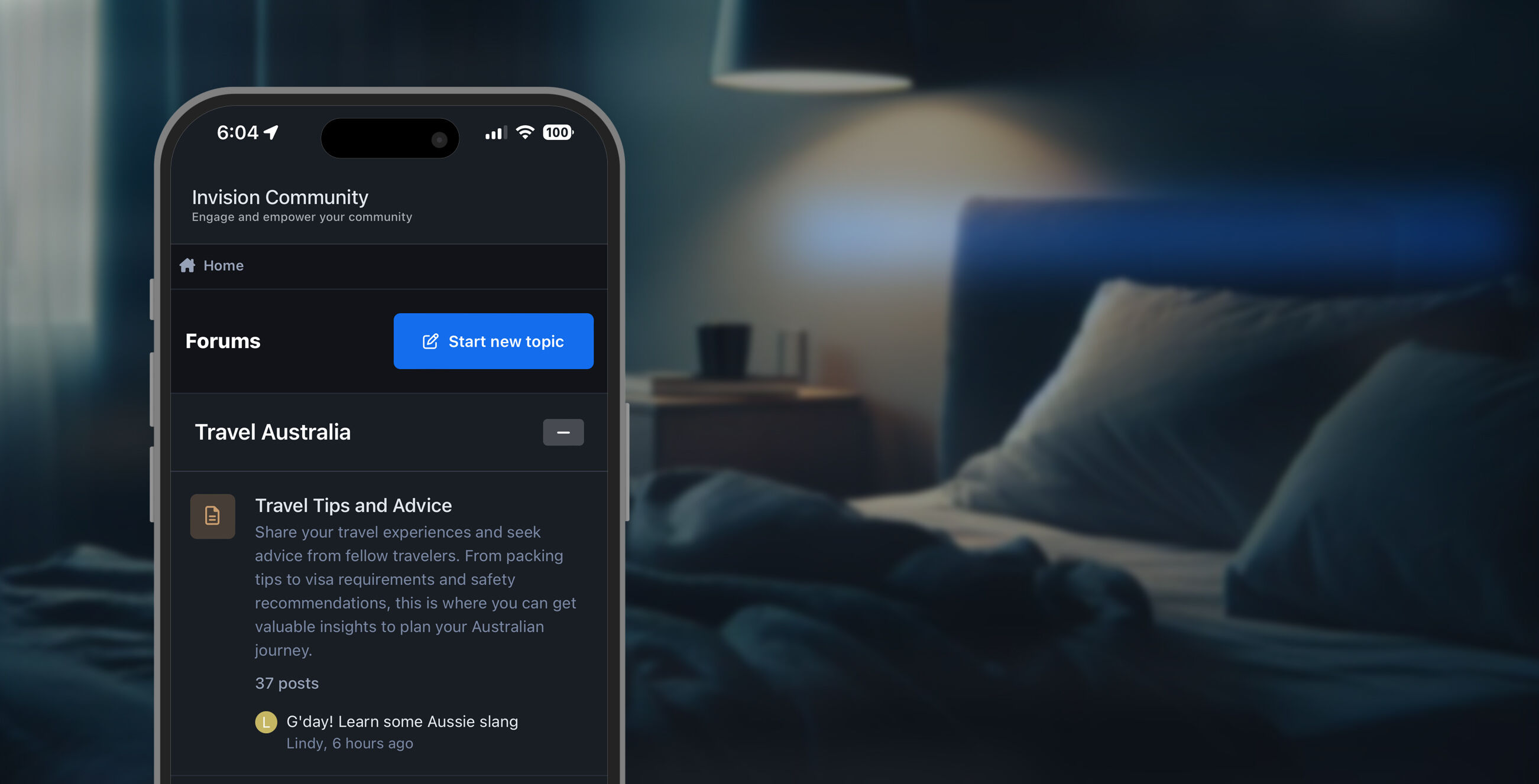
Mobile UI
With an incredible amount of mobile visitors accessing the web, we’ve placed a huge priority on redesigning the interface to ensure it lives up to todays standards.
A new navigation bar at the bottom of the page provides convenient access to your activity feed, notifications, messages, a search panel, and navigation links. A conscious effort was made to ensure that this information was available within a single tap, and we found that a bottom bar like this was easier to interact with compared to icons in the header.

The mobile navigation bar from Invision Community 5
A goal of the mobile UI was to display elements that were previously only available on larger devices, while still maintaining a clean interface. For example, to improve navigation, we've added a scrollable breadcrumb list to the top and bottom of the page. To improve guest participation, we added Sign In and Sign Up links to the bottom navigation bar. These links were previously hidden within the hamburger menu, so we feel like this will really benefit those looking to improve registrations. And as demonstrated in last weeks video, profile information is now available within posts, comments and reviews on small devices.
We’re really excited for you to literally have a hands on experience with the new mobile interface of Invision Community 5, and we're interested to hear your feedback in the comments!