
A theme controls the overall look and feel of your site, allowing you to tailor its appearance to suit your vision. This could be as simple as choosing a color scheme you like, or as specific as matching your existing business branding.
Invision Community makes this easy with a zero-code theming system. You can create and customize themes without any technical knowledge, while the platform automatically ensures your colors are applied consistently and your site looks great across all devices, with minimal effort required.
Creating a New Theme
You would first create a new theme within your Admin CP, from the following location. You can set this as your default theme in the process, or leave it as a non-default, depending on your preference.
Customization -> Appearance -> Themes
Create New Theme

Once you have created a new theme, head to the front end of your site. First of all, from the bottom of the page, click the theme menu, and select the new theme.
Select Your New Theme

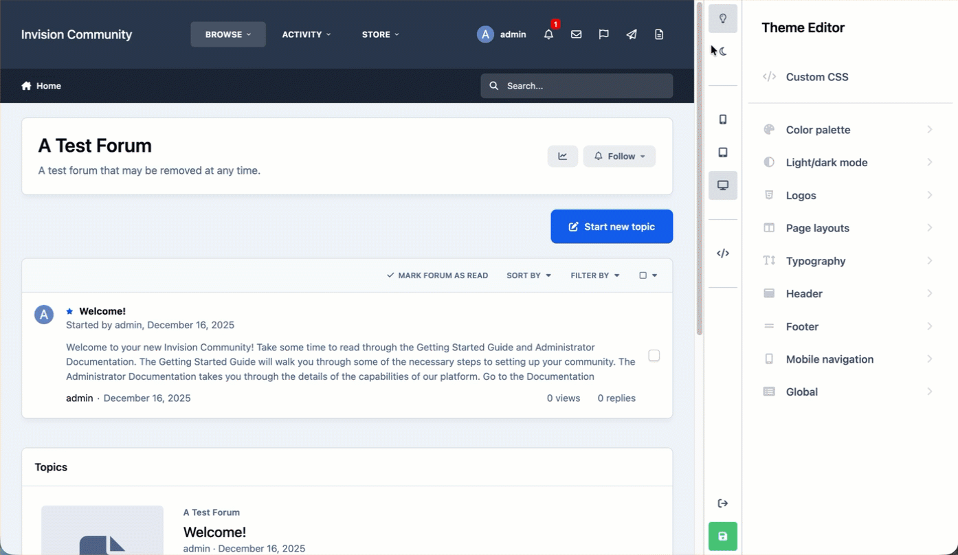
You are now ready to start editing the new theme to your liking, using the theme editor
Theme Editor
Now you have created your theme, you will want to open the theme editor. Click on your name and select "Theme Editor". Once open, you will be able to start customizing your site’s colours, logos, layouts, and more.
Theme Editor

Previewing
The theme editor provides an instant, live preview of your theme, as soon as you modify a setting. You can switch to different views that you would use day to day on your site, such as a mobile or tablet view, or a light or dark view.
Activate each mode by selecting the buttons shown below
Switching to Different Views to Preview
Coloring Your Site
Themes are powered primarily by just 3 colors, which can be selected in the color palette section of the theme editor
Primary - responsible for styling the main elements on your page, such as the Start new topic button.
Secondary - control minor elements, such as pagination links
Base - responsible for controlling the overall tint on your site.
The Color Palette
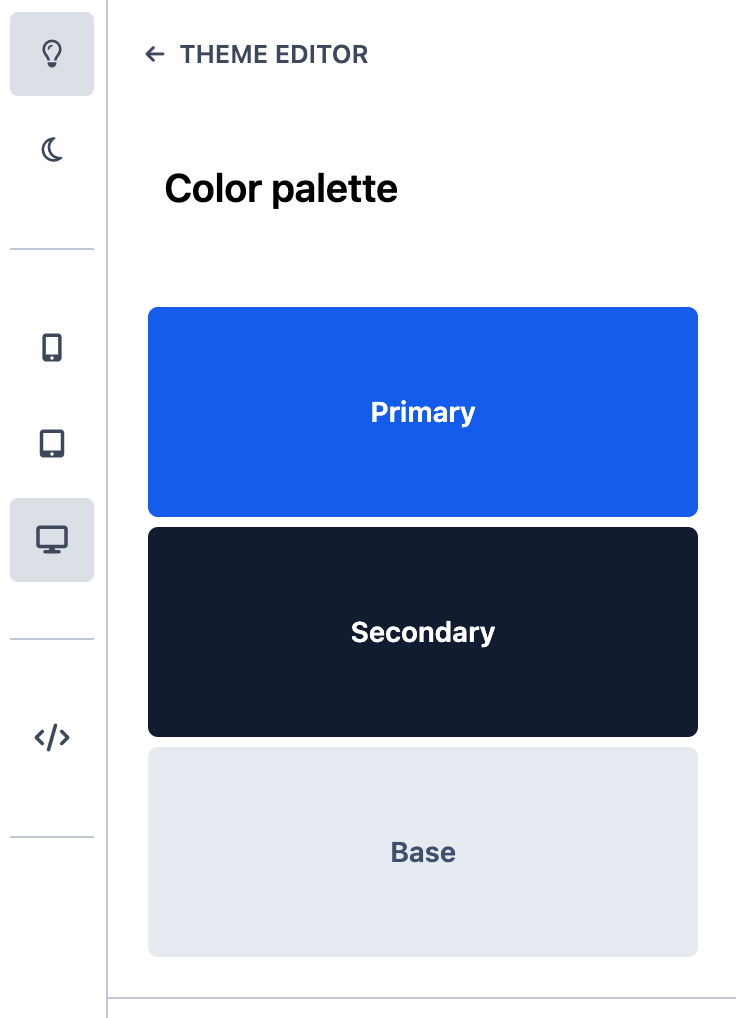
By changing each of these, you can very quickly change the color of your site, using the provided color picker. You can see this in action below
{changing colors quickly here}
Logos
A logo is a visual symbol or text that represents your site or brand. It’s often the first thing visitors notice and helps create a recognizable identity for your community. Your logo is typically displayed in the header of your site. In the logos section, these and can be created using or text logo editor, or by uploading an image logo.
Text Option
The first logo option available is a simple text-based logo. This uses text only, with the option to add a short slogan that appears directly underneath. It’s a clean and flexible choice, especially if you don’t yet have a graphic logo.
Creating a Text Logo
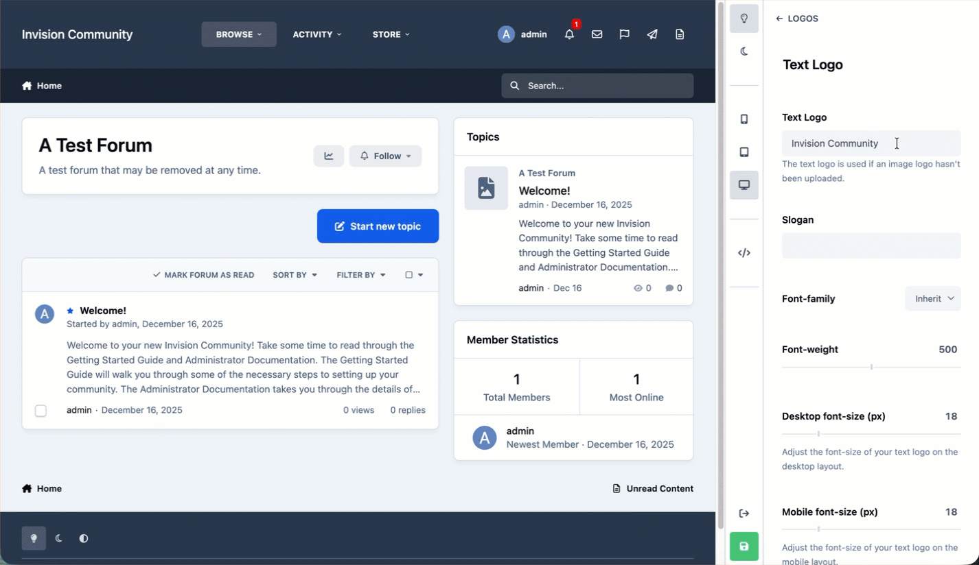
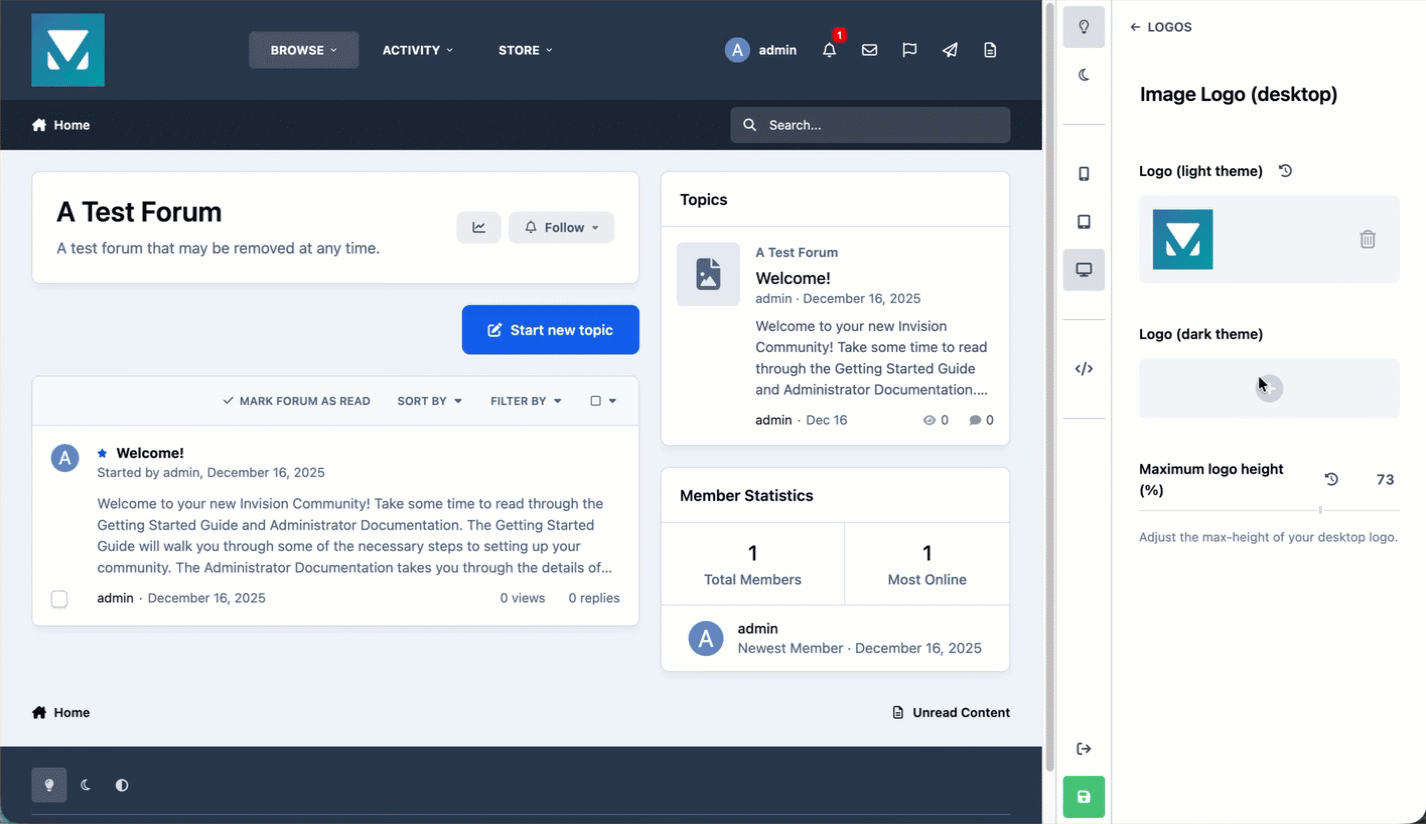
Image Options
The image logo option allows you to upload a graphic logo instead of using text. You can provide both a light and a dark version of your logo, ensuring it looks great across different themes and color schemes. The maximum logo size can be adjusted, with the header automatically resizing to fit. As with all theme settings, any changes you make are shown instantly in the live preview.
Uploading an Image Logo
Header
The header is the uppermost area of your site and is one of the most visible parts of your community, as its shown on every page. It’s where key elements such as your logo, main navigation menu, user menu, and search bar are displayed. You can customize both the colors and the layout of the header to match your branding and arrange everything in a way that best suits your preferences.
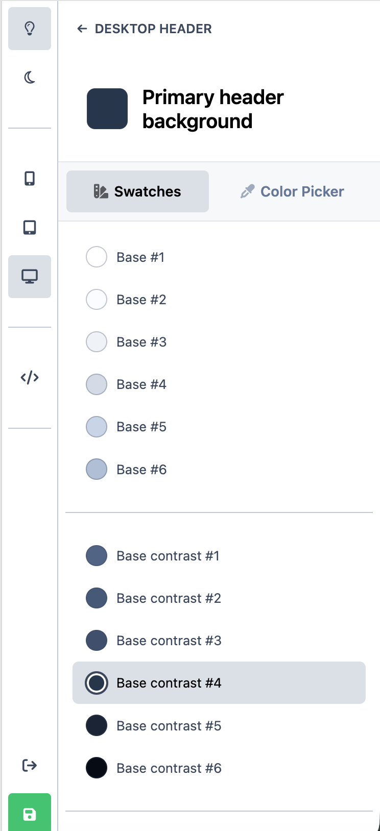
Swatches & Color Picker
Selecting any of the area within the colors section in any of the following sections will allow you to select from various predefined colors, or choose your own using the color picker provided
Header - > Desktop header
Header -> Mobile header
Swatches are preset colors that are automatically created from the main colors in your color palette, such as your primary, secondary, and base colors. These swatches make it easy to apply consistent colors across your header, that match the rest of your community, without needing to manually choose values each time. You can simply select one of the available swatches as shown in the image below. If you do have a specific color you wish to use, you can always use the color picker to choose a specific custom color instead.
Pre-Determined Swatches from your Main Color Palette
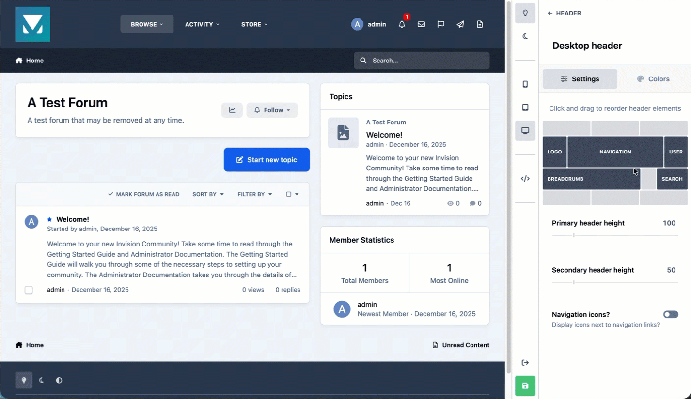
Header Arrangement
You can arrange the header items for desktop views in the following area of the theme editor:
Header -> Desktop Header
The header arrangement options, allow you easily control how items are laid out in your header. Using simple drag-and-drop controls, as shown in the image below, you can rearrange menu items to suit your needs.
If icons have been assigned to menu items in the AdminCP, these can also be displayed alongside the menu text. You can also adjust the height of both the primary and secondary header areas, giving you more flexibility over the overall look and spacing of your site’s header.
Rearranging The Header
Page Layouts
Layout options can be found in the Page layouts section of the theme editor, and allow you to define the default layouts used throughout your community. Using the theme editor, you can choose how different areas of the site are displayed, with changes shown instantly in the live preview. An example of using layout options is shown below.
You can configure layouts for a wide range of areas, such as:
Page layout
Forum index
Topic list
Topic view
Blog layouts
And other areas besides
{need animated gif here once its fixed}
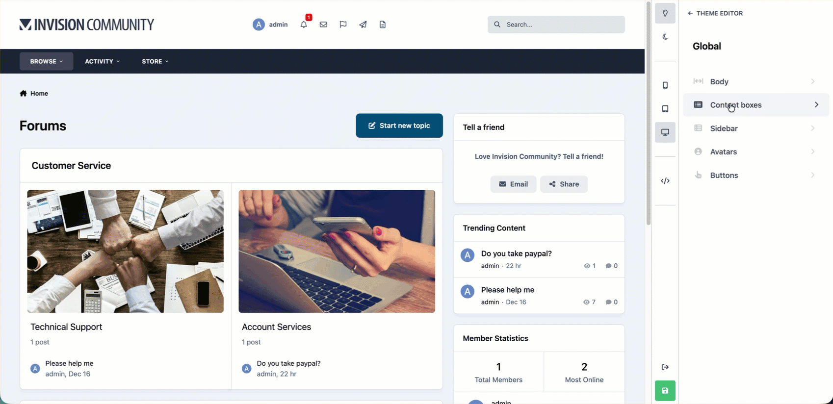
Global Body Elements
The Global section of the theme editor controls shared styling used across your entire site, helping keep everything looking consistent. From here, you can easily adjust these global settings to change the overall look and feel of your community. The image below shows how simple it is to modify these elements, such as removing rounded corners to create a cleaner, more square and flat appearance throughout the site.
Changing Global Elements
Other Items
In addition to the areas covered above, there are other options that are available within the theme editor that we haven’t gone into here. We encourage you to spend some time exploring and experimenting, as most changes can be previewed instantly and adjusted at any time.
Some of the other areas you can customize include:
Typography - allowing you to change the typeface used across your site, as well as adjust font sizes
Footer colors - giving you control over the look of the footer area
Light and dark options - where you can choose whether these modes can be toggled by users, or set to follow the system’s current appearance setting
CSS Additions - Adding your own CSS using the </> icon
{link to advanced topics here}

Recommended Comments