
Introduction
In this guide, we’ll walk through creating a basic home page from scratch, demonstrating just how simple it can be to build a clean, informative, and visually appealing page within the platform. Whether you’re setting up a new site or refreshing an existing one, you don’t need any advanced design or coding experience to achieve great results.
By following along, you’ll see how quickly you can combine built-in tools and content blocks to produce a professional-looking layout that clearly presents your key information. The aim here is not only to create a functional home page, but to show how easily you can tailor it to suit your own community or business needs.
Getting Started
Before we can begin adding any content, the first step is to create a page to work with. This provides the foundation for everything that follows, giving us a dedicated space where we can build and structure our home page.
In this section, we’ll guide you through the process of creating a new page within the Admin CP. Once created, this page will act as the canvas for your content, allowing you to start adding blocks, text, images, and other elements to bring your home page to life.
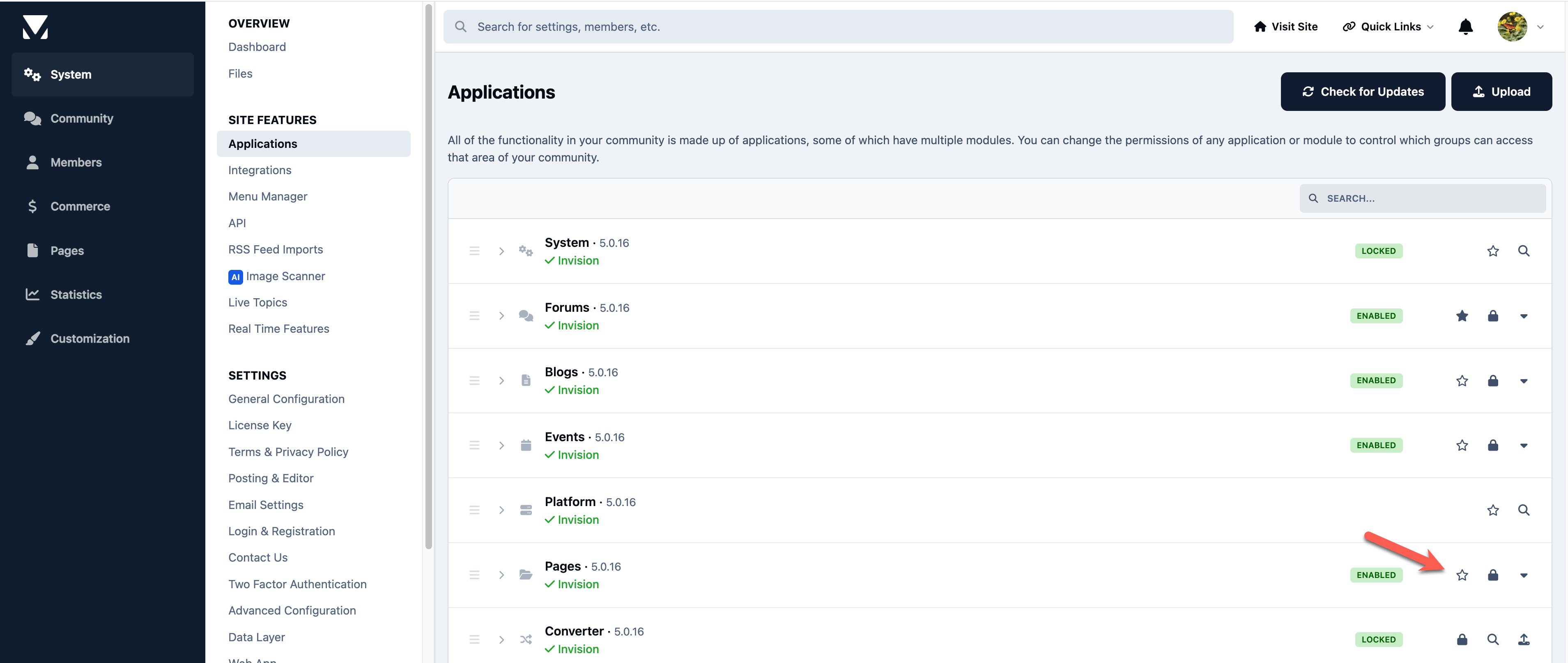
Setting the Default App
Before we begin, we need to ensure that Pages is set as the default application, so it is shown first when your site loads.
This can be found in the following location within the Admin CP
System → Site Features → Applications
From here, locate the Pages application and select the star icon next to it to set it as the default.
Select the Pages Application for Default
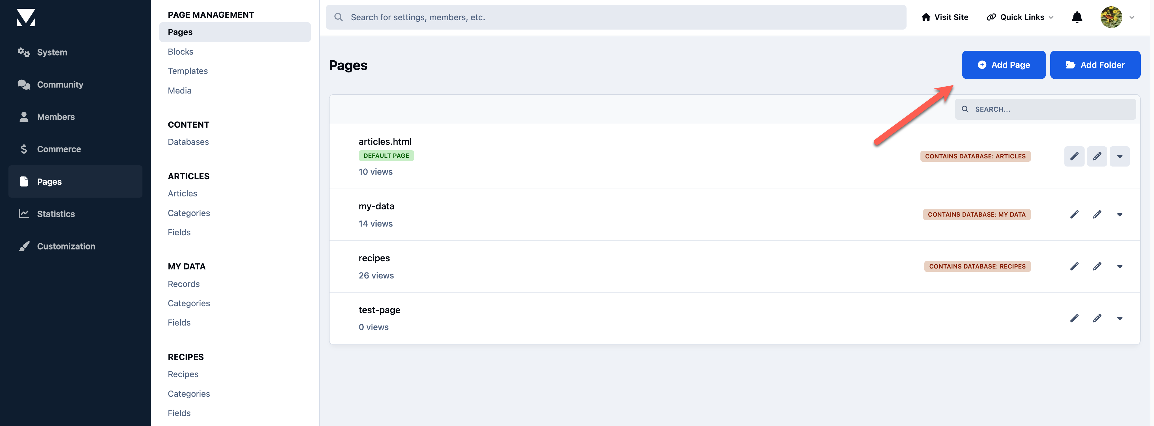
Creating a Page
To create a new page, navigate to the Pages section and select the option to add a new page.
This can be found in the following location within the Admin CP
Pages → Page Management → Pages
From here, click on “Add Page” to begin creating your new page.
Click on Add Page to Create
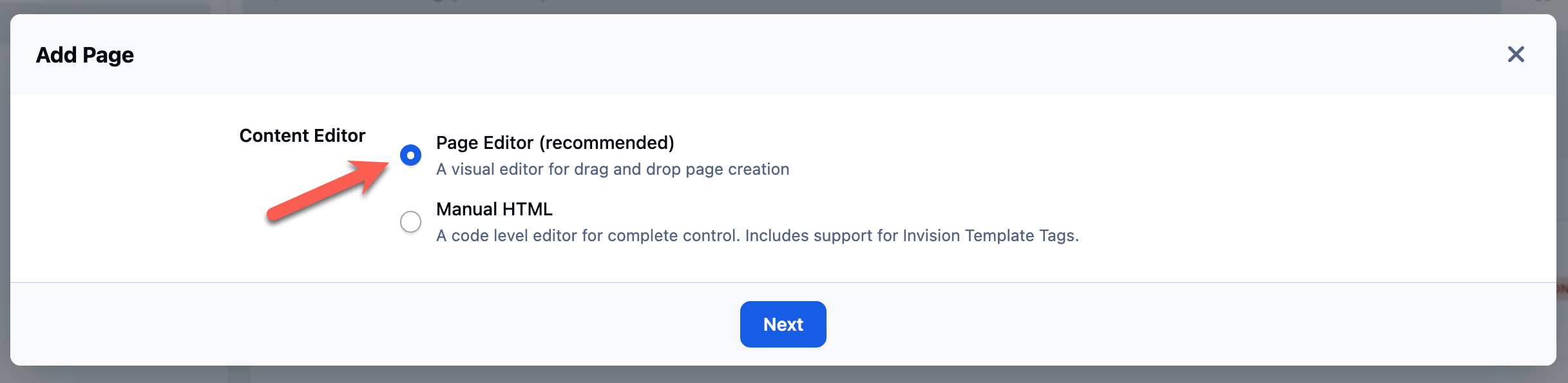
When prompted to choose a page type, select Page Editor. This option allows you to use the simple drag-and-drop builder, making it quick and easy to design your page layout without any coding.
Use Page Editor for Simple Drag & Drop
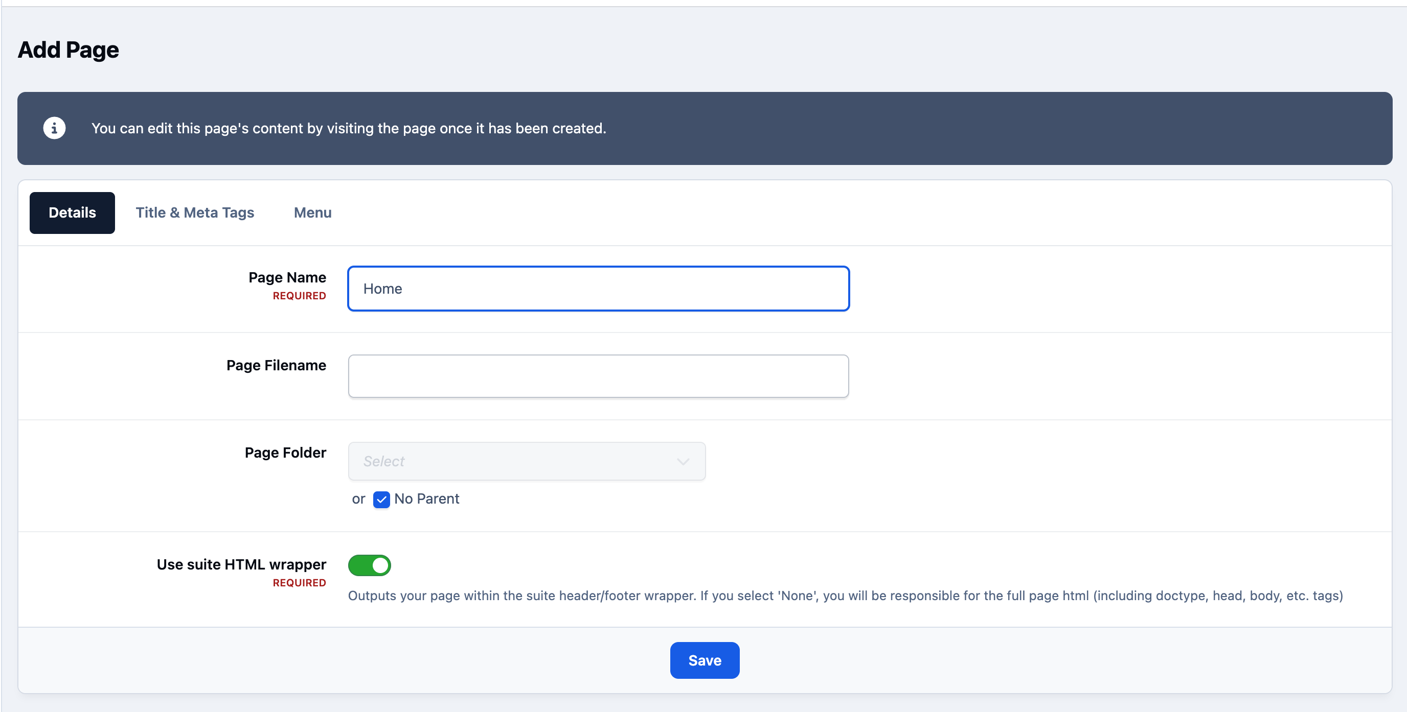
On the first tab, enter “Home” as the page name, and leave the remaining options as their default values.
We will also keep the suite HTML wrapper enabled, as this ensures your page inherits the overall structure and styling of your site, such as the header, footer, and navigation. This keeps your new page consistent with the rest of your community.
Add Only Name
You can ignore the Title & Meta Tags tab for now, as this is not required for our basic setup.
Next, move to the Menu tab. Here, we will create a menu item so the page appears in your site’s navigation bar. Enable the option to add it to the menu, and leave the remaining settings as their default values.
Select to Add to the Navigation
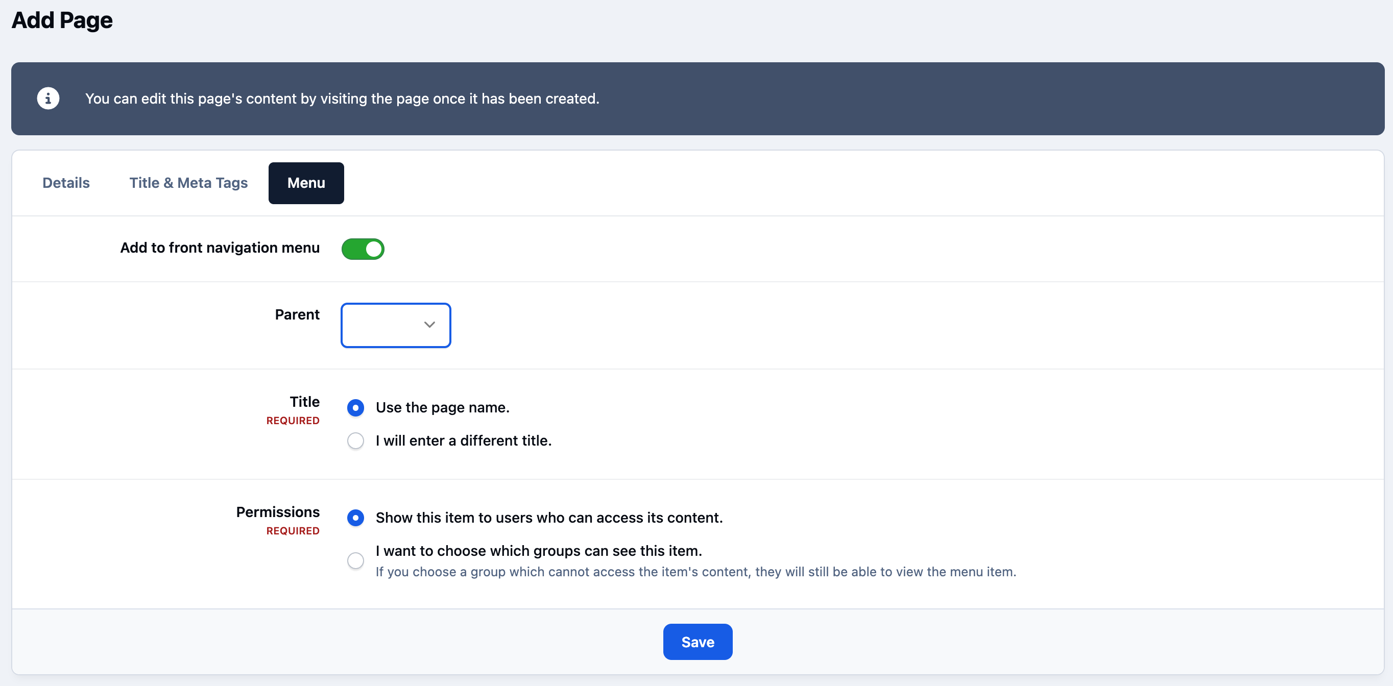
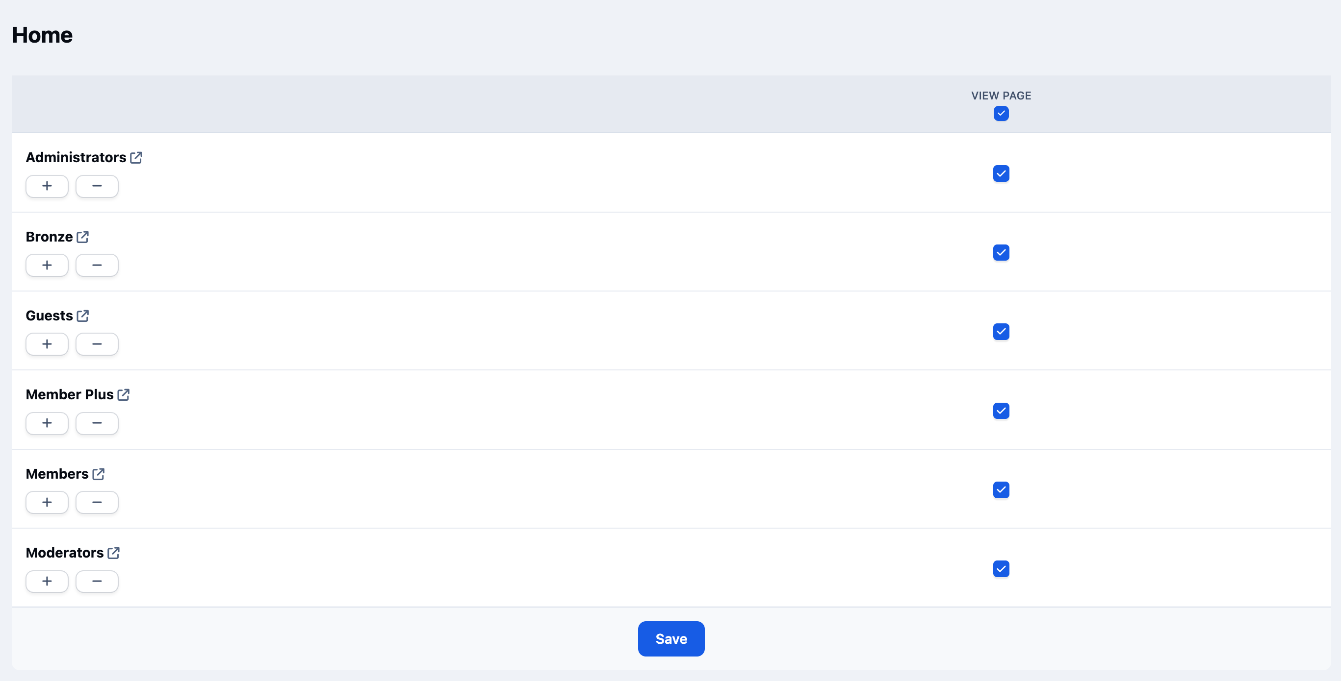
Once you click Save, you will be prompted to set permissions for the page.
As this is a home page that should be visible to all visitors, ensure all permission options are selected. This will allow everyone to view the page. Once selected, click save to continue.
Select All Permissions
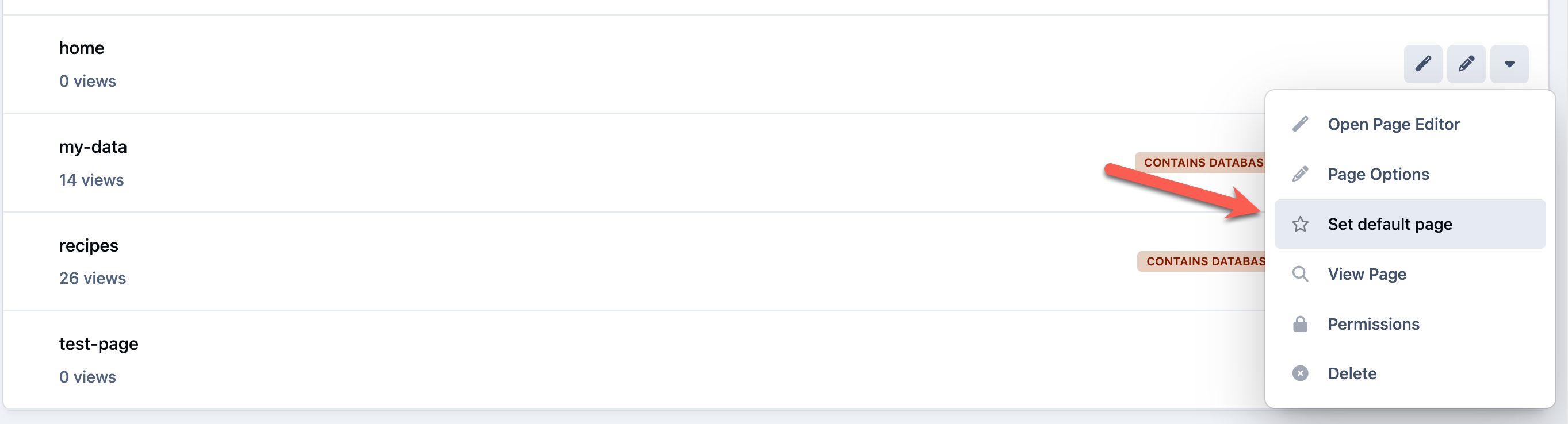
You will now be returned to the page list. From here, we need to set this new page as the default.
Locate the page you have just created, click the dropdown menu next to it, and select “Set as default page”. This will ensure your new home page is shown when users first visit your site.
Setting the Page as Default
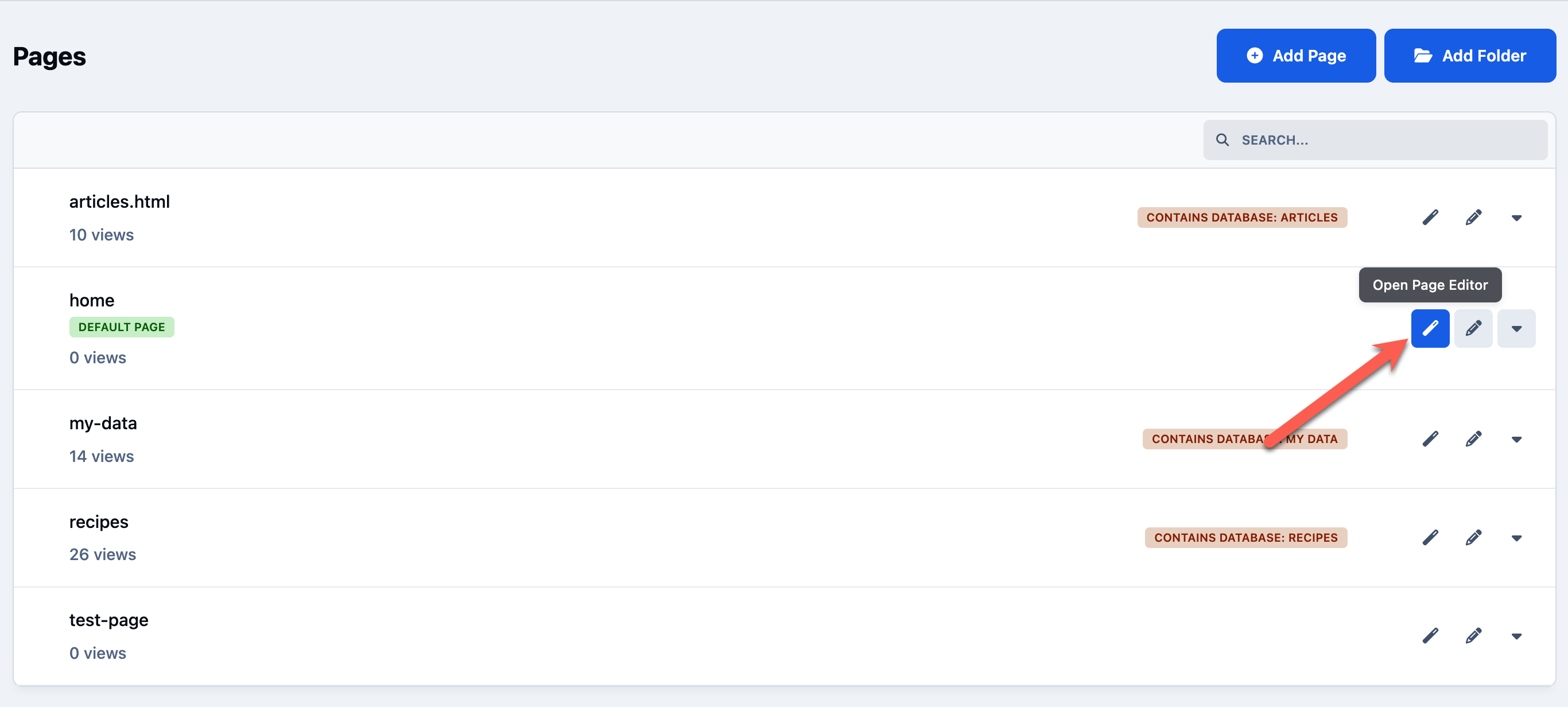
Accessing the Page Editor
To access the page editor, click on the pencil icon next to your page.
This will take you to the front end of your site, with the page editor open and ready to use, allowing you to start building your layout straight away.
Opening the Page Editor
Adding Content
We’re now ready to start adding content. By default, you will see a blank page with the page editor open.
On the left-hand side, you will find the available blocks and widgets that can be added to your page. These are the building elements we’ll use next to start creating our layout and adding content.
Placing & Editing Blocks
Blocks can be added to your page by simply dragging and dropping them into place.
You will notice that the drop locations are already visible on the page. These indicate where blocks can be placed. Simply drag a block from the left-hand side and drop it into any of these areas to position your content exactly where you want it.
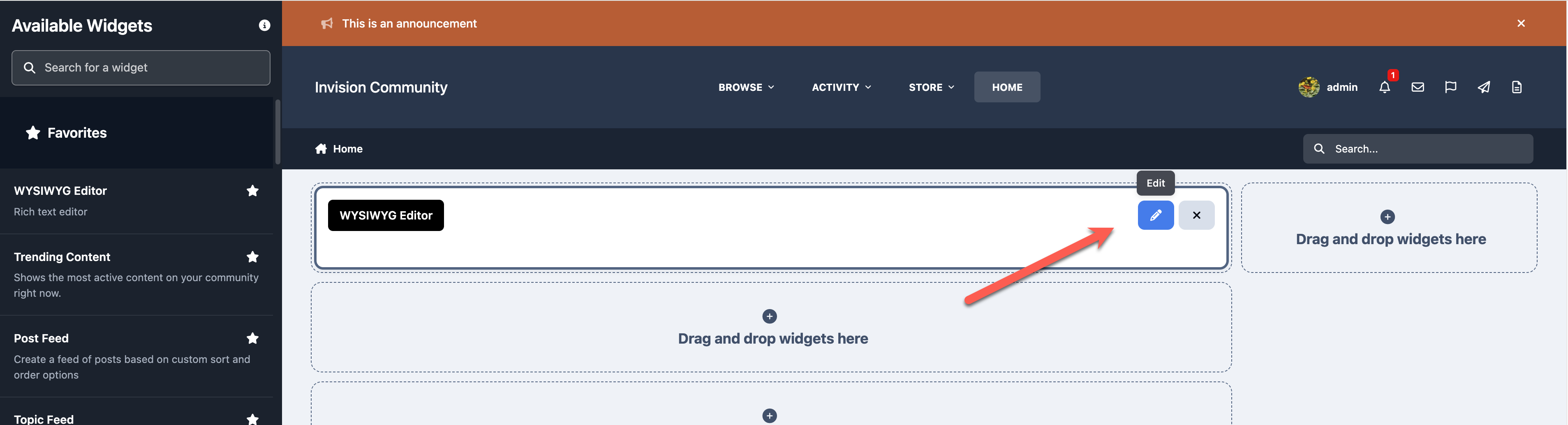
All blocks include an edit option, which can be accessed by clicking the edit button on the block itself.
The options available within this menu will vary depending on the type of block you are using, allowing you to customise the content and behaviour of each block to suit your needs.
Editable Blocks
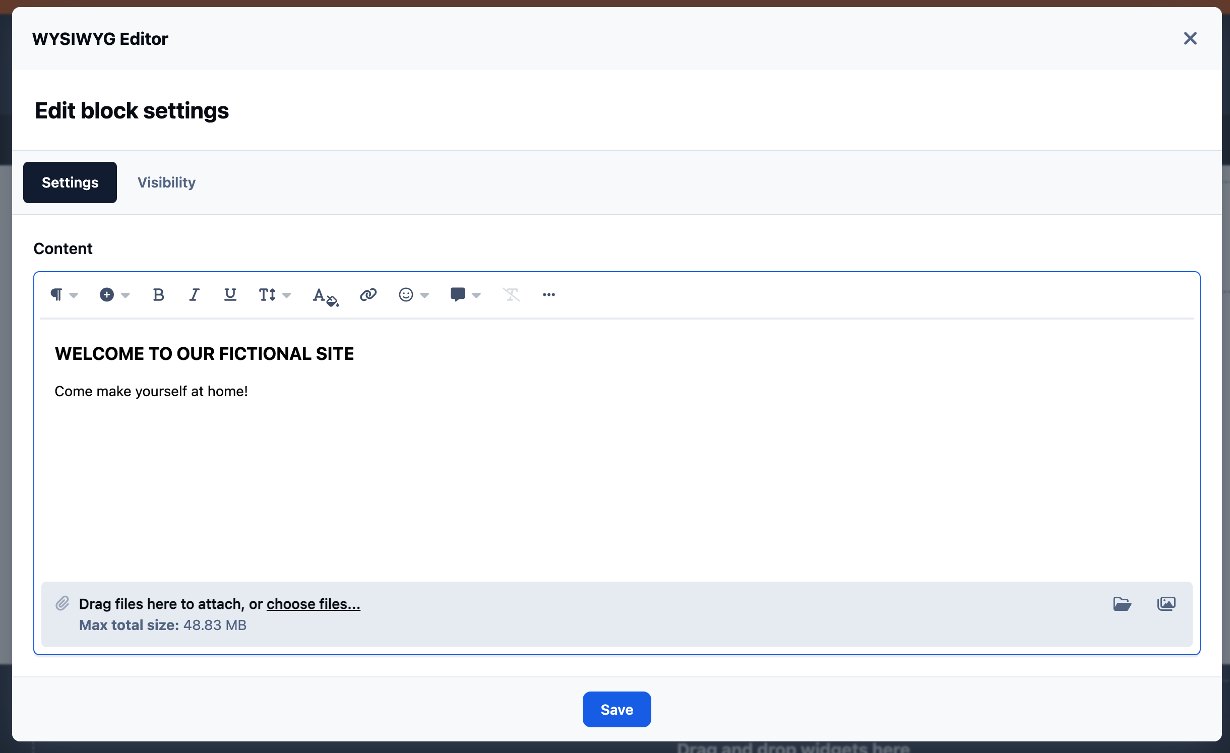
Here, we have added our first block, a WYSIWYG block, which allows you to add simple formatted text to your page.
When editing this block, you can enter and format the text you want to display. In this example, we’ve added some welcome text to introduce visitors to the site.
Adding Details to a WYSIWYG block
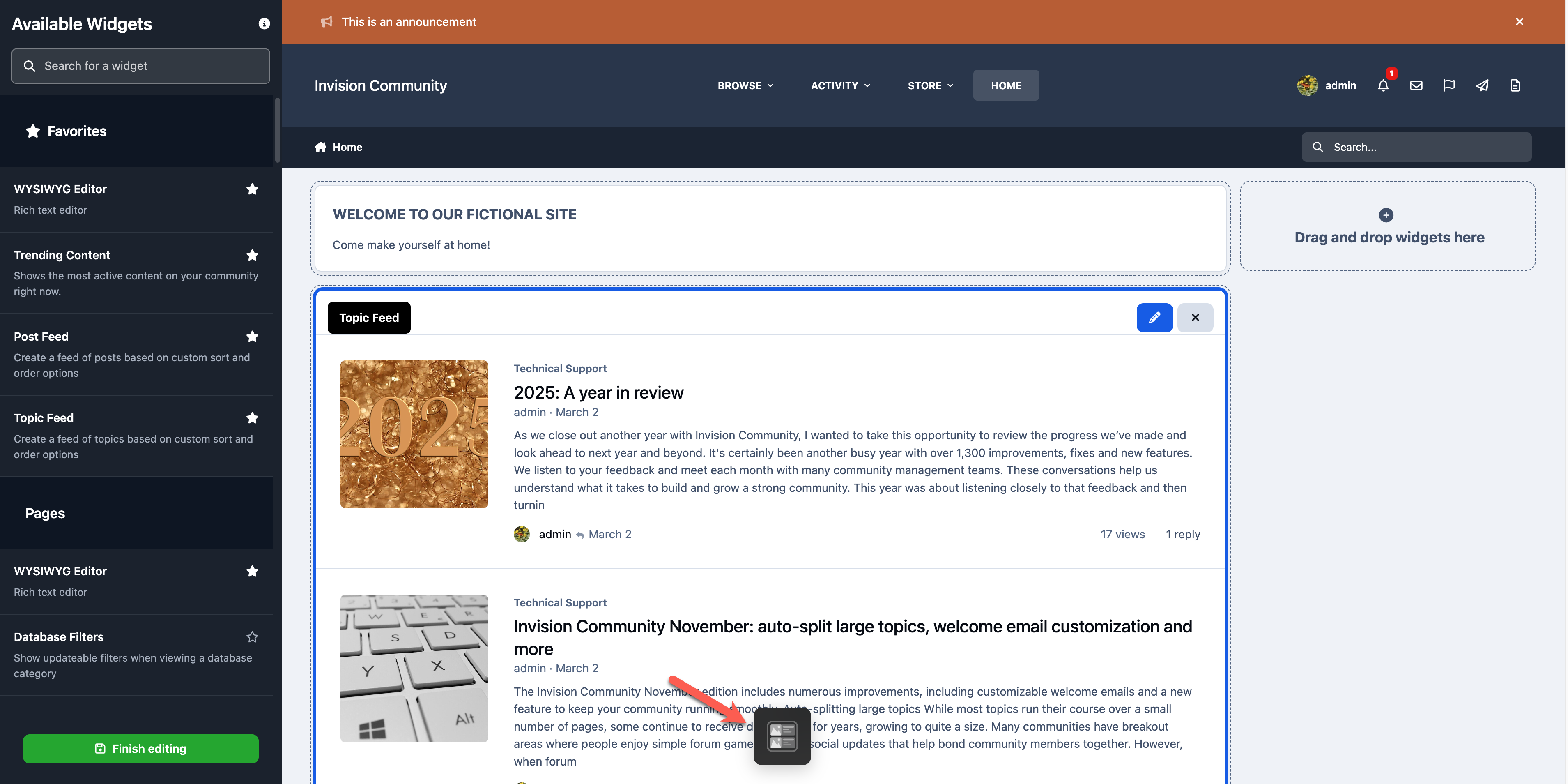
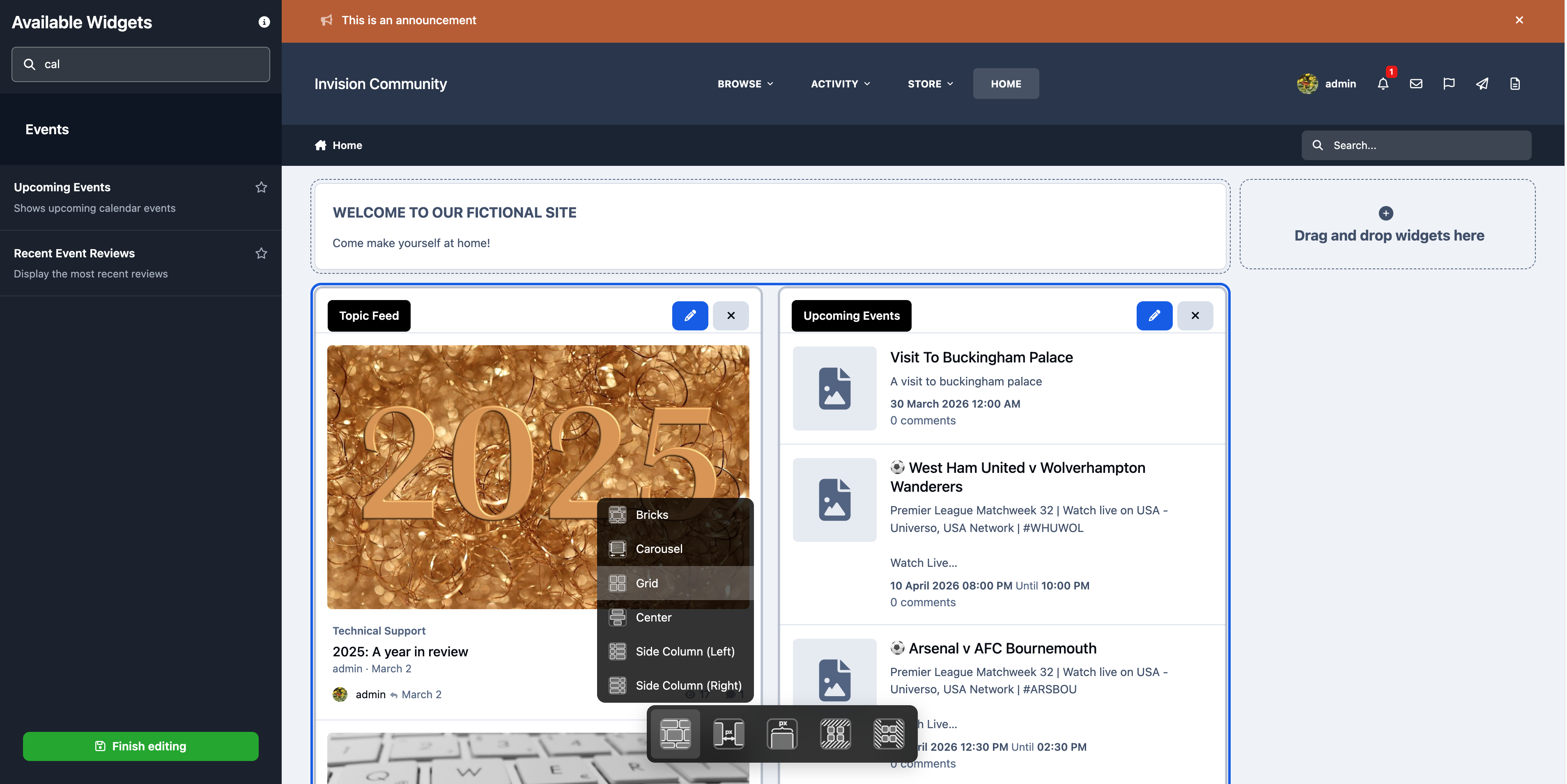
Layouts
When placing blocks, you will see a layout icon appear at the bottom of the page.
Selecting this will display different layout options, which change how the block is visually presented, rather than where it is positioned. For example, you may choose styles such as a wallpaper or other display variations depending on the block.
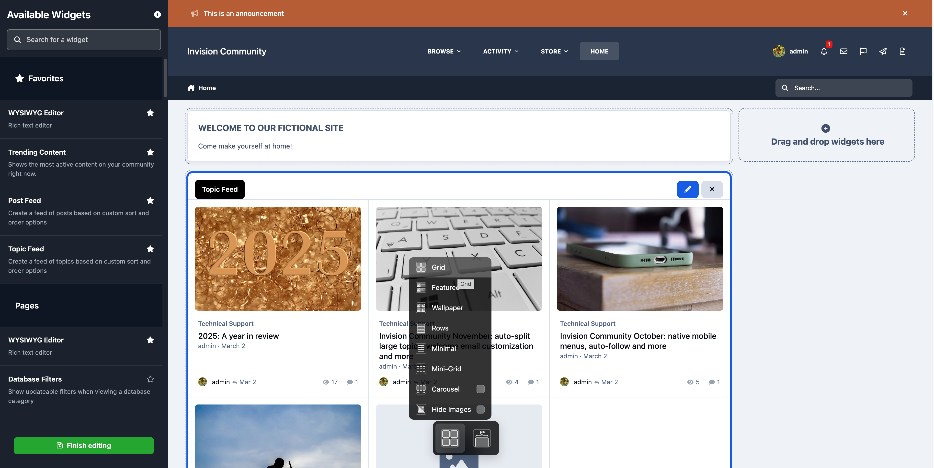
For our topic feed, we’ve chosen to use a grid view layout.
This presents the content in a clean, structured format, making it easier for visitors to browse and quickly pick out items of interest.
Selecting a Grid Layout
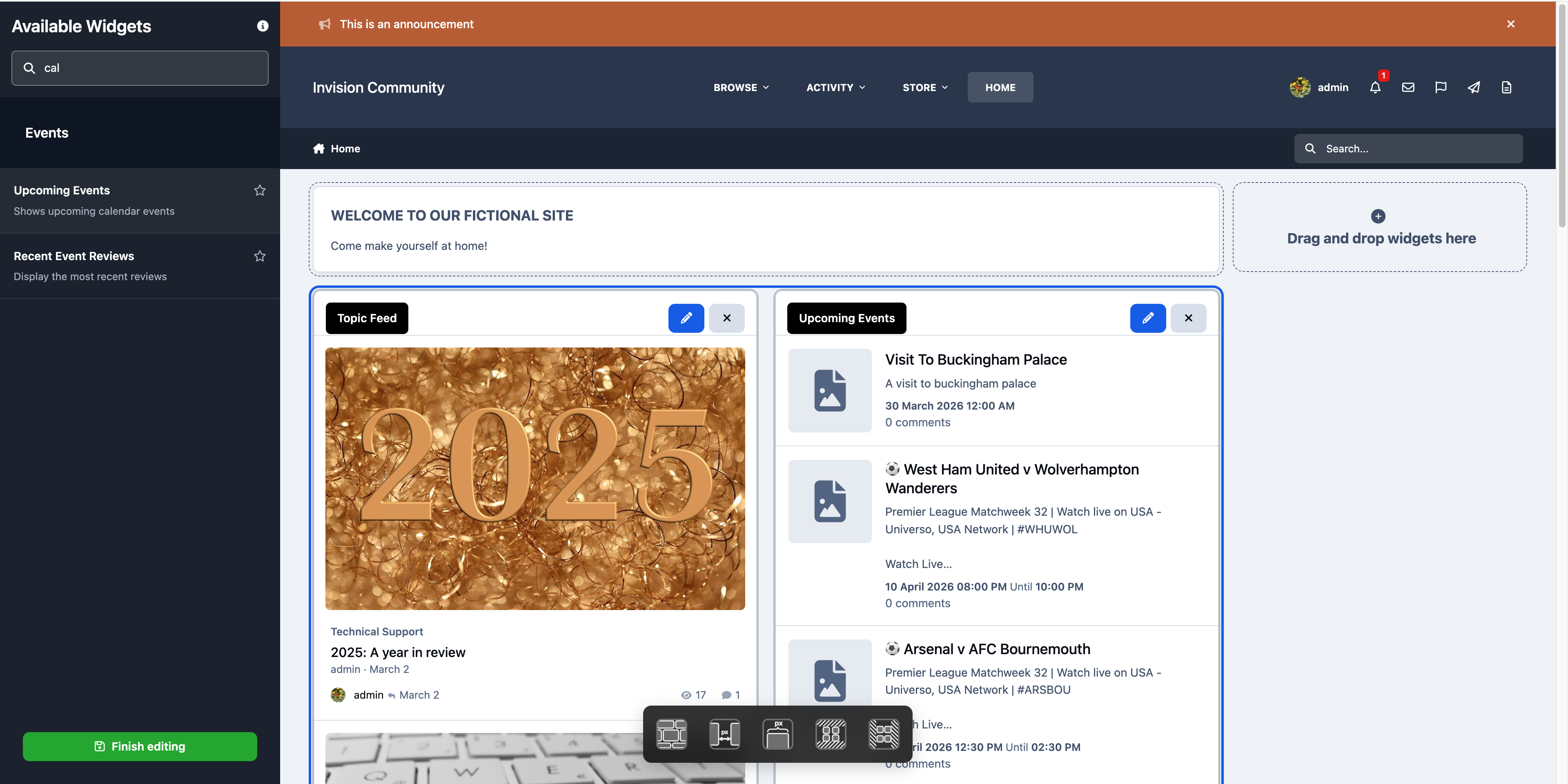
You can also place blocks side by side within the main central drop zones.
By dragging a block next to another, you can create columns and build more dynamic layouts, allowing you to organise your content in a way that best suits your page design.
Side By Side Layout
When you first drop a block into place, you will notice that the entire area is selected, rather than just the individual block.
At the same time, new layout options will appear at the bottom of the page. These options allow you to control how content is arranged within that section, such as adjusting how blocks are positioned and displayed alongside each other.
Grouped Layout Options
In this example, we have chosen to display the block in a side column on the right-hand side of the page.
To keep the layout clean and uncluttered, we have also disabled images for this block. This can be done by first selecting the block, then using the layout options and enabling the “Hide Images” setting for that
Selecting to Hide Images
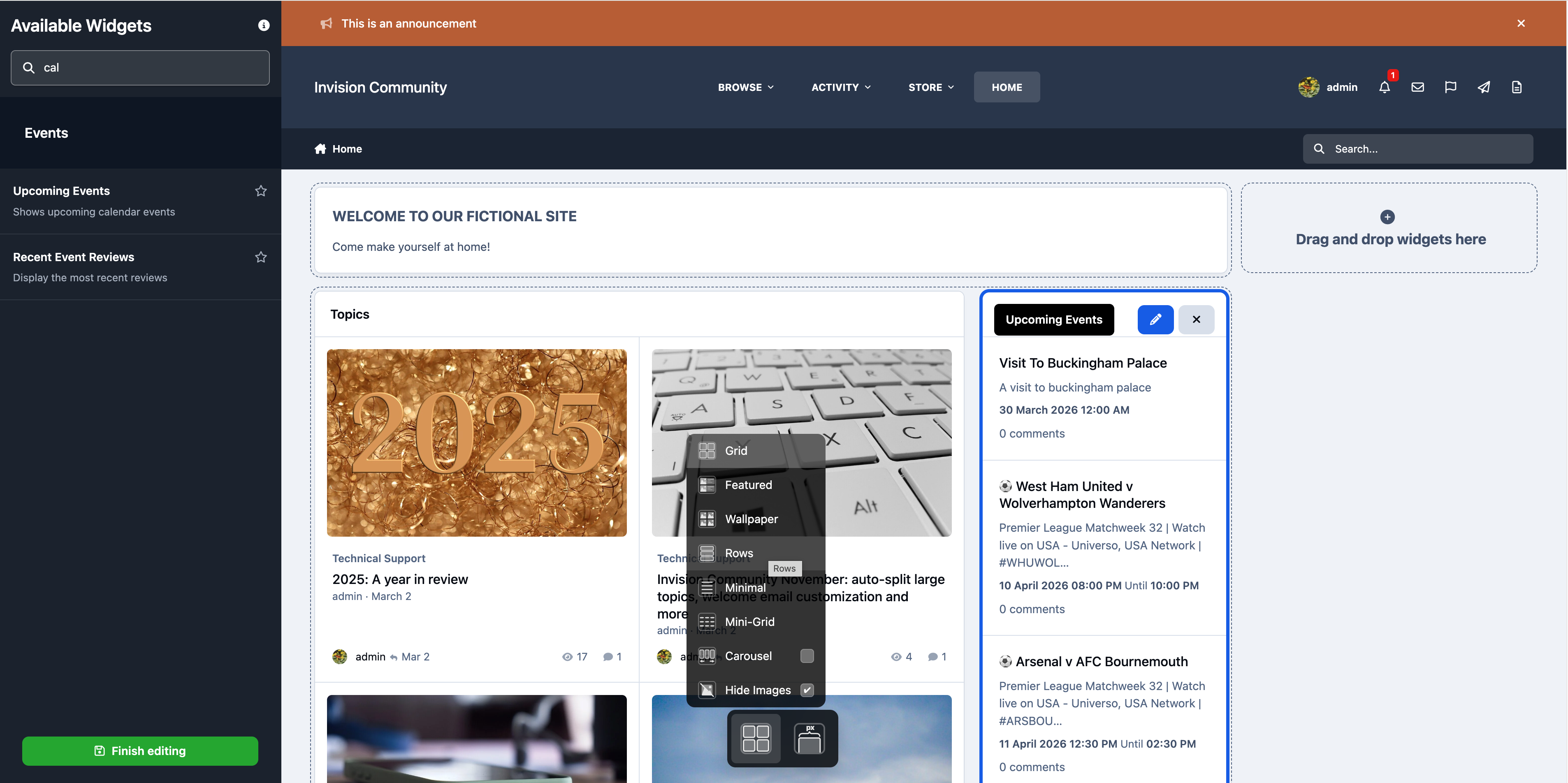
On the sidebar, you will see we have now added a newsletter signup block.
However, you will also notice left and right arrows at the bottom of this area. This indicates that multiple blocks have been placed in the same location. In this case, one block has been dropped on top of another, meaning there are two blocks occupying this space. You can switch between them using the left and right arrows.
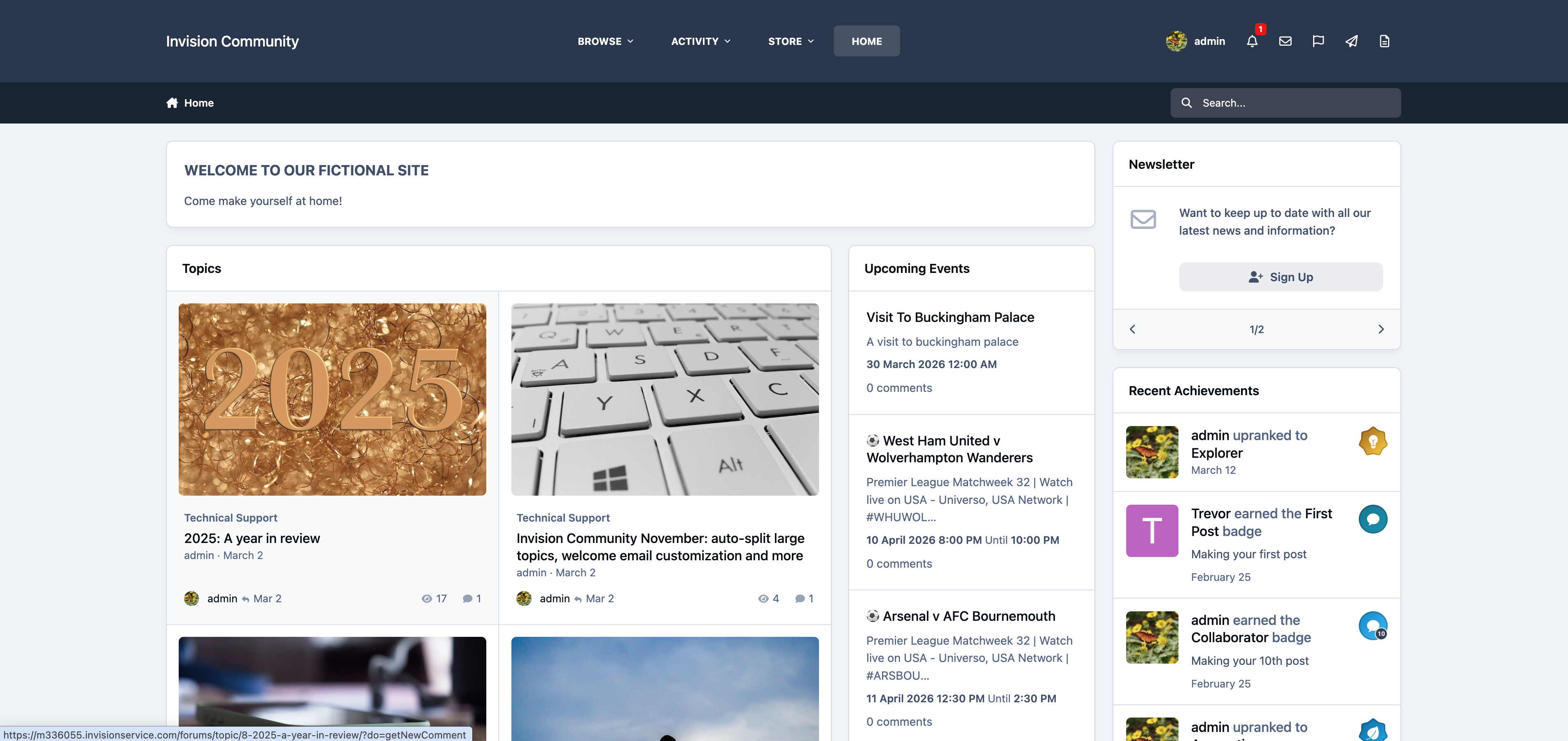
Final Result
To finish up, we’ve added a recent achievements block and then closed the page editor.
All changes are saved automatically as you work, so there’s no need to manually save at any point. With that done, your first home page is now complete, providing a clear and engaging overview of your site and its content for visitors.
Example Home Page
Recommended Comments